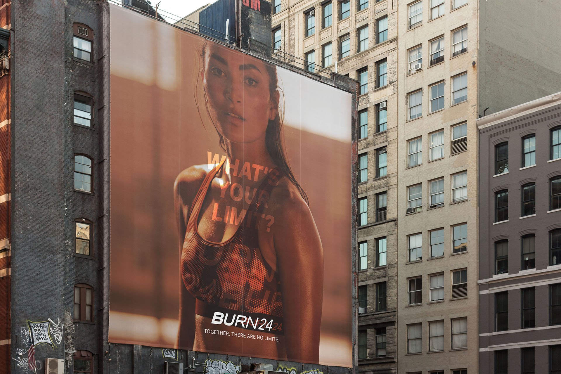
BURN24

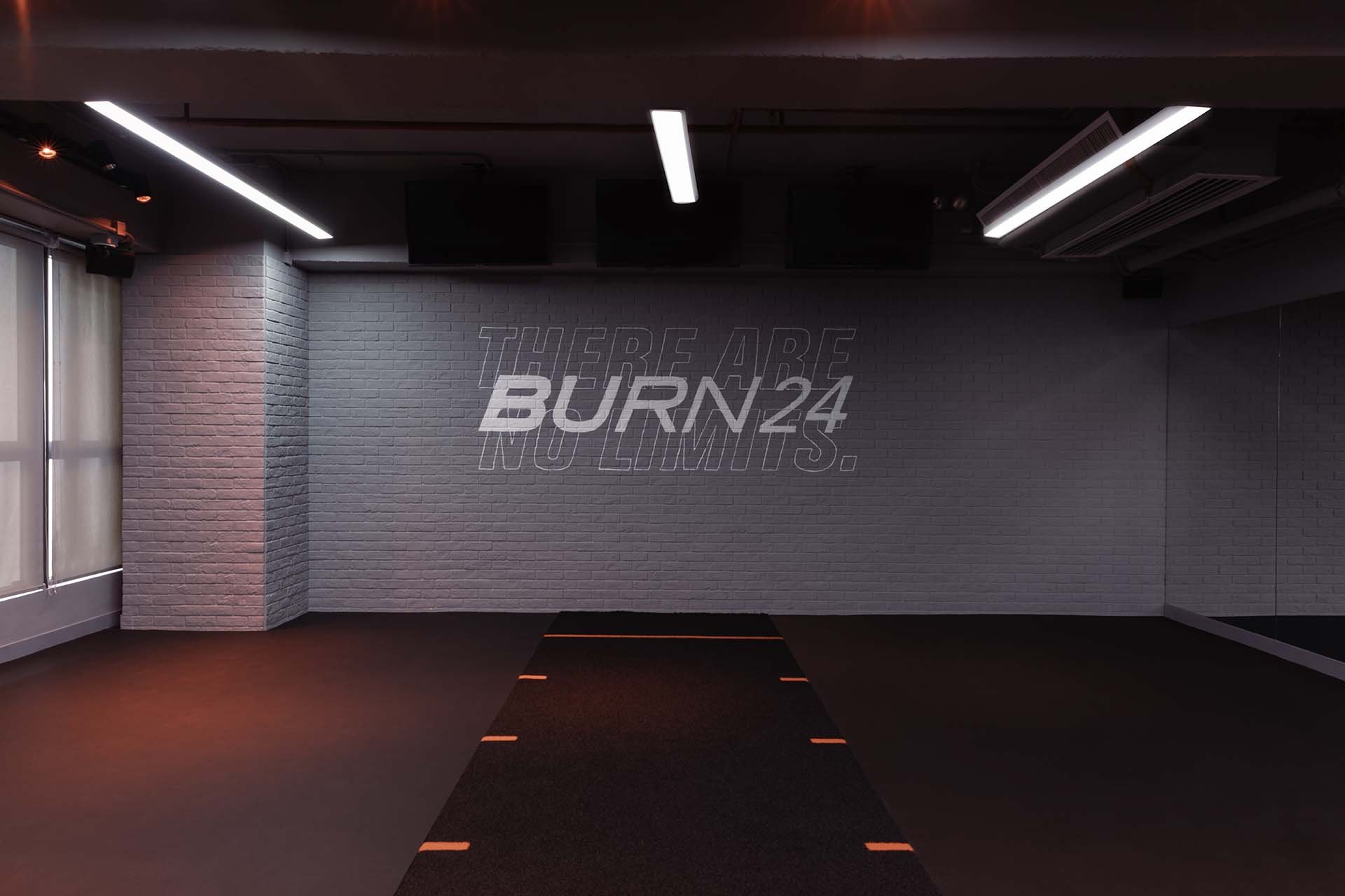
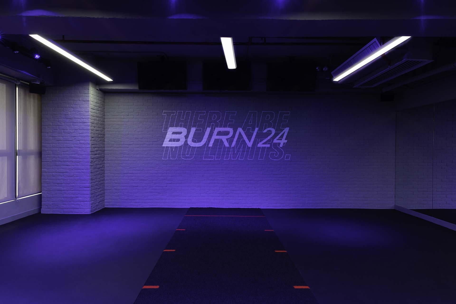
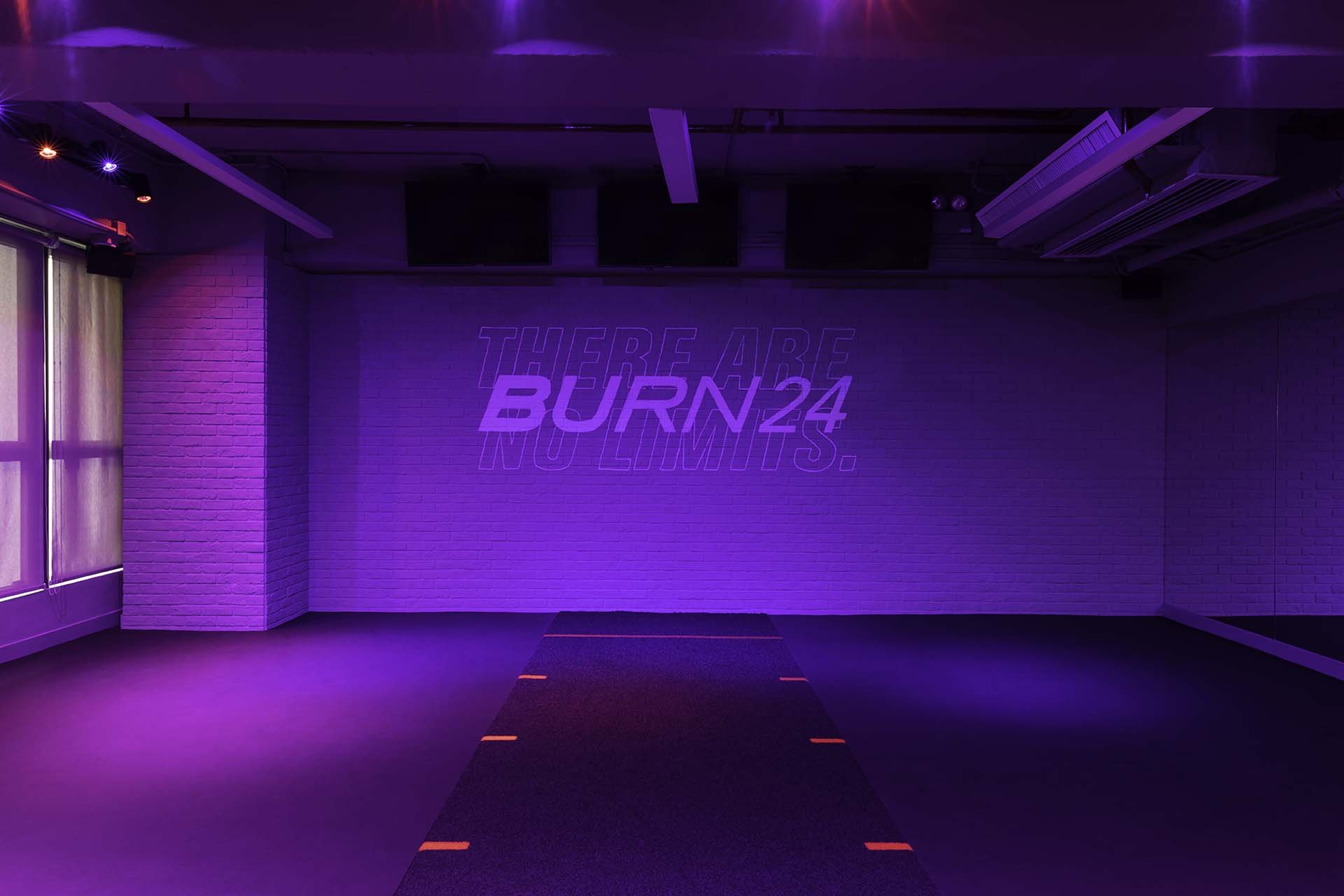
Together, There Are No Limits.
BURN24 is a new fitness community specialising in innovative, high-intensity group workouts designed by GO24 Fitness Hong Kong. Featuring functional training, circuit and HIIT workouts geared toward everyday movement. Designed for all shape and sizes, BURN24 is a platform for those who wants to stretch their abilities, push their concentration and limits to the edge.
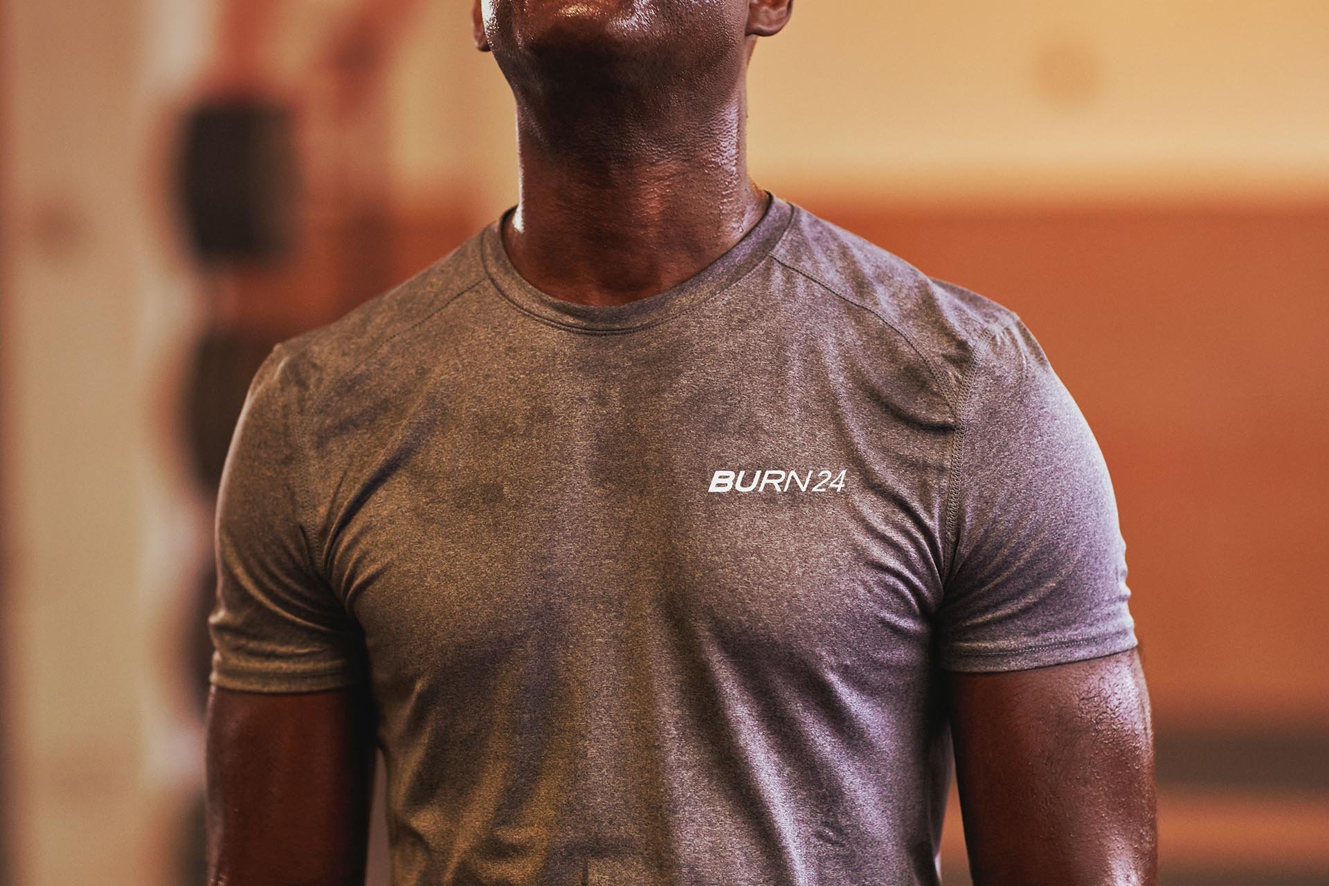
House of Forme worked with the client on the brand identity, collateral development, marketing templates, uniform design and brand environments of their new location in Lai Chi Kok, Hong Kong.
See website: www.go24fitness.com
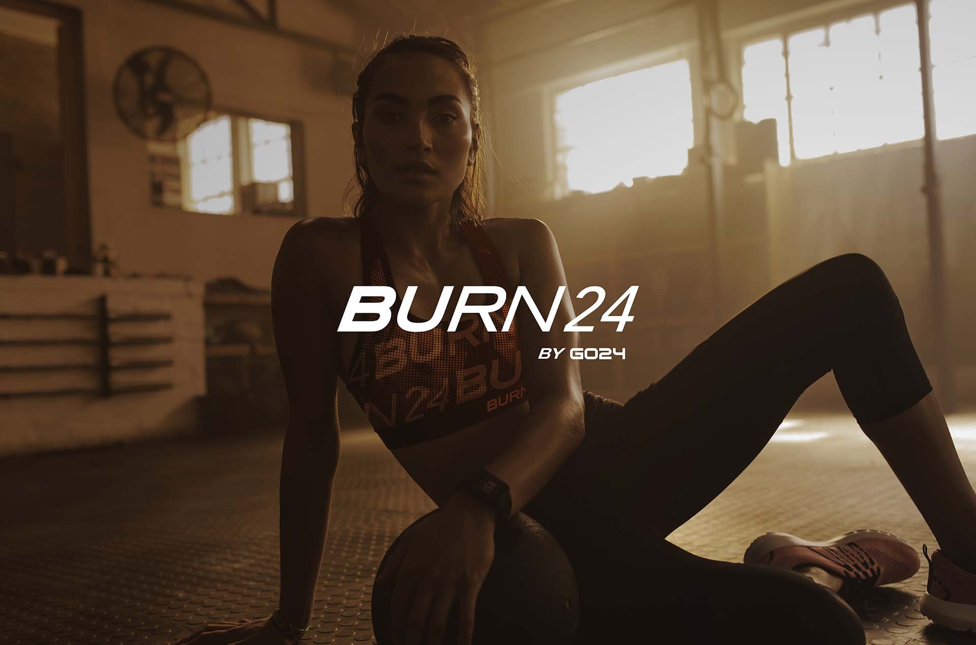


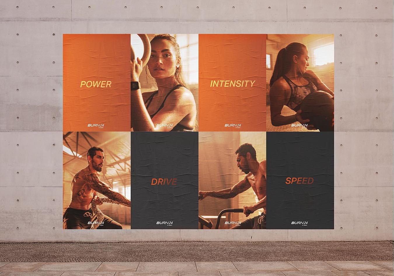
Speed. Intensity. Drive. Power.
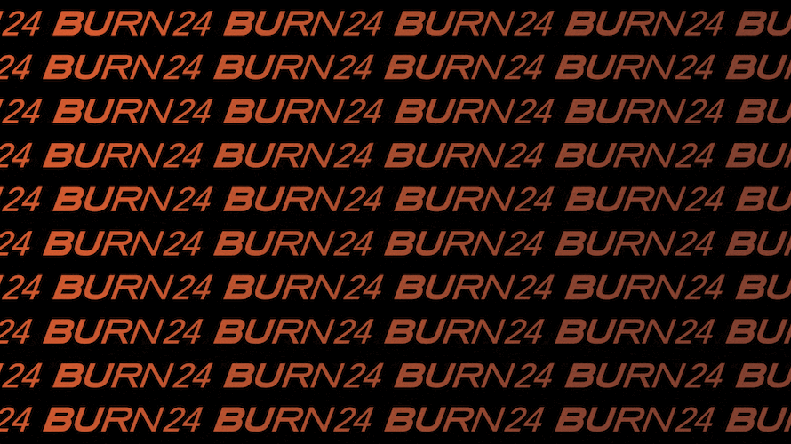
The identity celebrates diversity, inclusivity and empowers people of different backgrounds, shapes and sizes to challenge their very own limits. Featuring a logotype that was created using different fonts weights, it symbolises the diversity of people, it also mimics the burning sensation of a workout. Complimented with a warm yet intense colour palette, the brand identity is brought to life.


The Burn24 Lifestyle.
A burning hue of orange stretches across the brand collaterals, complimenting with BURN24’s active & high intensity training. A featuring hand painted brand mural can also be found inside the centre of the gym. Echoing a sense of community and lifestyle for its members.


Moment
2020
Industry
Gym, Wellness
Services
Brand Identity, Collaterals Development, Brand Activation, Content Creation, Print Production, Art Direction
