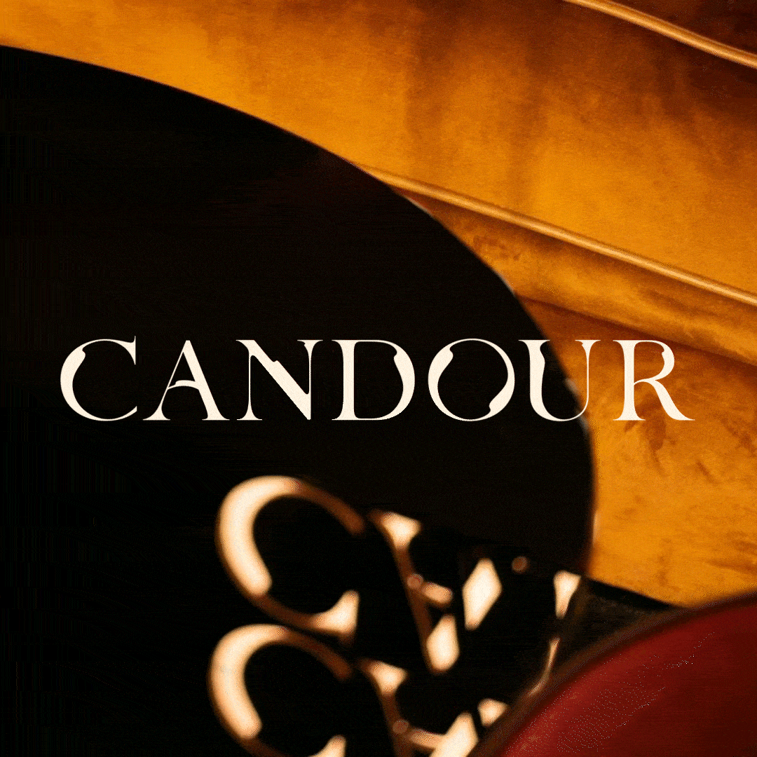
CANDOUR

Soho’s Playground from Dusk till Dawn
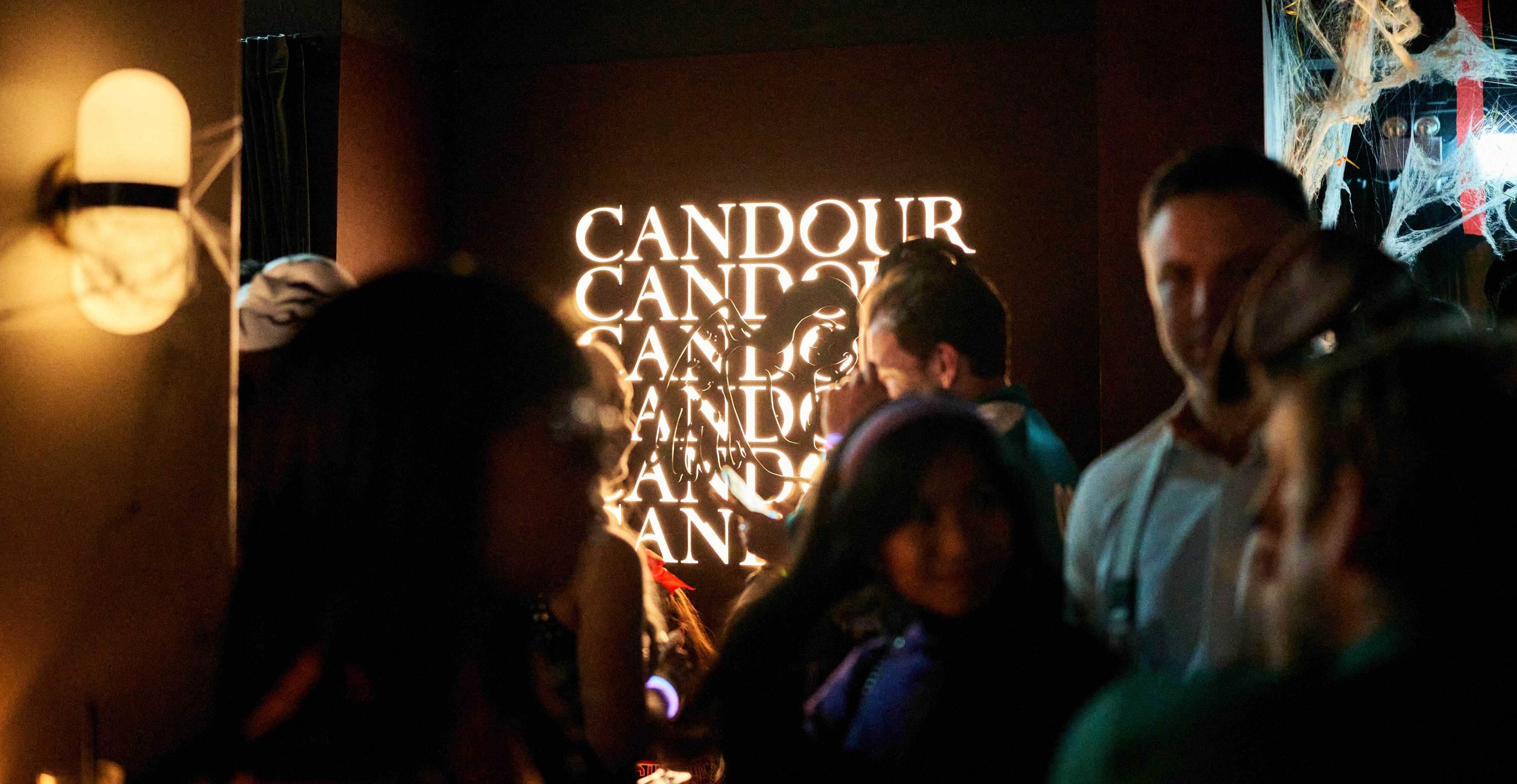
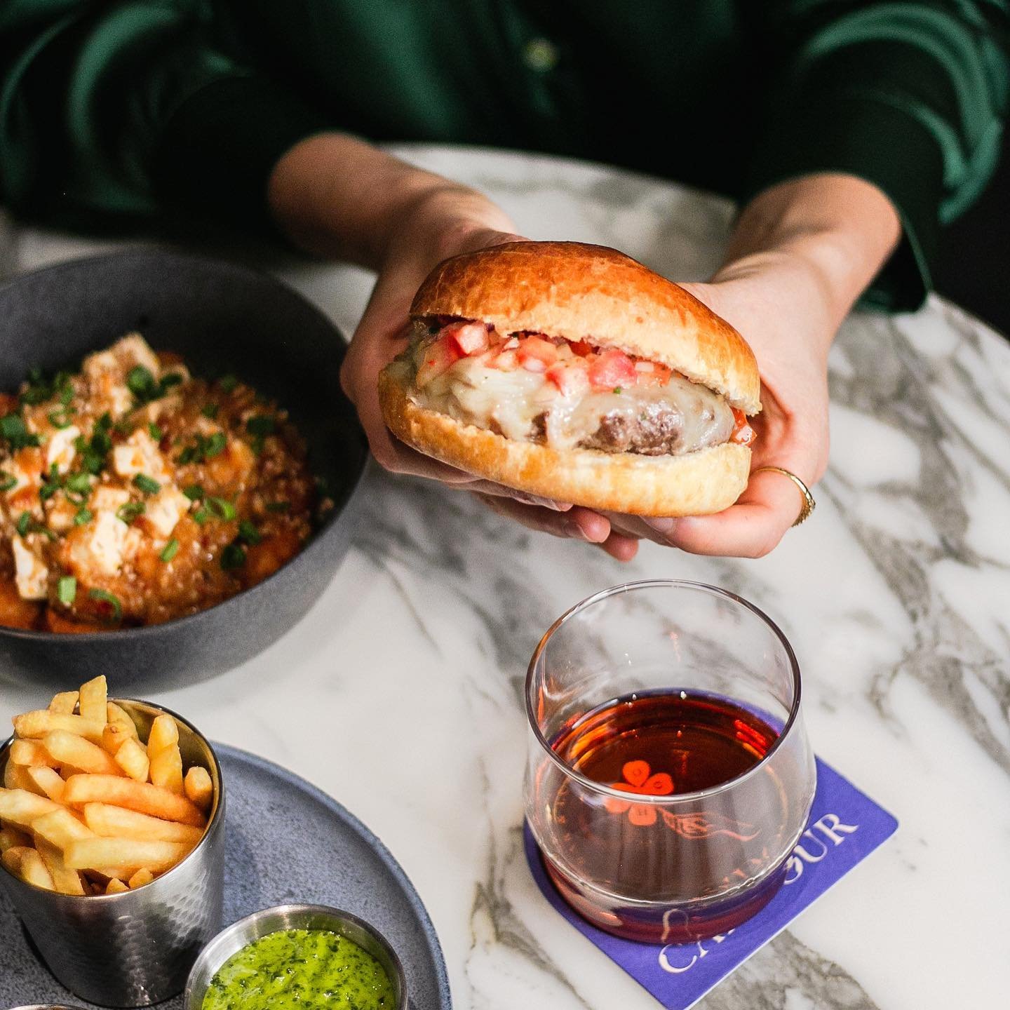
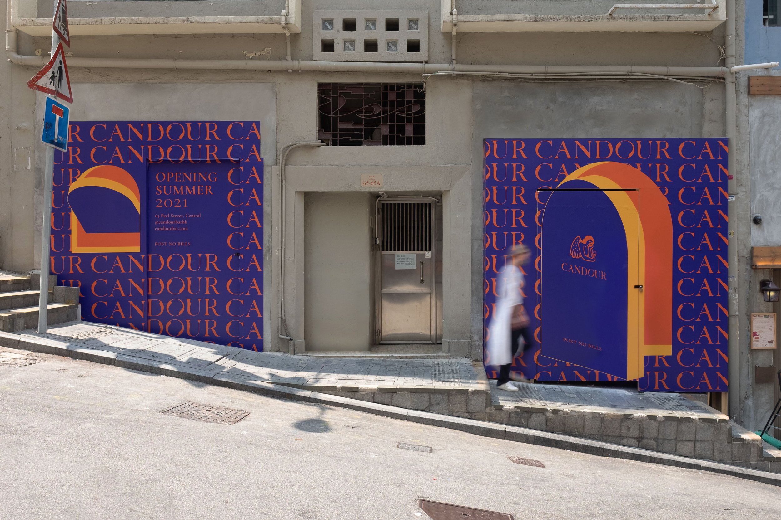
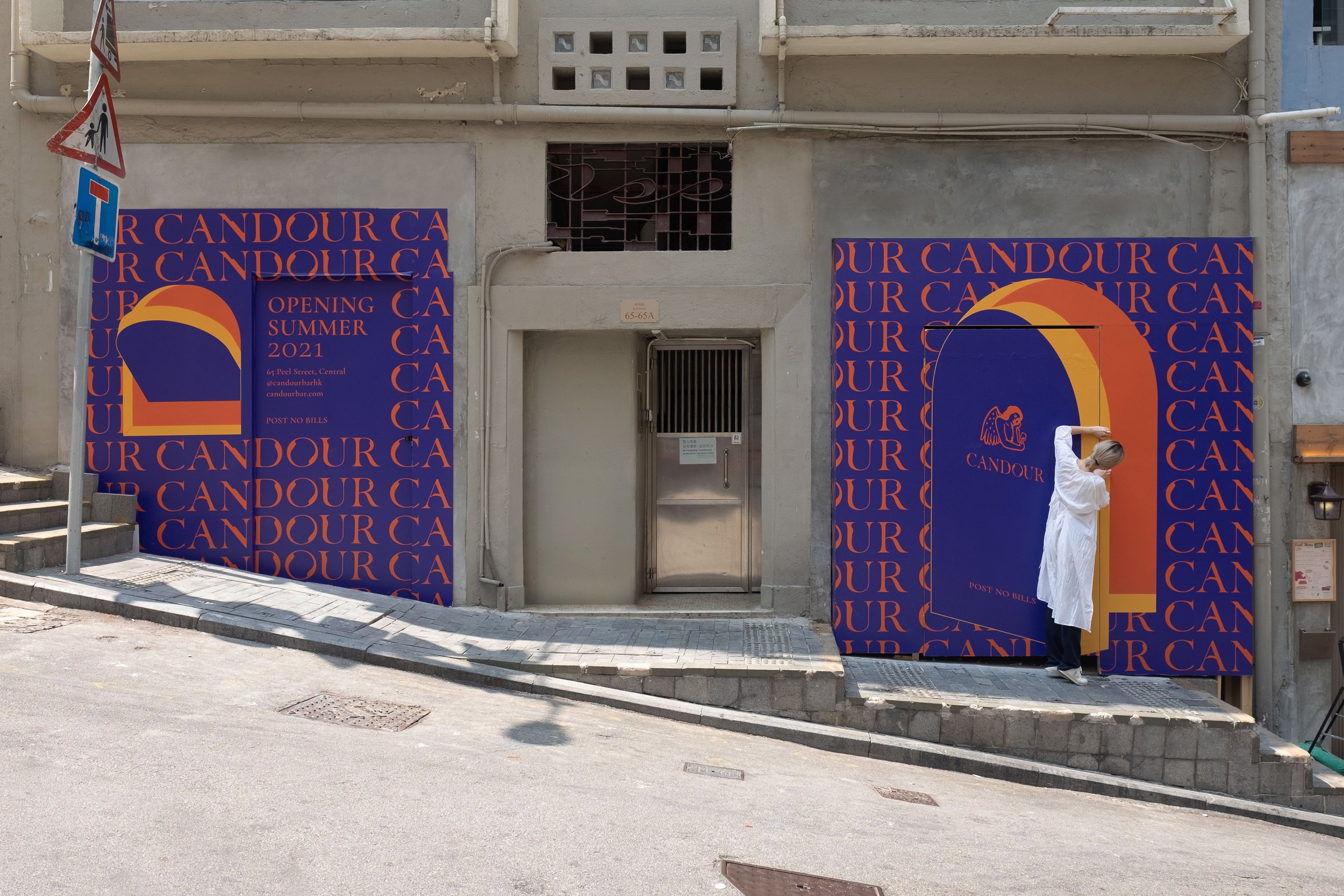
CANDOUR is a Bar & Lounge concept in the heart of Soho, Hong Kong. Located at the intersection of Peel and Elgin Street, the bar offers a unique combination of hip-hop culture and luxury. As an industry trendsetter in artisanal cocktails and dining, CANDOUR is a vibrant spot that radiates energy, community, and good vibes for gatherings around music and food.
House of Forme worked with the client on their brand naming, concept, visual identity, branding collaterals, website design and development and brand environments.
See their website: www.candourbar.com


Celebrating Hip-Hop’s Finest MCs
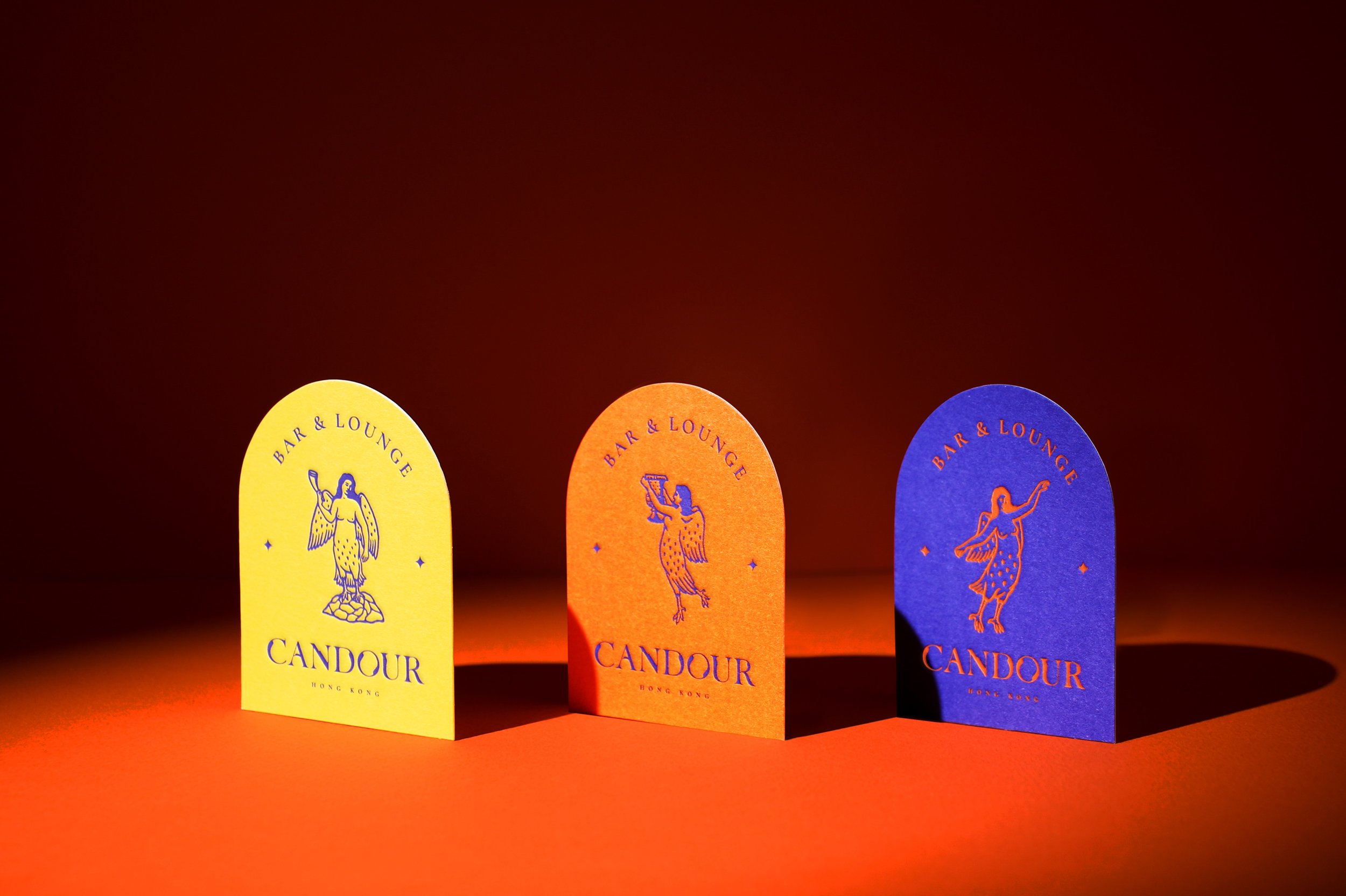
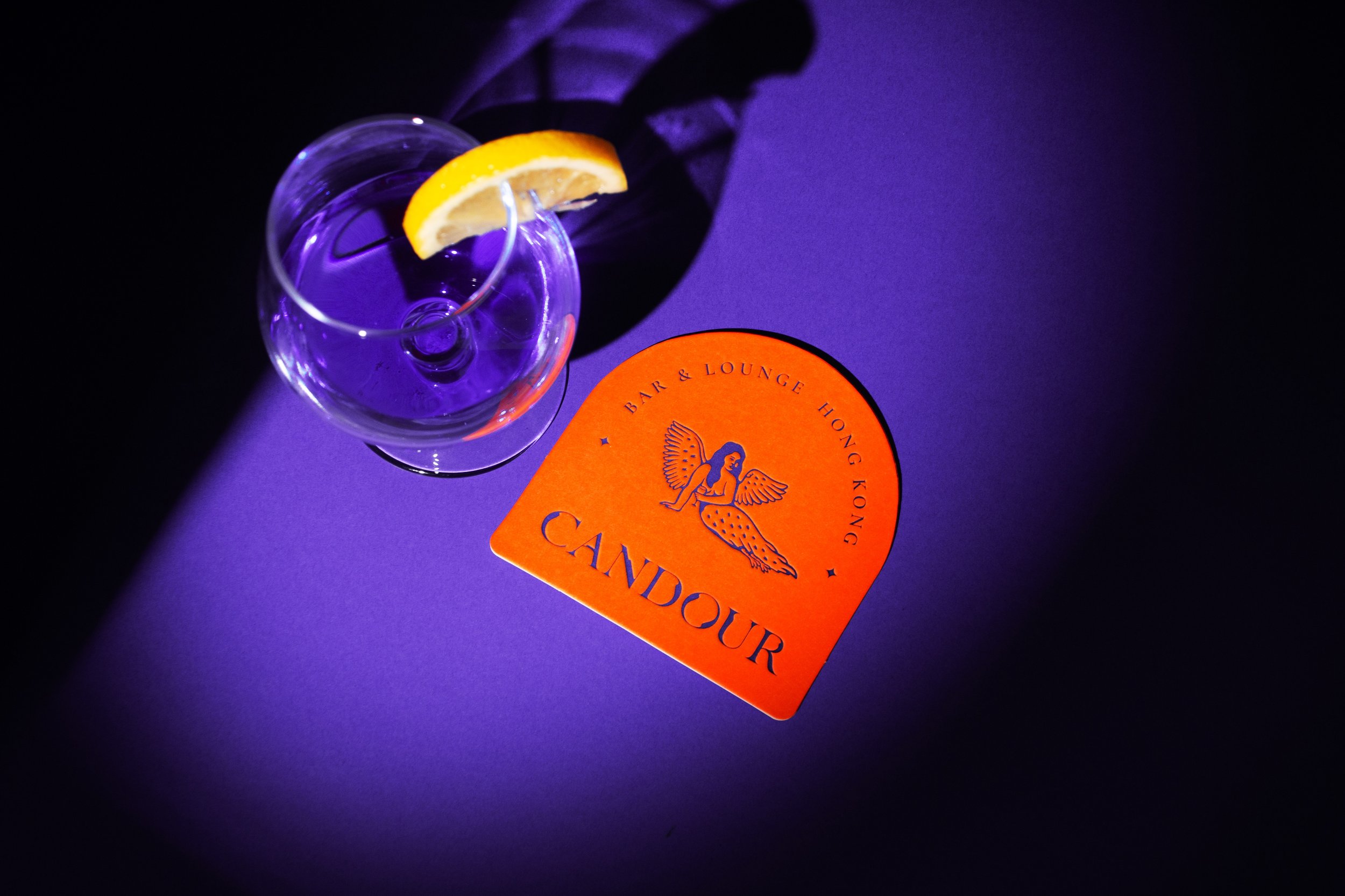
From deep within the Bronx in 1970’s New York City, the cultural movement of hip-hop emerged as an art form for celebrating and confronting life. As a creative outlet that helped pioneer urban poets, artists and philosophers, the concept pays tribute to defiant and dangerous voices. Depicted through the image of a siren, a creature half-bird, half-woman, our concept for CANDOUR plays on the parallels between the Bronx and the siren’s subversive and entrancing voice. Like the subcultures and stories that inspire it, CANDOUR presents a space that welcomes diversity, brimming with energy for people to connect and feel at ease.


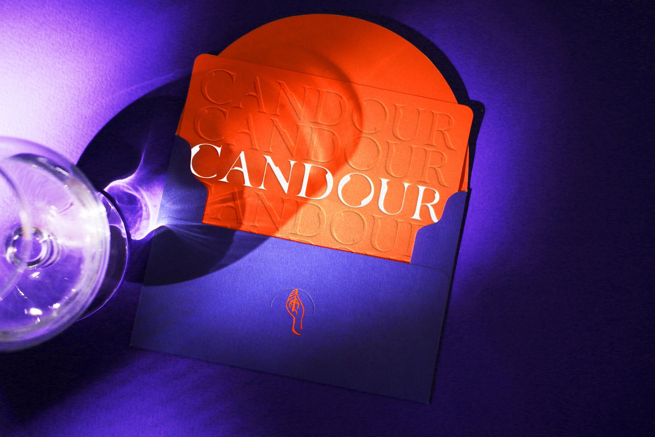

Our Flow is Hypnotic
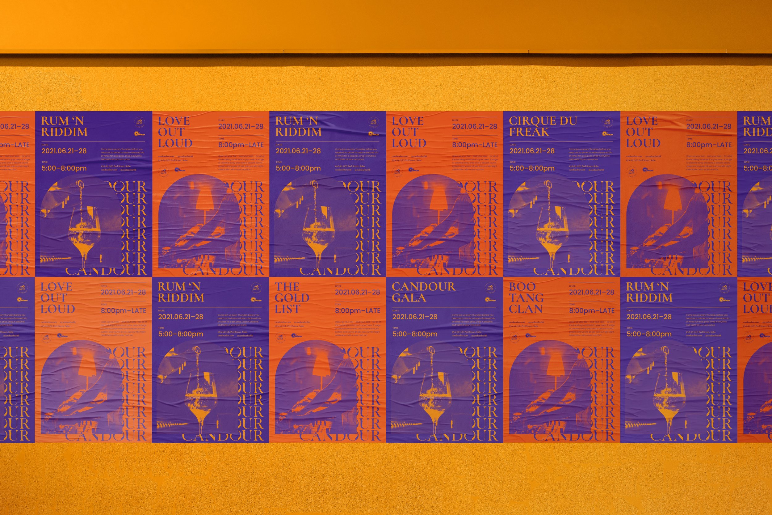
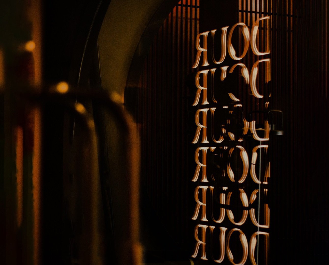
Like the revolutionary movement that captured the attention of the globe, CANDOUR is saturated in vivid, rebellious colours evocative of truth and power, a visually striking logotype that grows in volume and energy. As always a homage to the legends of hip-hop, the brand colours form the transition into the night - the backdrop to the genre’s sound, style, and fashion. From hip-hop parties to cocktail soirees and everything in-between, CANDOUR offers a larger-than-life concept and environment that challenges the status quo of F&B players in the industry.


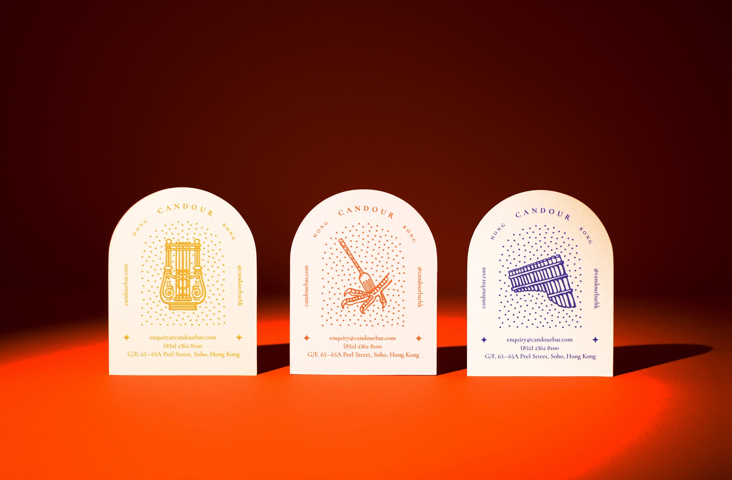
Wickedly Distinctive in Style
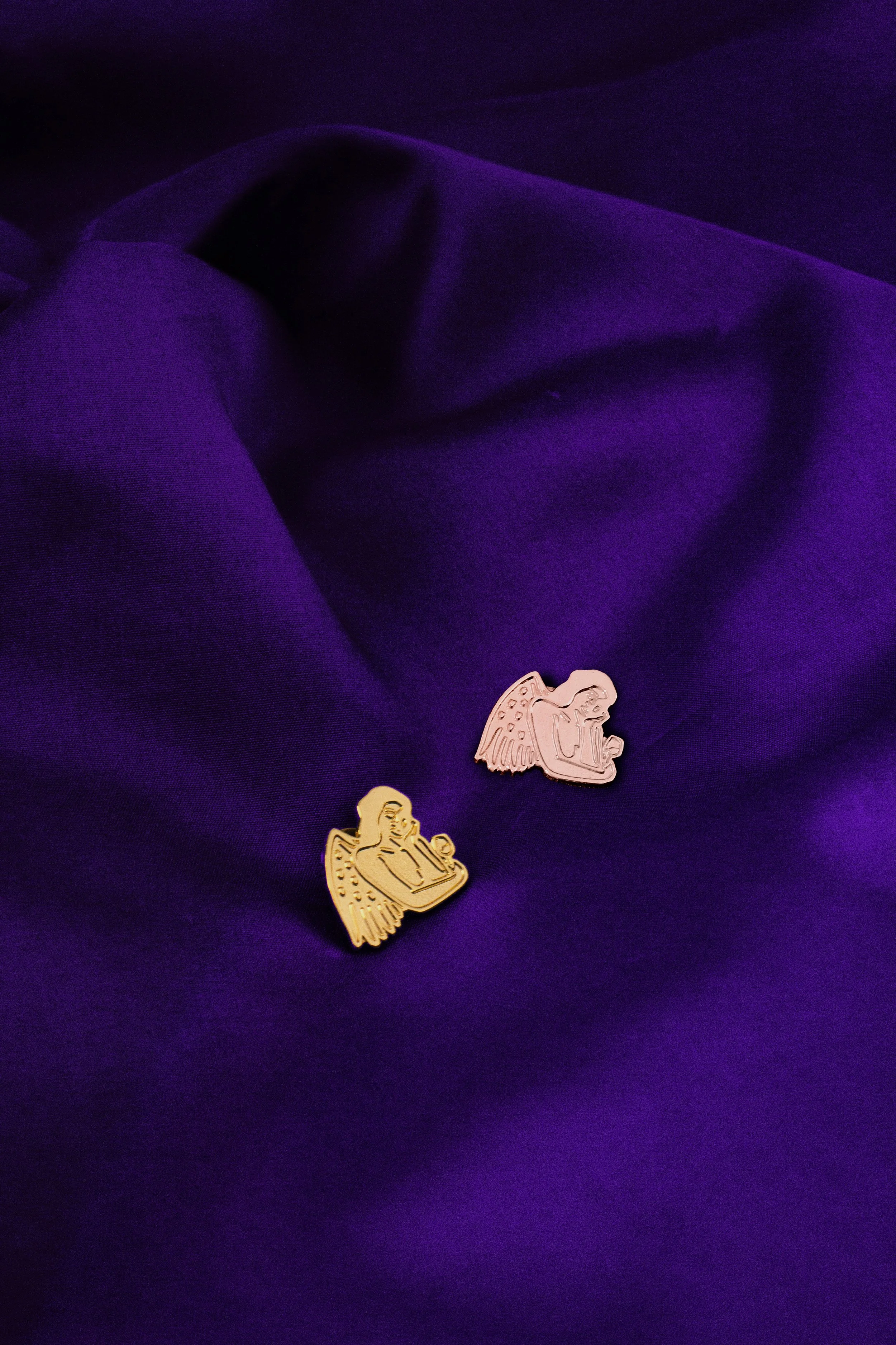
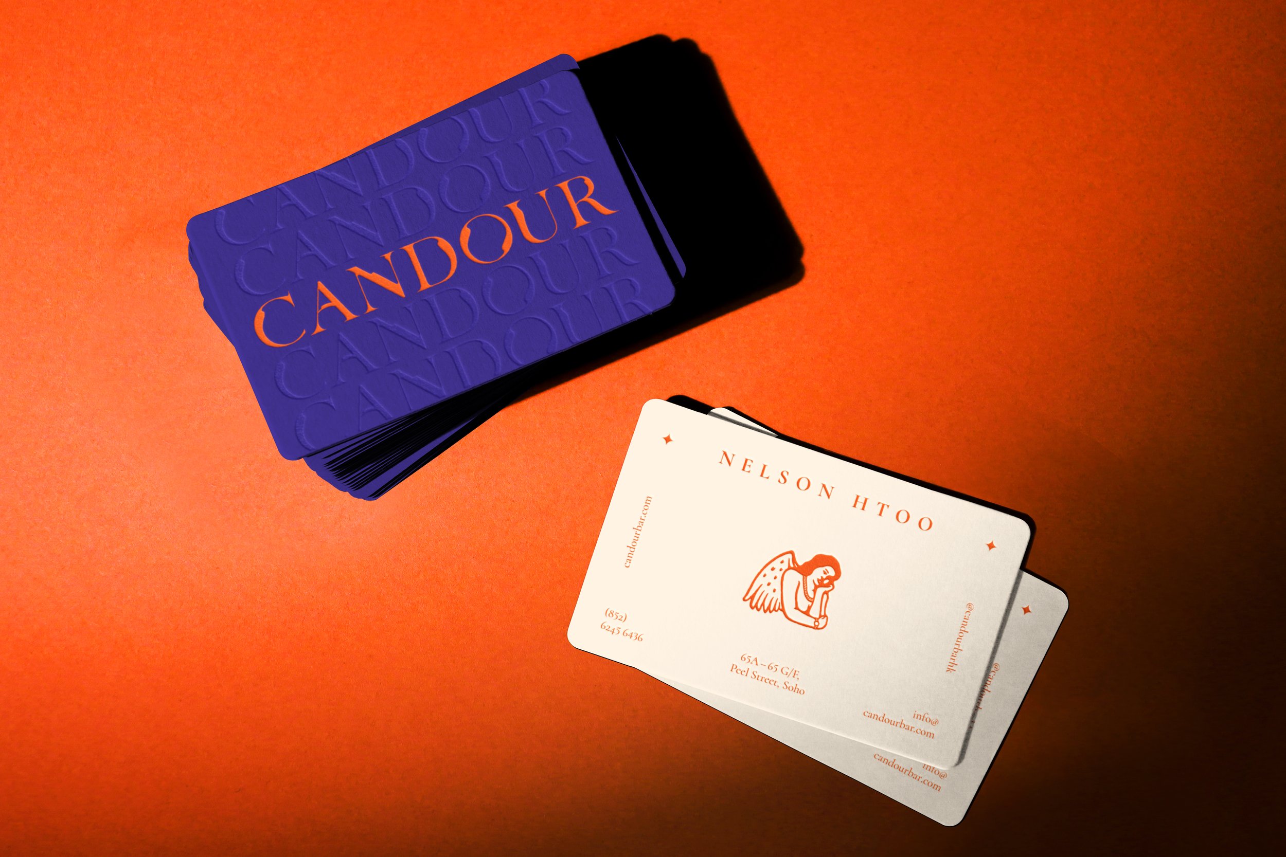
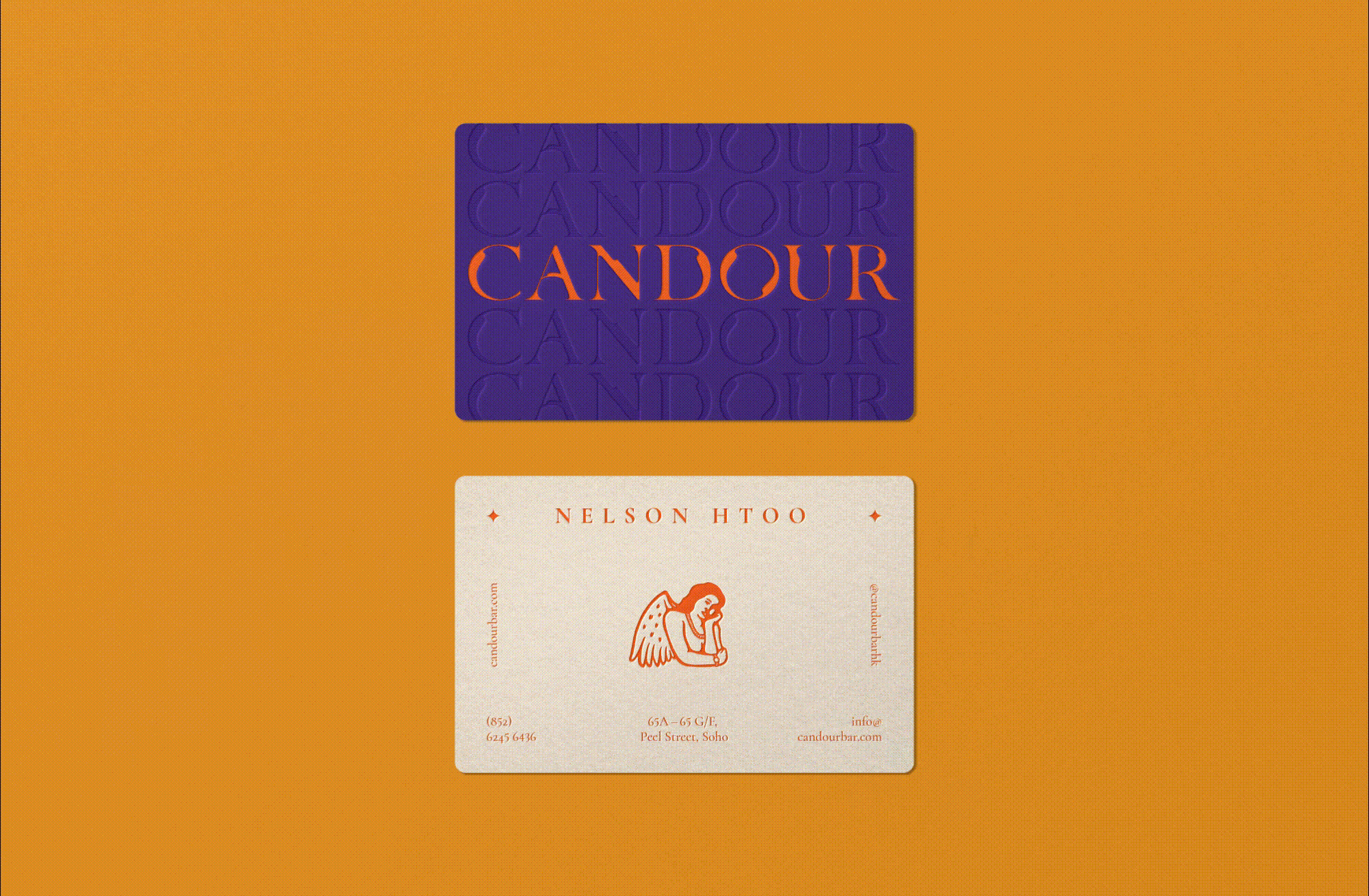
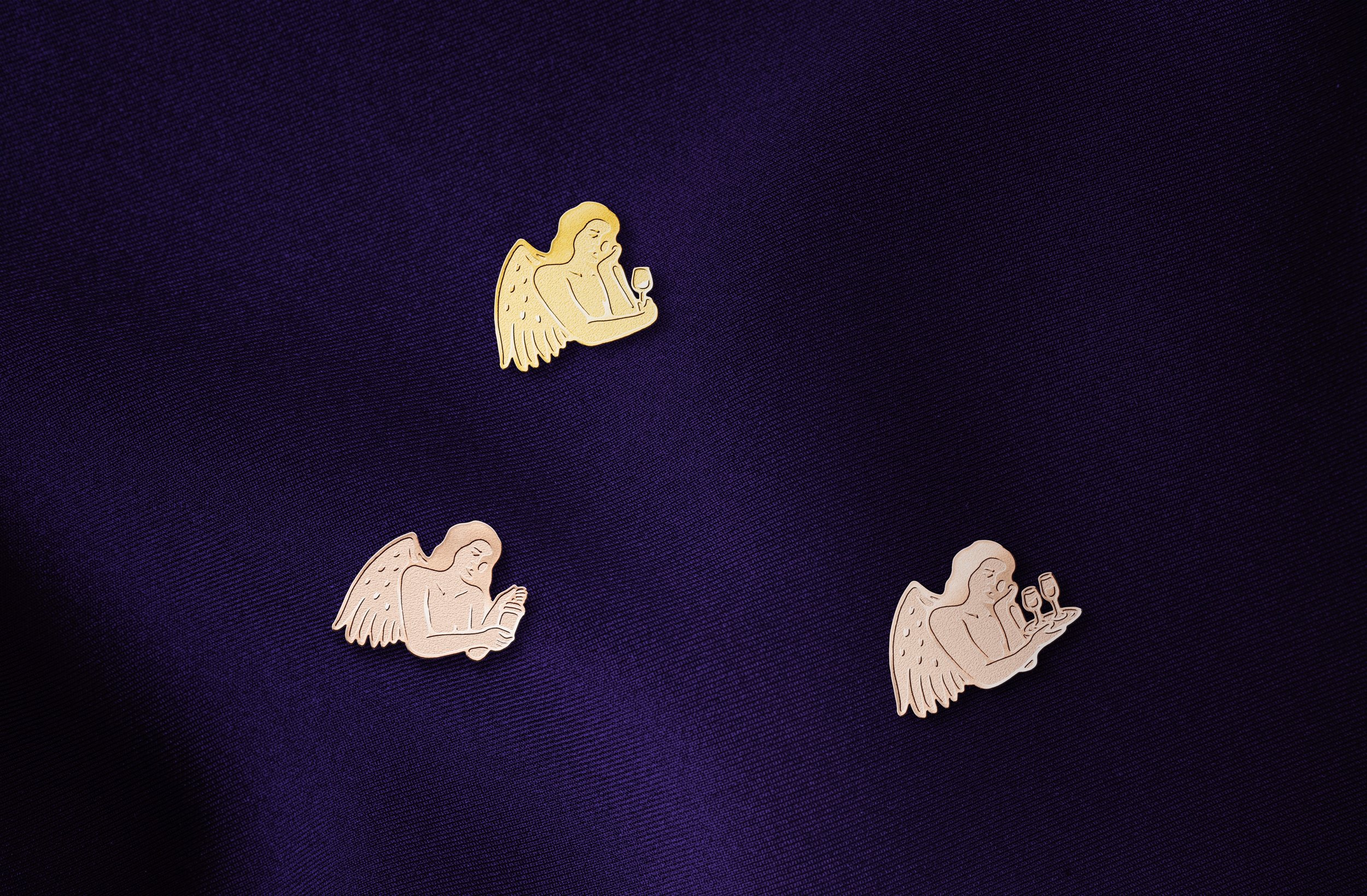
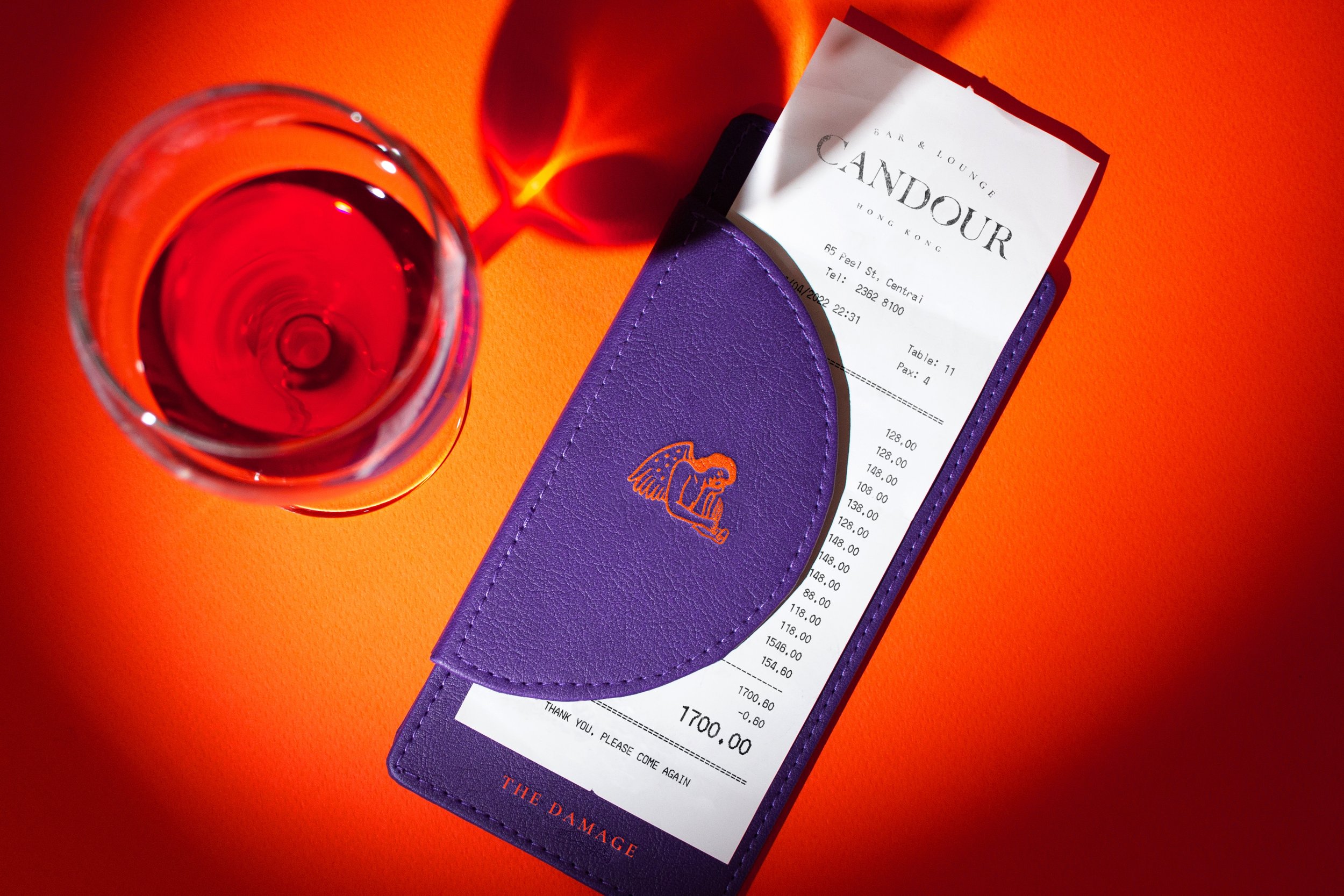
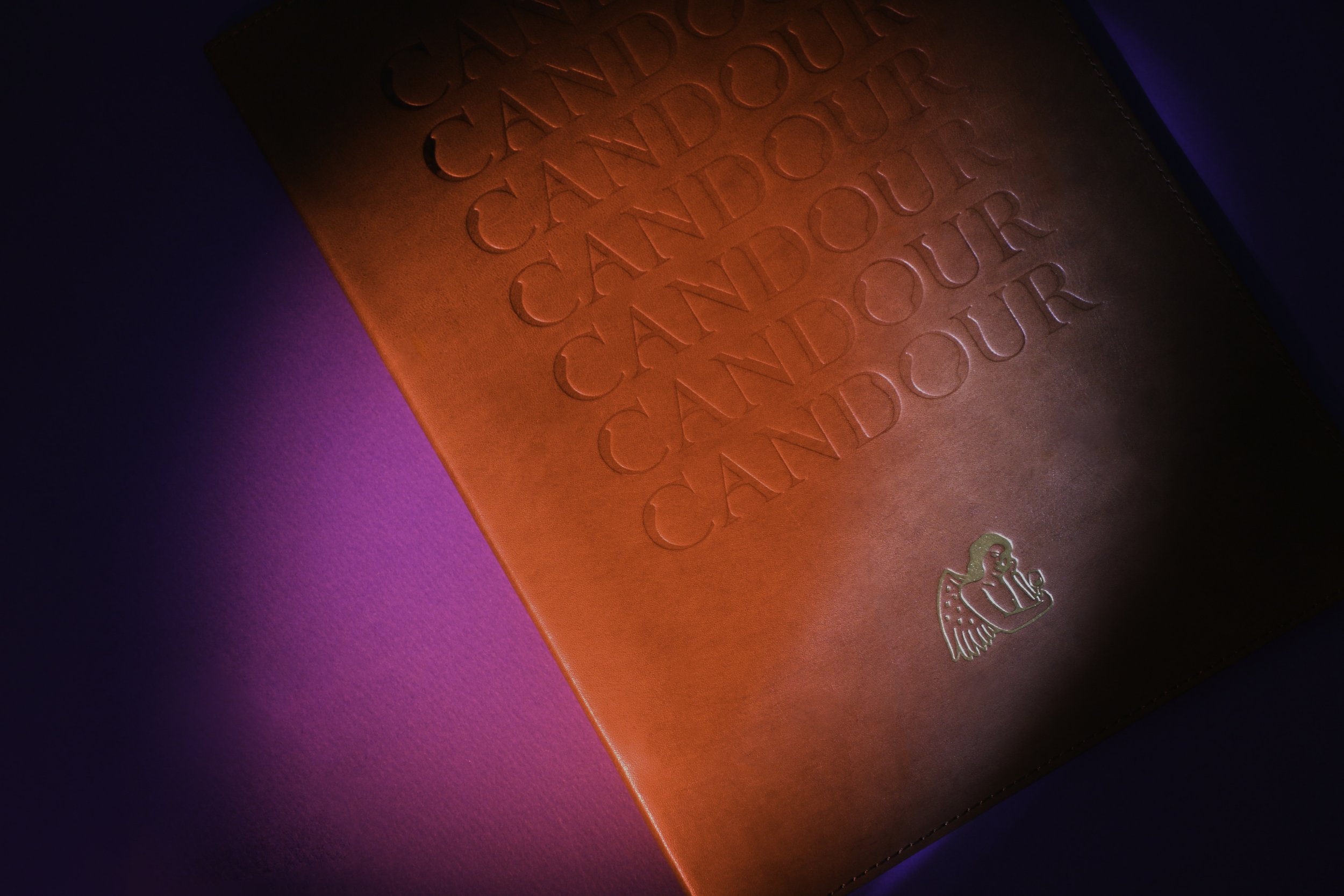
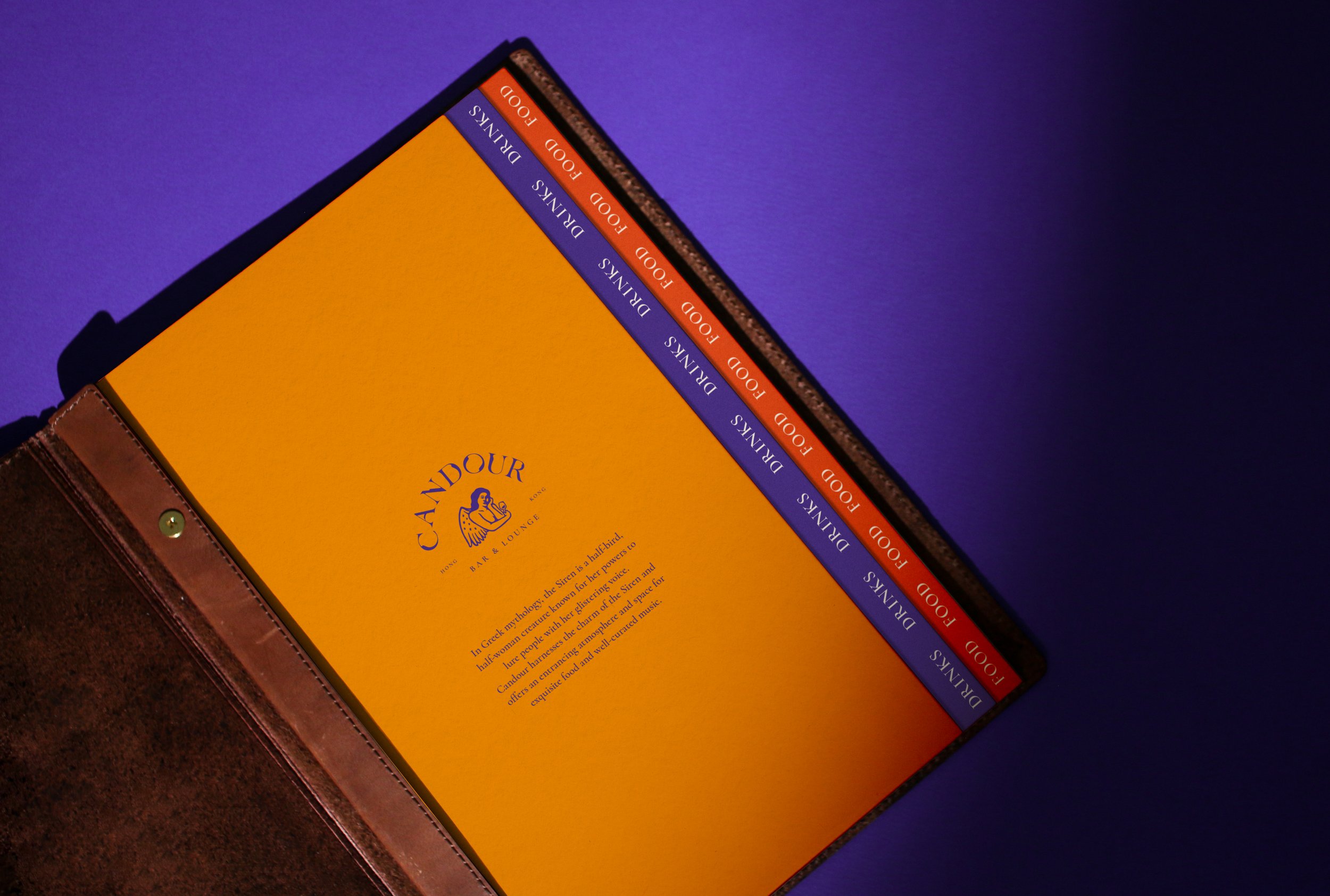
Complimented with customised hand-drawn illustrations, the brand icon portrays the siren with a glass of wine. Effortlessly painted with organic brush strokes, the brand iconography also depicts her in different variants with various hidden cues, such as lyres, quills, and drinks, that correspond to an infinite system of interpretation. The illustrations are largely used on printed collaterals as identifiable counterparts to shop cards, food & drink menus, coasters, and takeaway items. Bespoke business cards and label pins reflect the personalities of each staff, with personalised touches on the primary brand icon, examples of which include a chain, a dog, or a scroll.


Moment
2021
Industry
F&B
Services
Brand Management, Collateral Development, Digital Design, Interior Design and Brand Environments, Website Design & Development
Credits
Interior Photography- Candour
