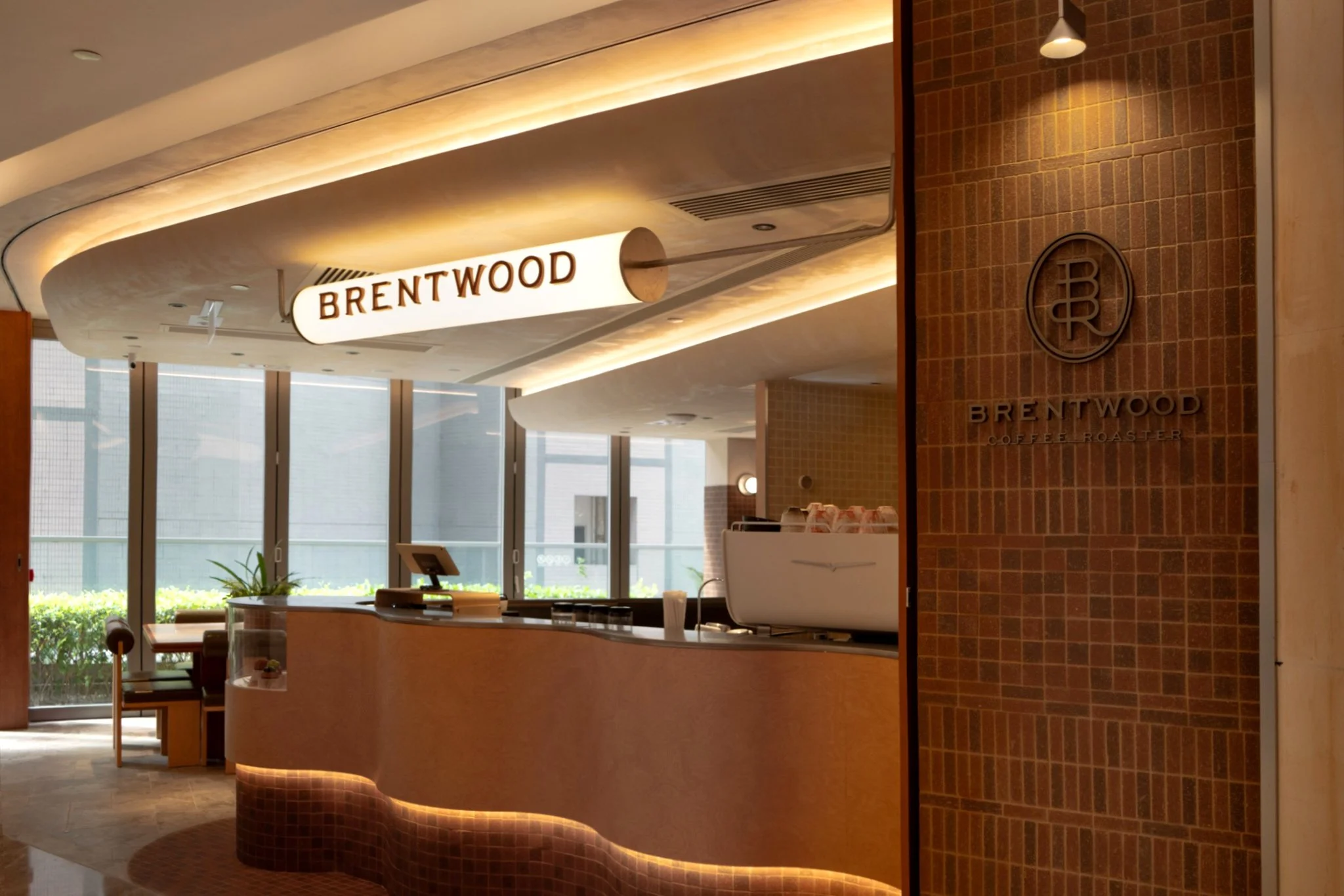
Brentwood Coffee Roaster

The Modern Penny University.
Brentwood Coffee Roaster revives the spirit of the 17th-century ‘Penny Universities’—where a single cup of coffee fueled limitless discovery and debate. Our new branding invite modern enthusiasts to gather, explore the craft of specialty coffee, and connect over shared curiosity.
House of Forme worked with the client on brand concept, visual identity, and collateral development & production.
Honouring the Art & Heritage.
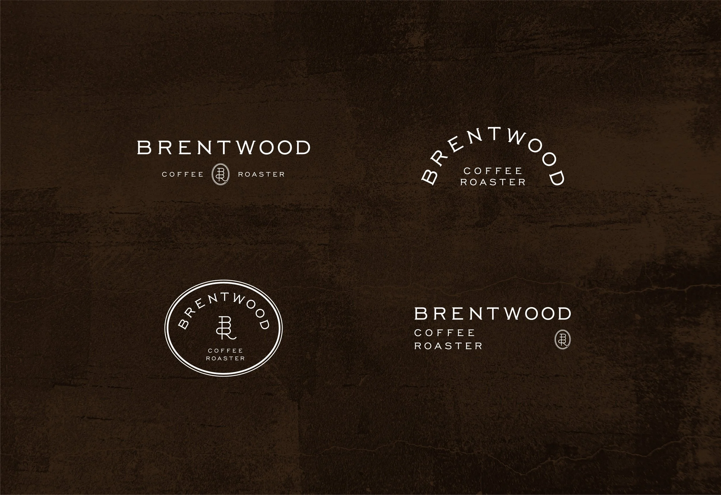
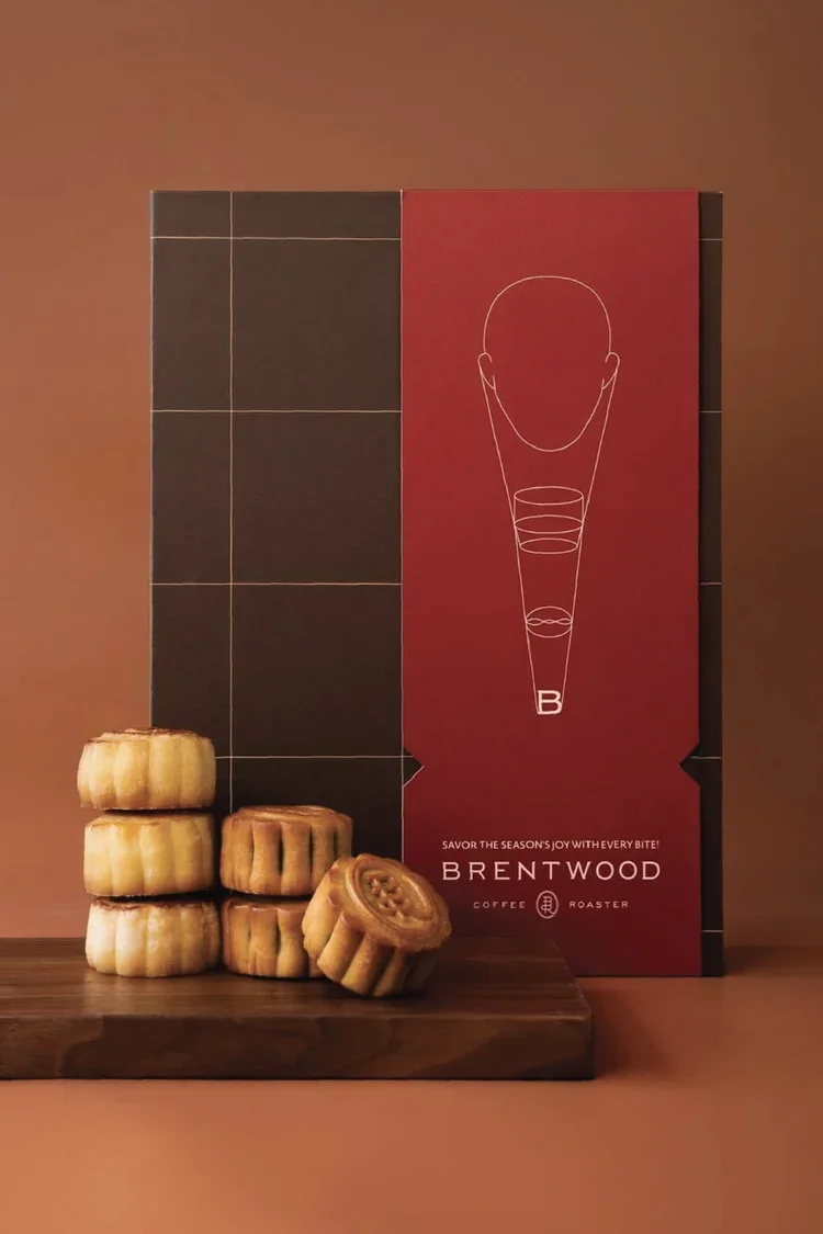
The new Brentwood Coffee Roaster logo is rooted in the science precision and artistry of coffee. Its clean, modern design conveys both professionalism and approachability. The oval crest shape resembles a crest stamp, echoing the theme of ‘Penny Universities’, highlighting the pursuit of knowledge in coffee making. It is a contemporary take on timeless prestige.
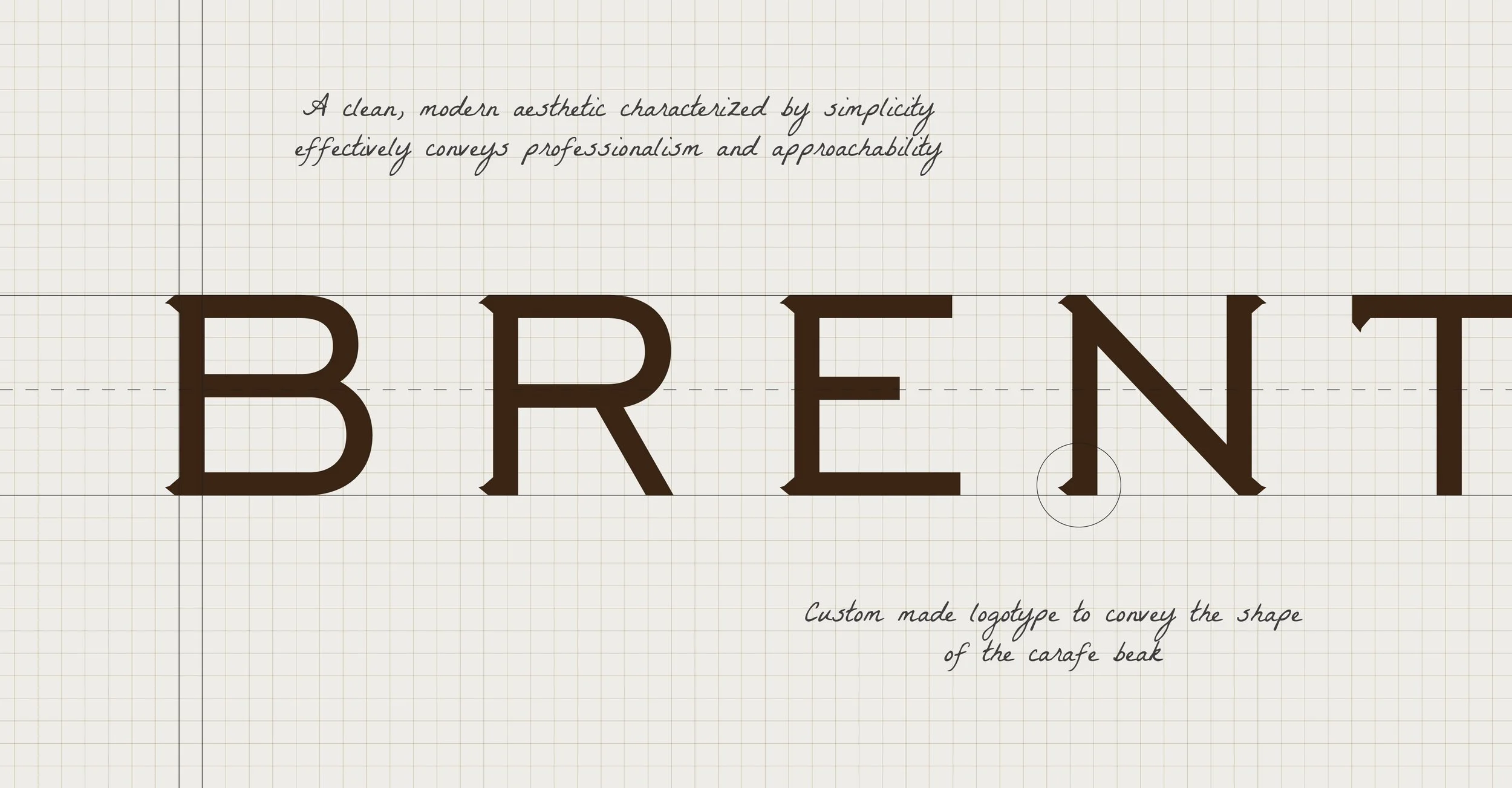
Our custom logotype is a nod to the carafe’s beak, a container commonly used to serve coffee. Its resemblance to the utensil further reinforced the brand’s identity as a coffee expert, promoting legitimacy within customers. Its subtle reflection of the artistry in making exceptional coffees signifies the value of precision and craftsmanship in brewing.

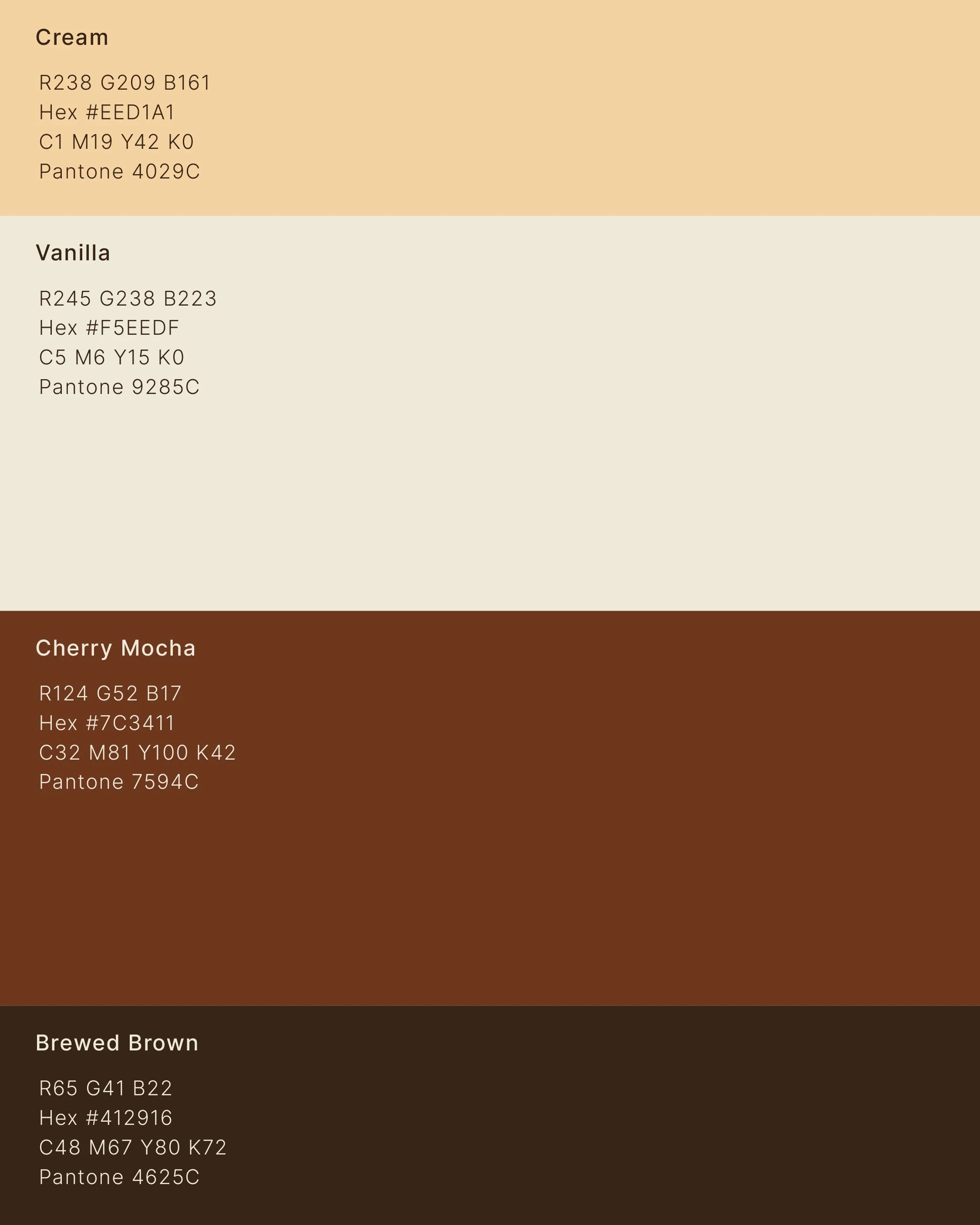
To honour the sense of the brand’s rich coffee heritage, we have adapted an earthy colour palette. Cream and Brewed Brown act as the foundation, while Vanilla and Cherry Mocha serve as complementary accents, creating a soothing yet visually engaging contrast. These colours not only convey the essence of coffee itself, but also subtly resembling vintage certificates and crest stamps, visualising Brentwood Coffee Roasters's legacy and dedication to craftsmanship.
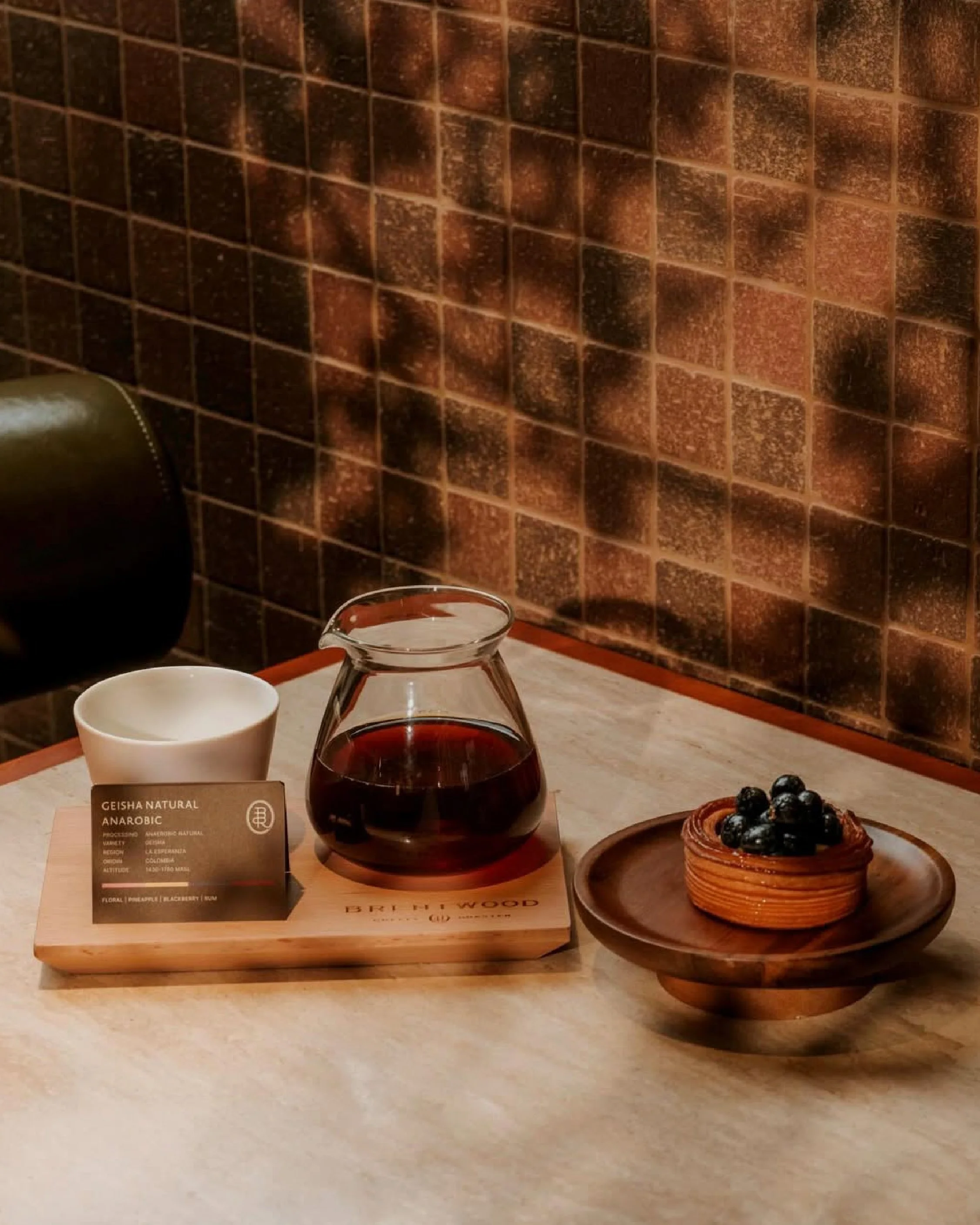
Image via Brentwood Coffee
The Science Behind Coffee.
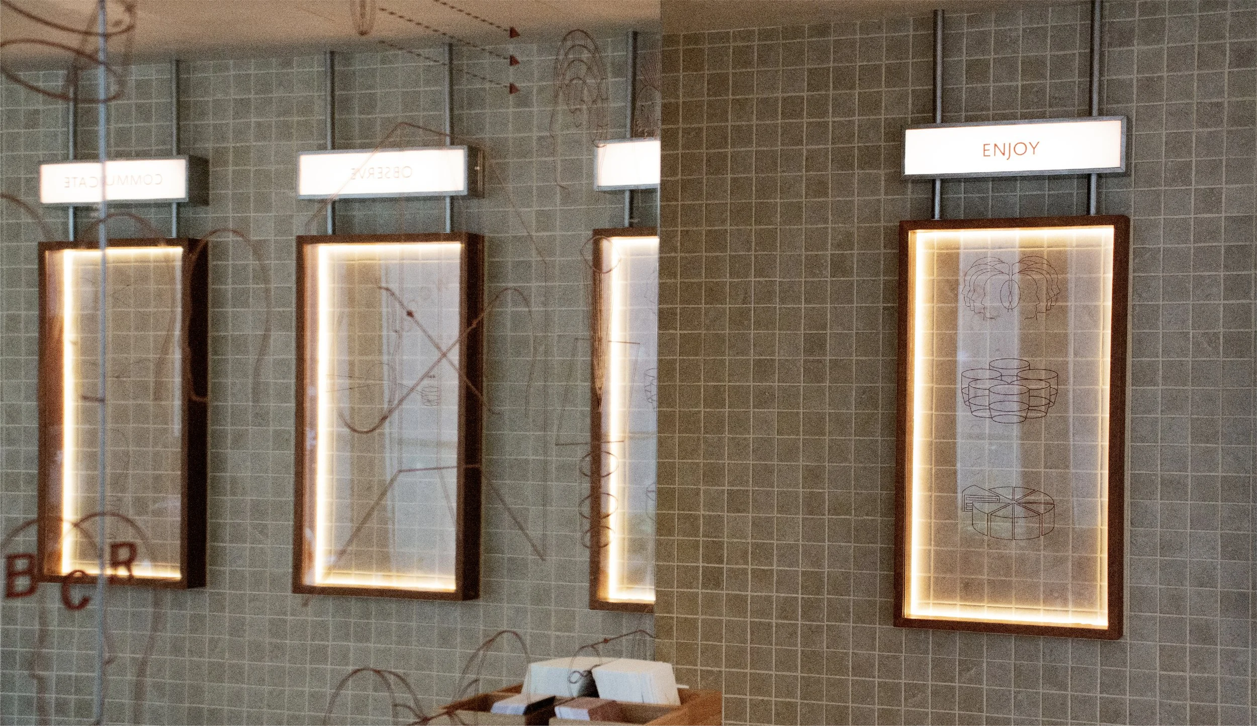
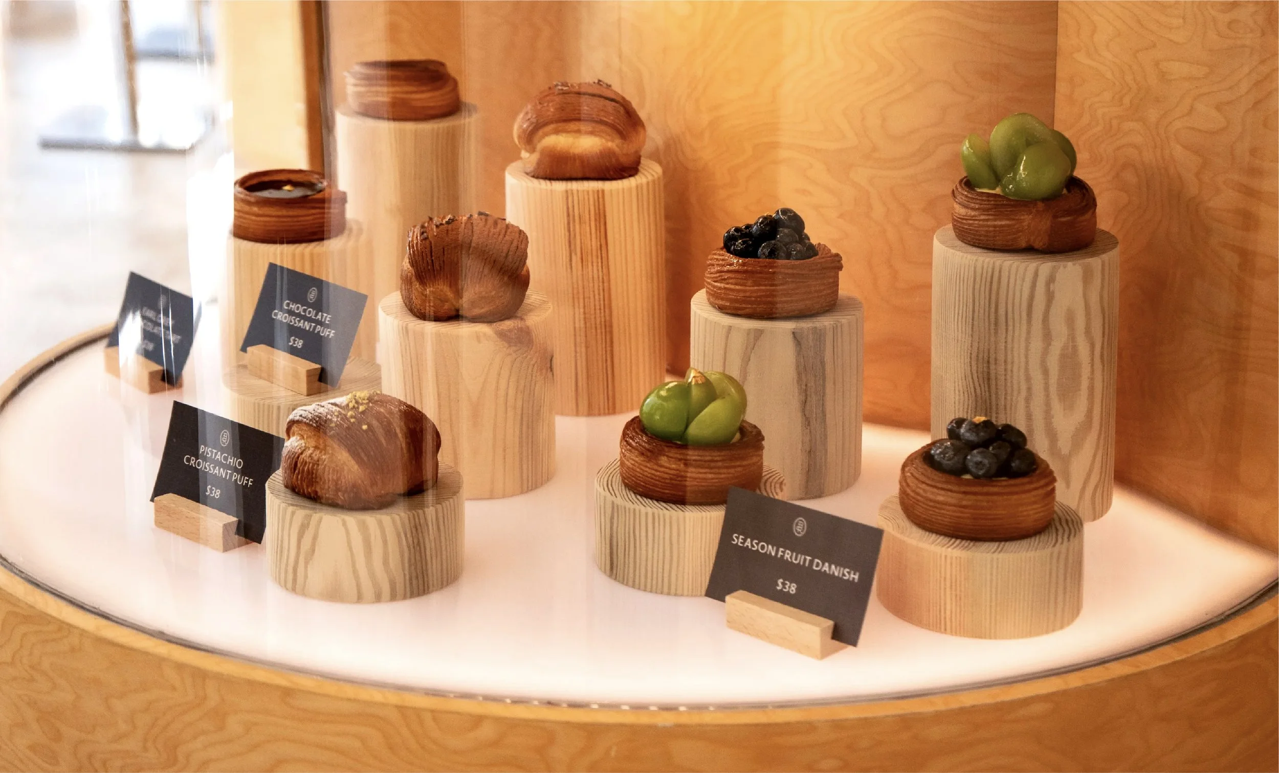
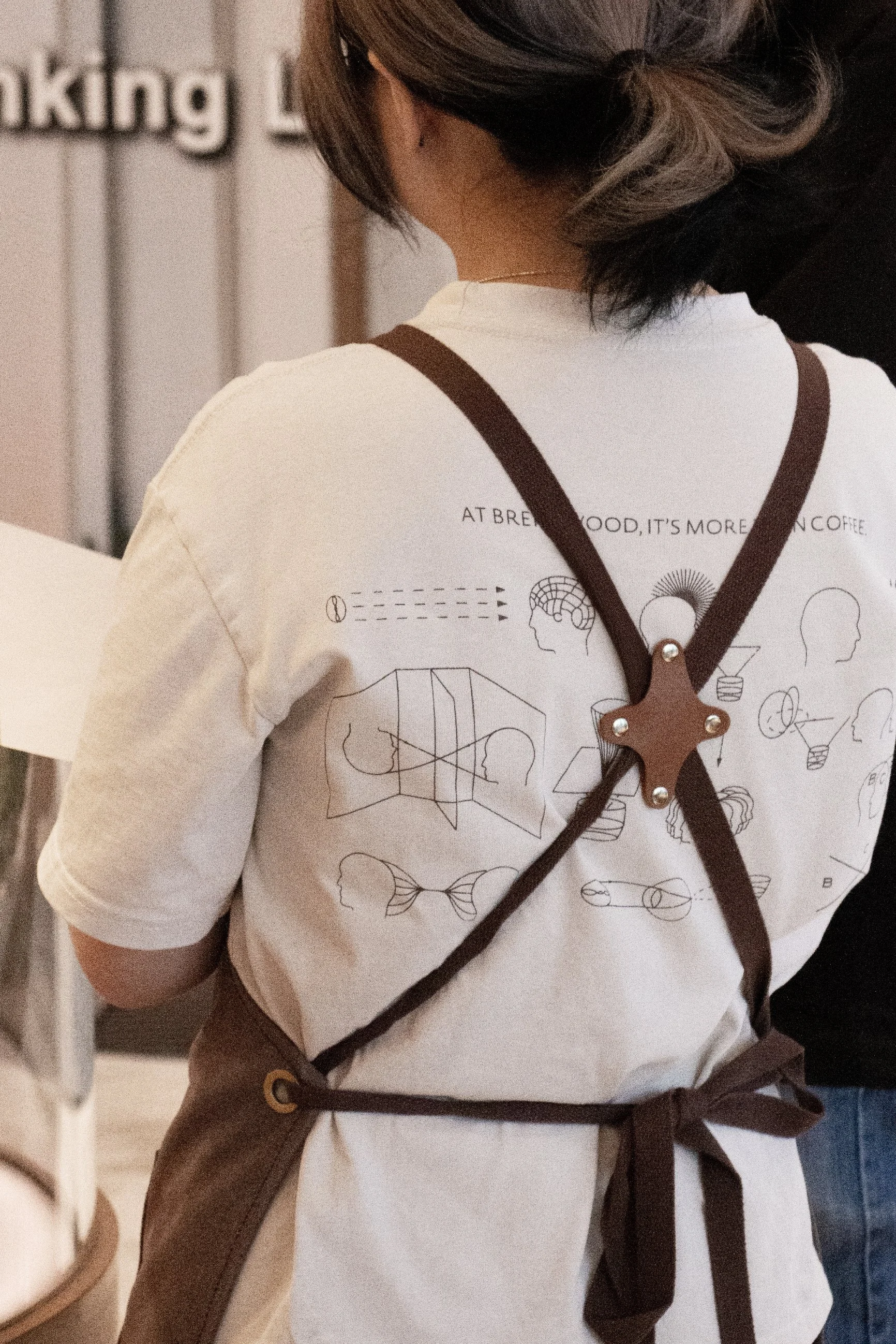
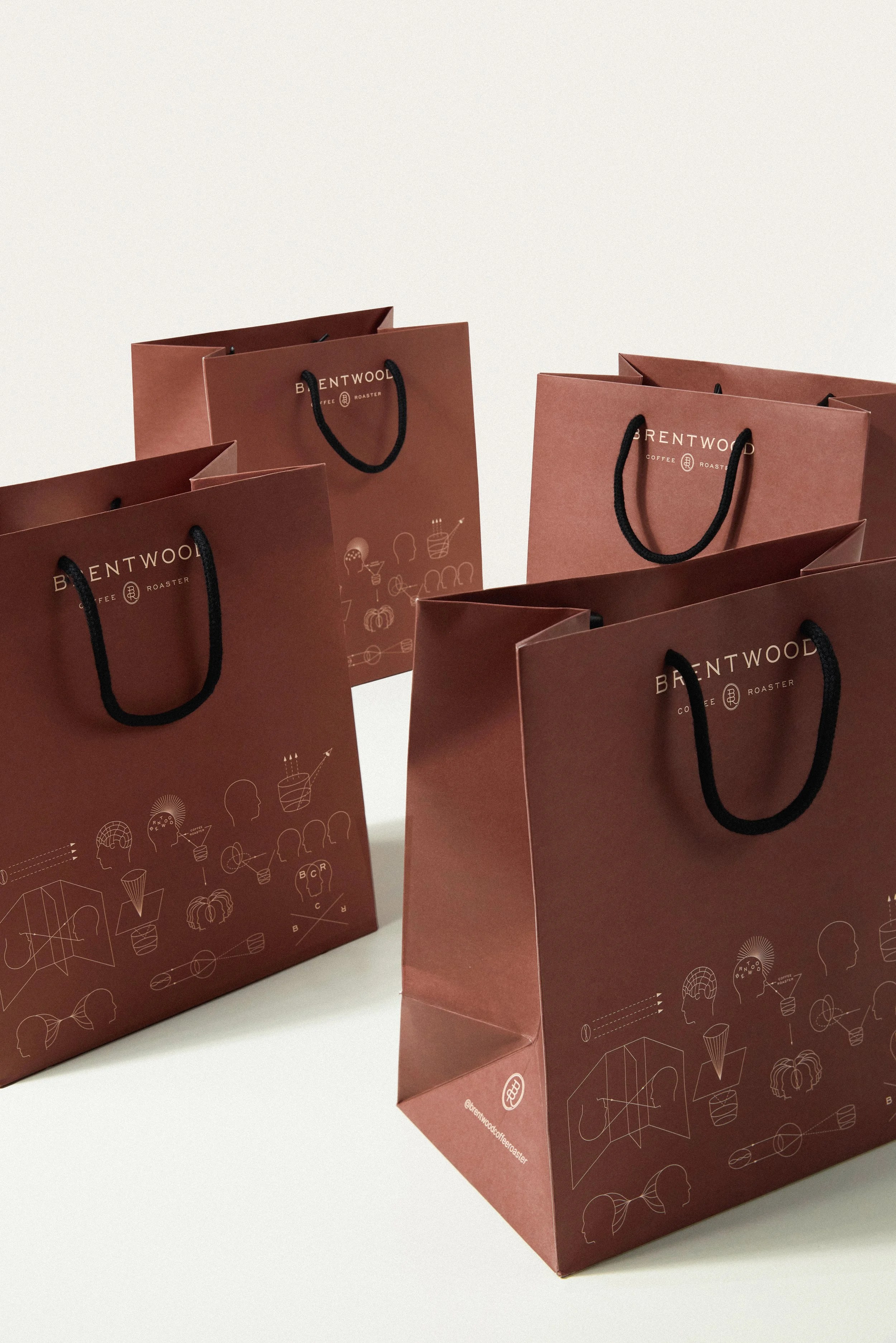
To further enrich Brentwood’s narrative, we have crafted a diverse range of secondary graphics. From scientific diagrams to playful illustrations and hand-drawn sketches, these visuals reflect the brand’s deep exploration and passion for the coffee-making process.
Various scientific theories have been incorporated into the collection of secondary graphics to enhance visual storytelling. The Torus Field Universe Theory illustrates the cyclical flow of energy and interconnectedness, symbolising the inseparable link between coffee and human energy, fueled by caffeine. The Human Eye Optics, with its parallel lines representing focus and clarity, redirect the viewer’s attention to the craftsmanship behind the daily cup. The Camera Obscura, with its intersecting elements depicting the convergence of light and perspective, encourages a deeper focus on the brand’s history and nuances of coffee making.
The thoughtfully selected theories are a visual invitation, encouraging observation and engagement with coffee in a new way. Visitors will find enjoyment, communication, and even a fresh perspective on the coffee experience through these familiar yet intriguing patterns. Their clean lines, combined with a touch of creativity and scientific precision, draw viewers into the art of coffee making. The graphics’ adaptable, repetitive patterns allow them to be effortlessly applied across all brand collateral and media.
A Consistent Academia Storytelling.
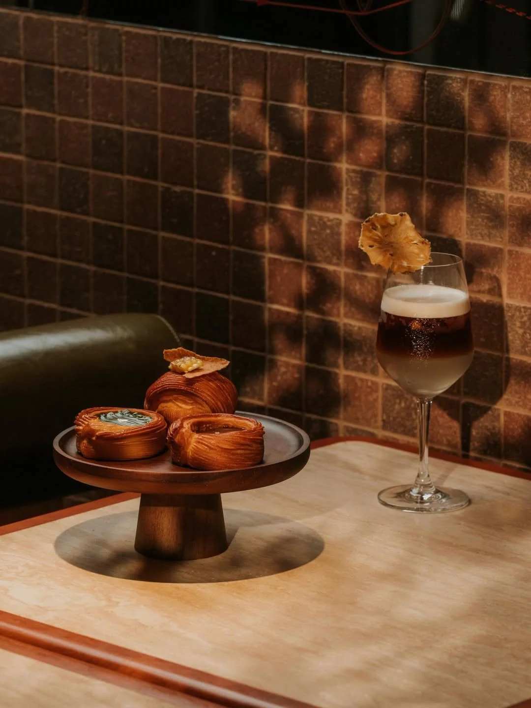
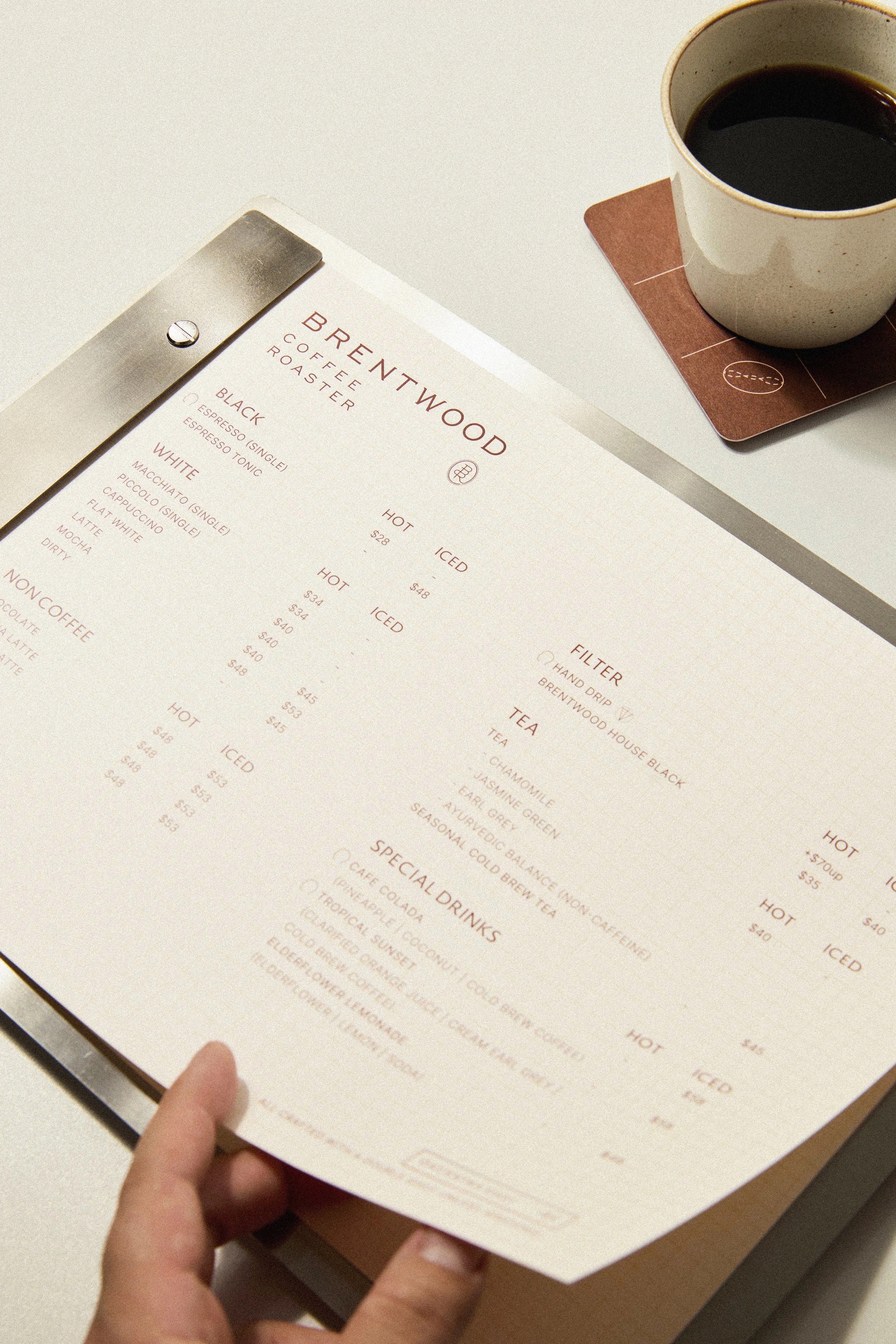
The collateral, beginning with the menu, reinforces the storytelling of ‘Penny Universities’ and the brand’s commitment to exploring coffee. The menu is designed to evoke scrap paper. Featuring gridded paper fixed to a metal menu board, it is decorated with engraved ruler measurements, subtly conveying the precision in specialty coffee preparation.
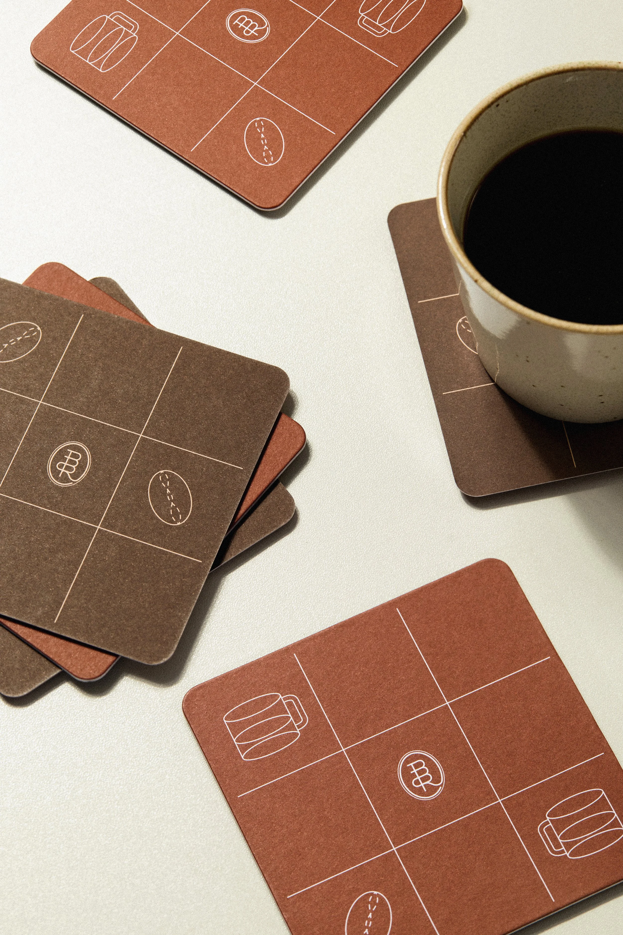
Adding a touch of playfulness to the academia narrative, the two-sided coaster features a tic-tac-toe design, replacing the traditional “X” and “O” with bespoke coffee-related graphics. This playful element is meant to start conversation and encourage interaction.

Image via Brentwood Coffee

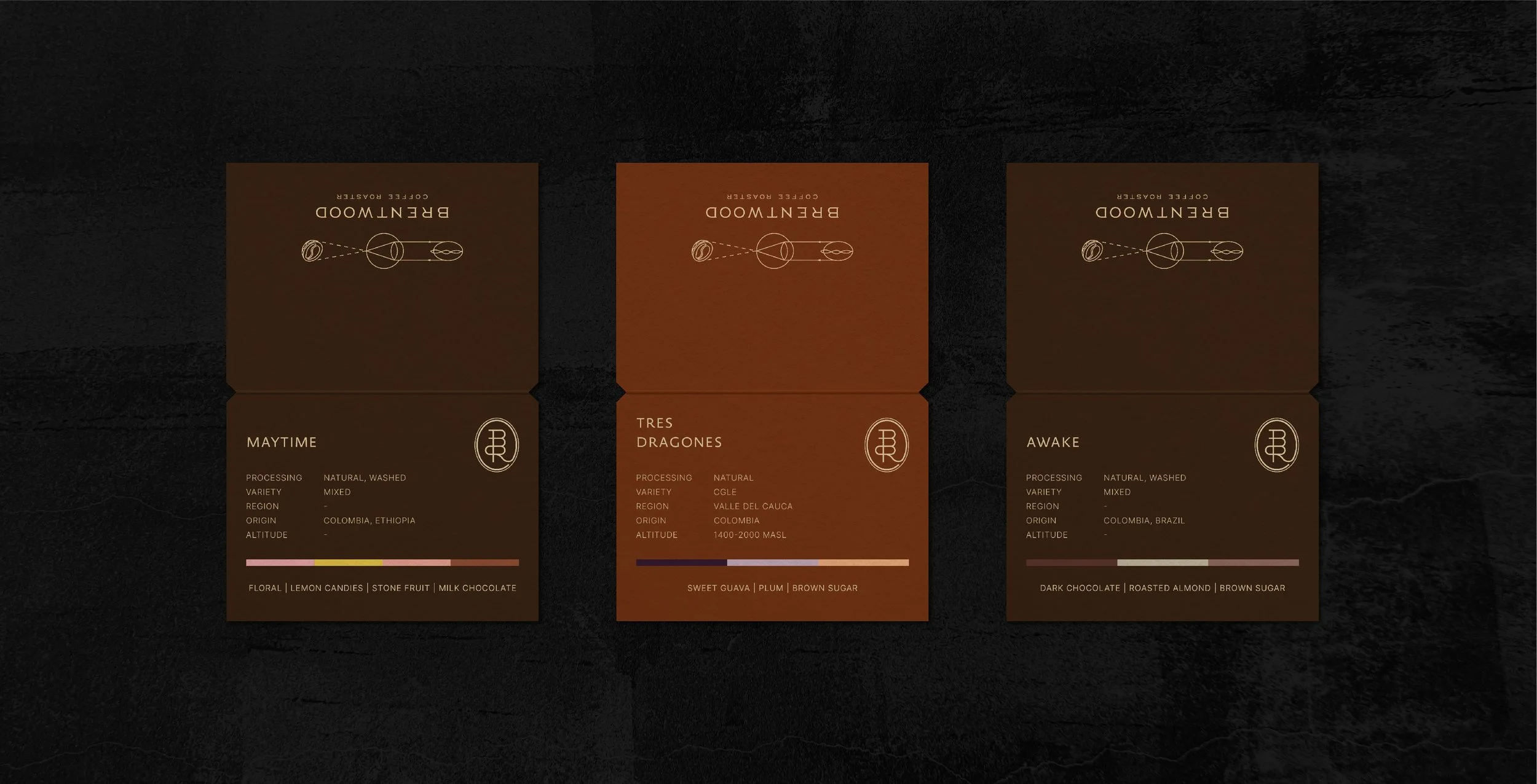
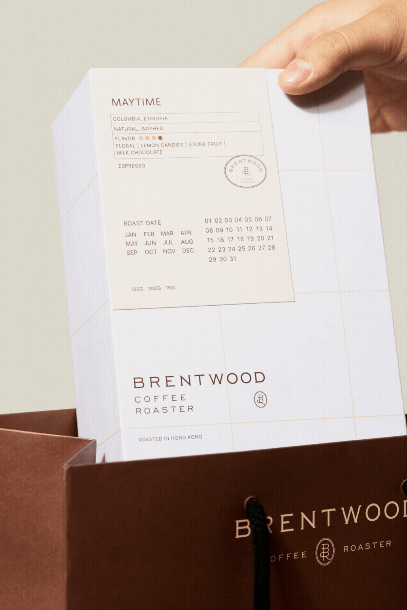
The coffee bean packaging also amplifies the theme. Roasted dates on the label are designed to be manually crossed out, adding a human touch to the artisanal process of bean roasting. The stamp-like logomark further presents the craftiness behind the brand’s coffee, while the grid pattern on the packaging box echoes the menu, creating a cohesive brand system.
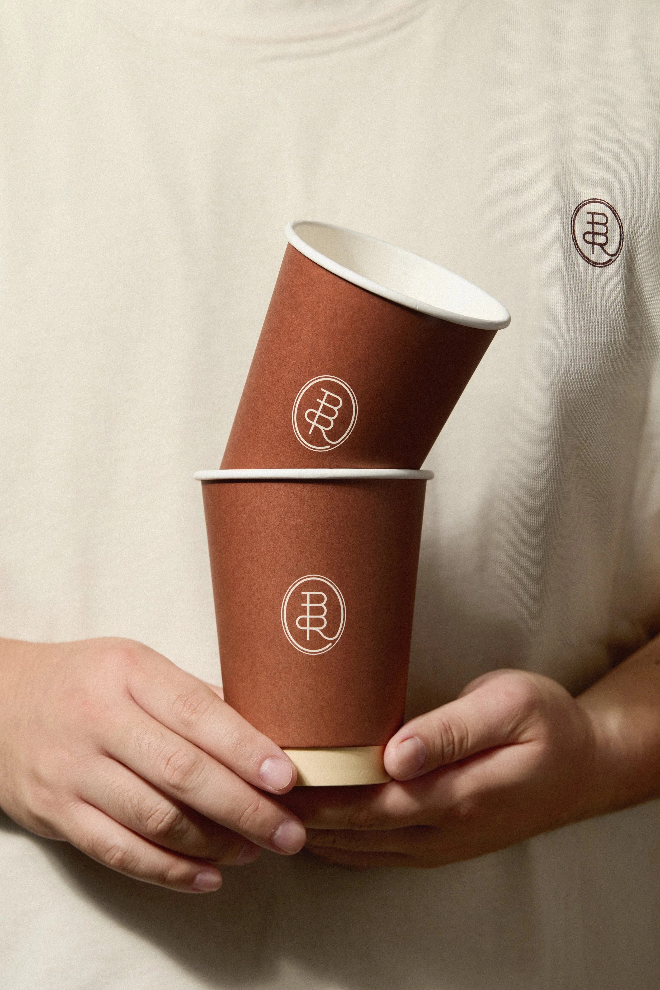
Other collateral includes a double-walled paper cup, whose simplicity conveys Brentwood Coffee Roaster’s professionalism. The paper bag, designed in the brand’s signature colour and adorned with repetitive scientific graphics, is designed to capture attention from afar. The consistent use of Brewed Brown across the takeaway cup and paper bag strengthens the immersive brand narrative throughout the collateral.
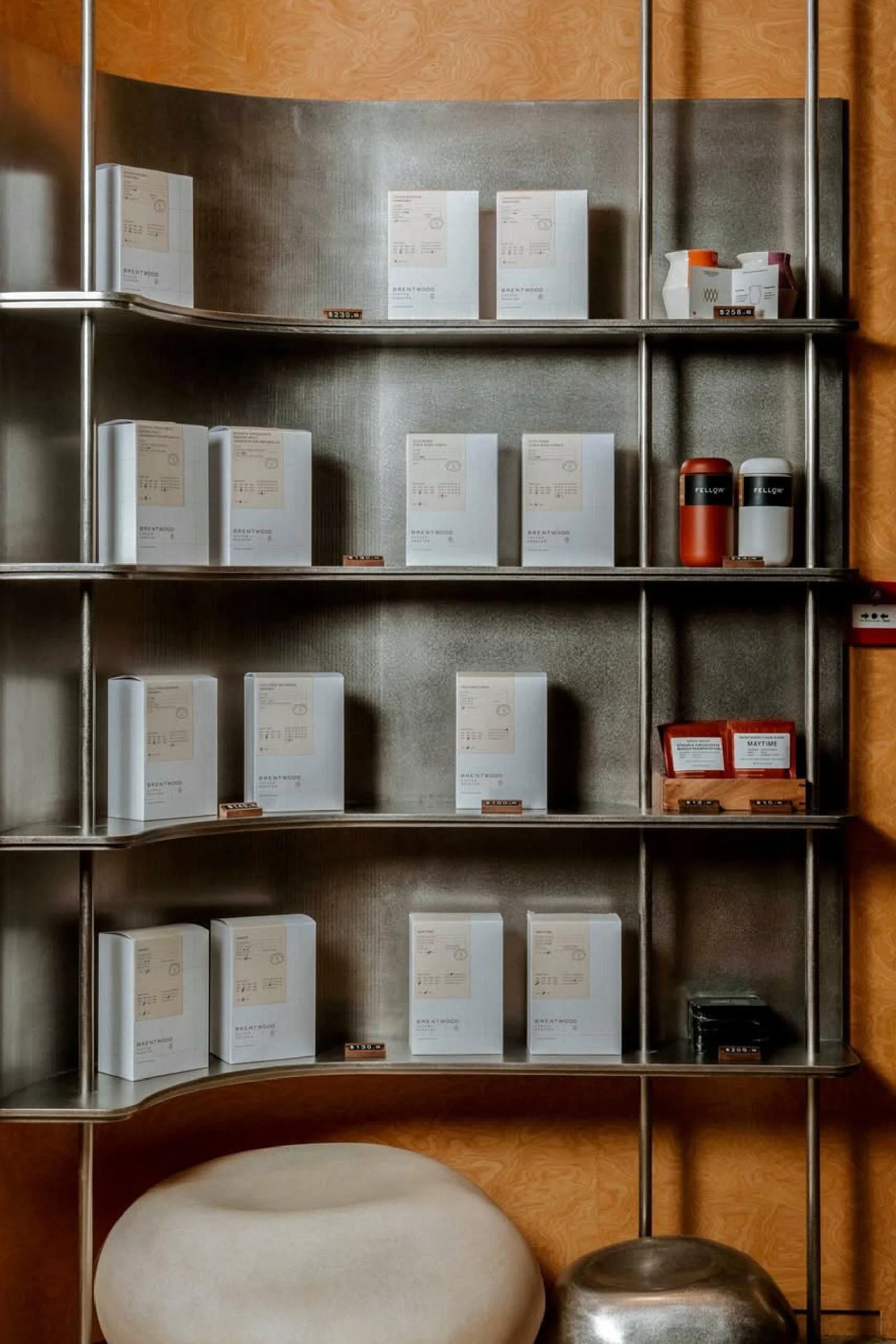
Image via Brentwood Coffee
Moment
2025
Industry
Gastronomy, Hospitality, Lifestyle
Credits
Photography - Vizion Creation
Food Photography - Brentwood Coffee Roaster
Services
Brand Concept & Identity, Collateral Development & Production
