Campfire HQ

Come Together, Go Far.
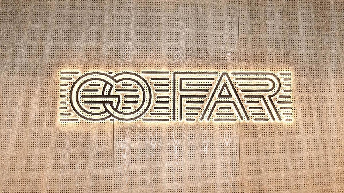
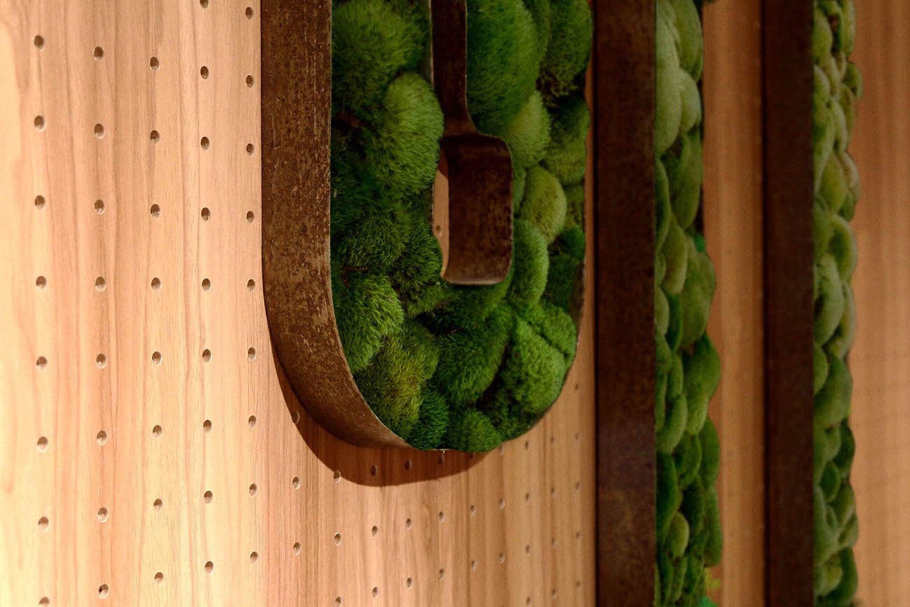
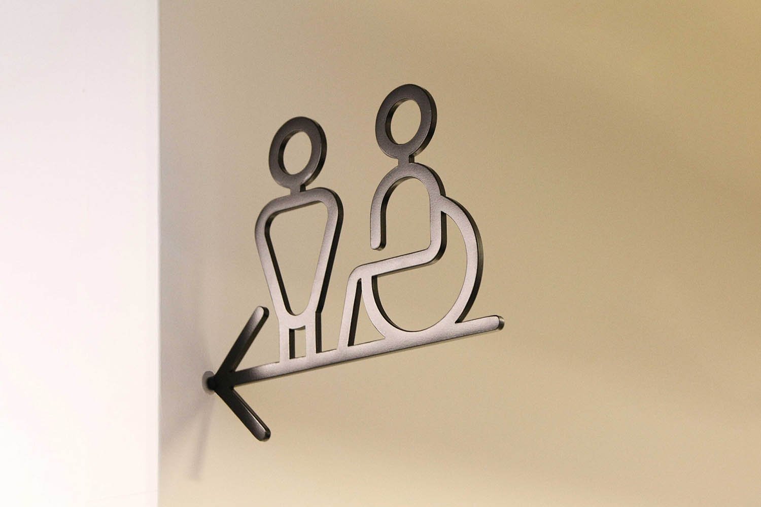
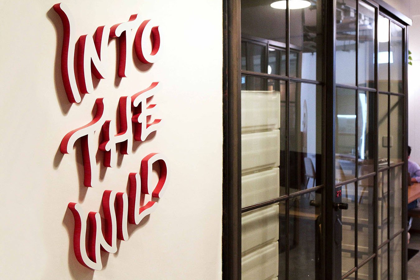
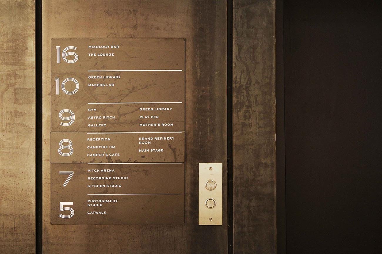
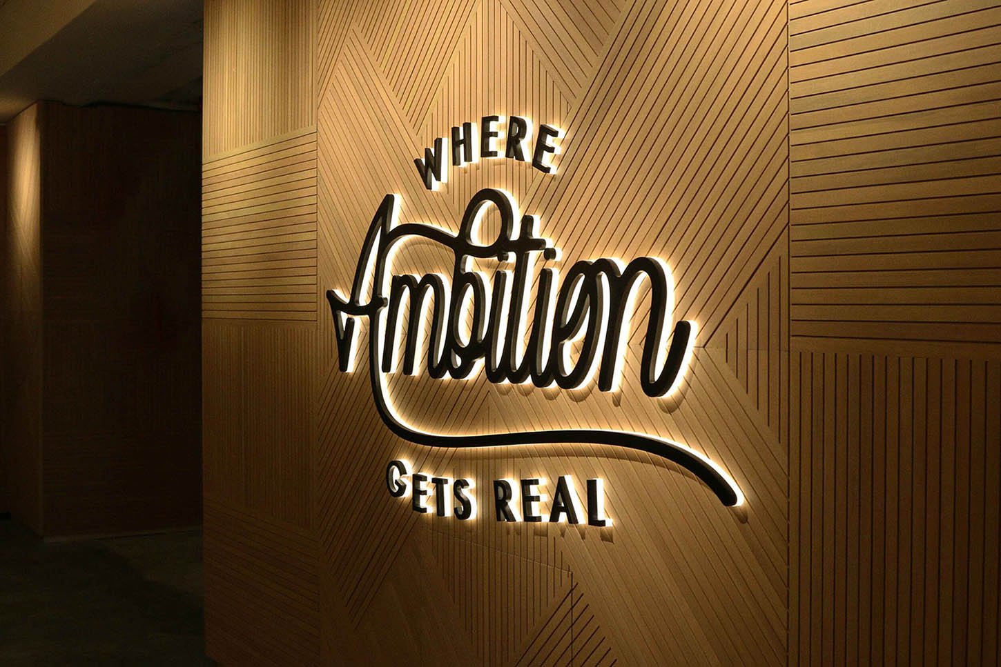
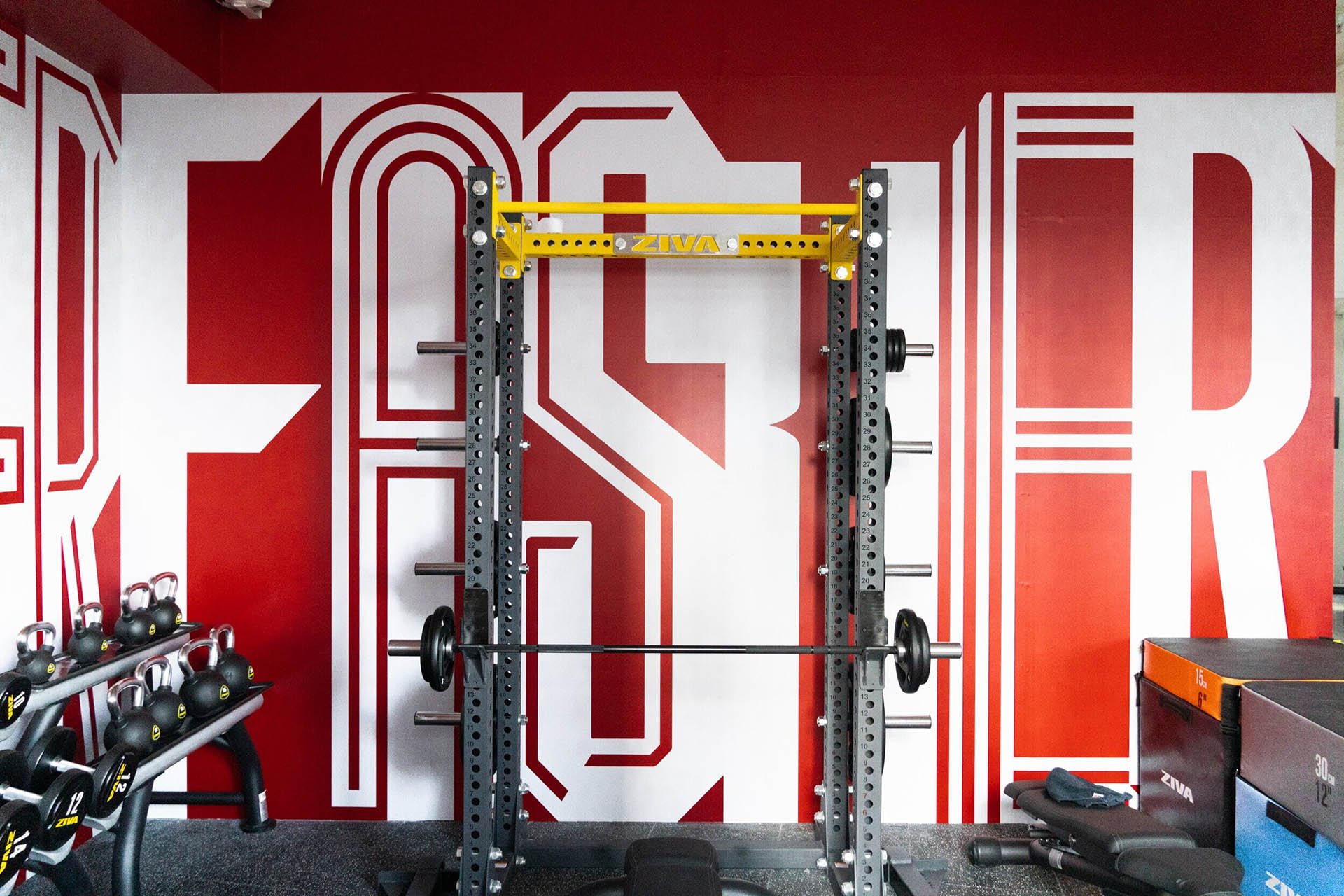
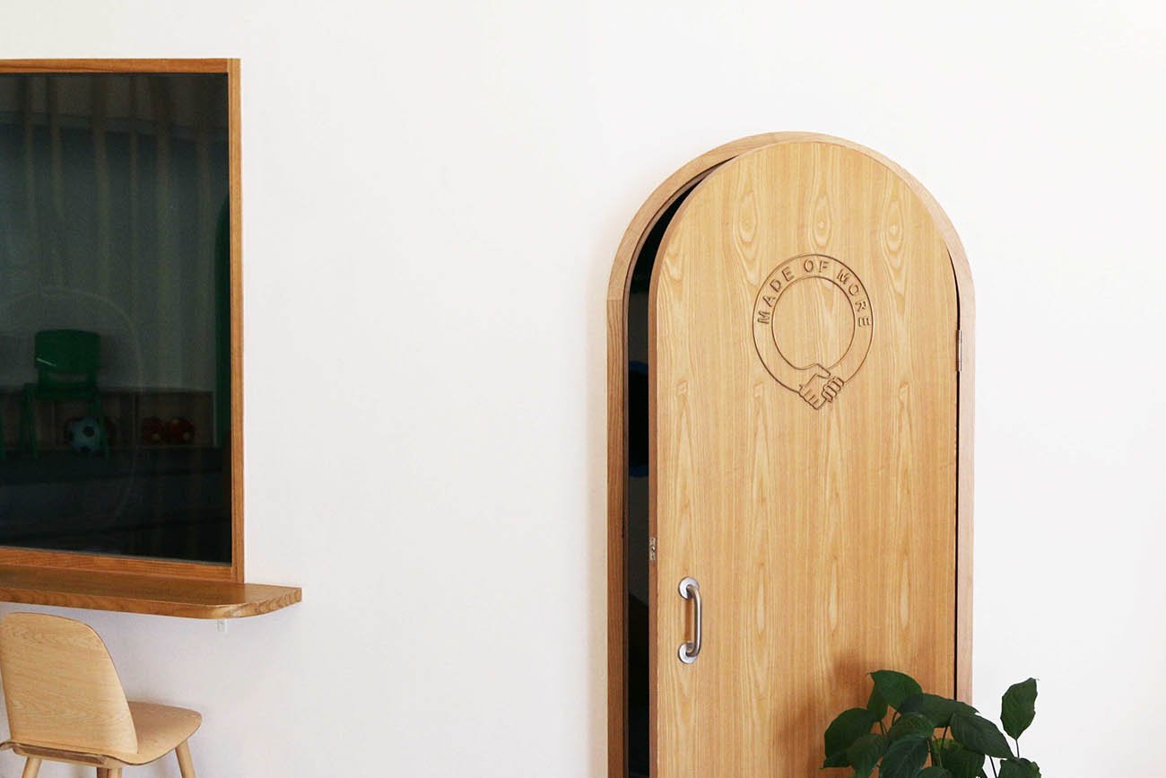
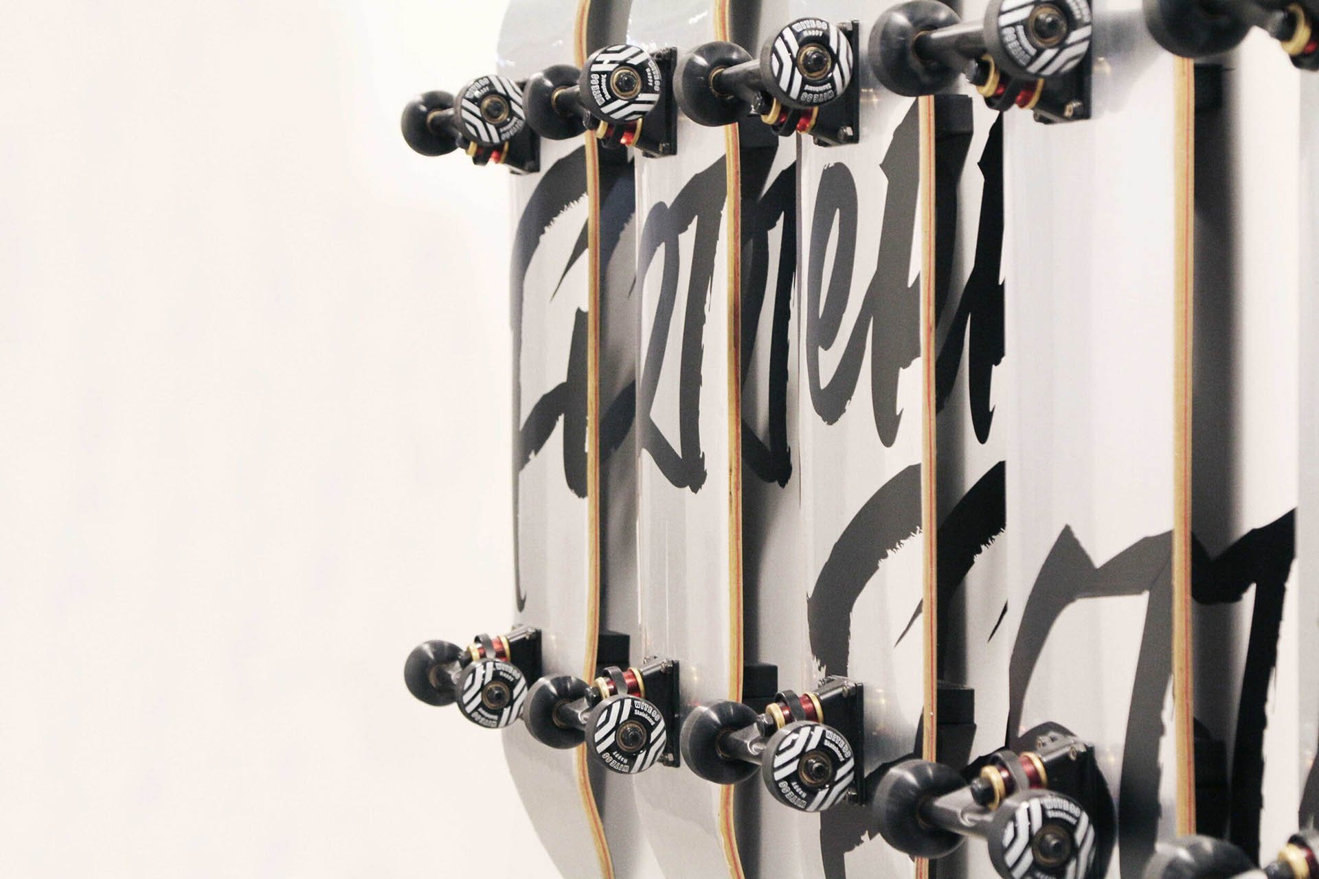
As an extension to the rebranding exercise and opening of the new Campfire HQ, we created a series of signages and environmental graphics that further enhances the brand’s messaging in an interior space. From subtle backlit signs across the hall ways to new way finding directories, the new signages welcome viewers on an encouraging and motivational journey as they roam through the space. As the viewers go across the floors and rooms, bolder statement pieces can also be found.
House of Forme worked with the client on the brand, identity, strategy, stationary, digital media, marketing, space and photography.
See their website: www.campfire.co


The Environment.
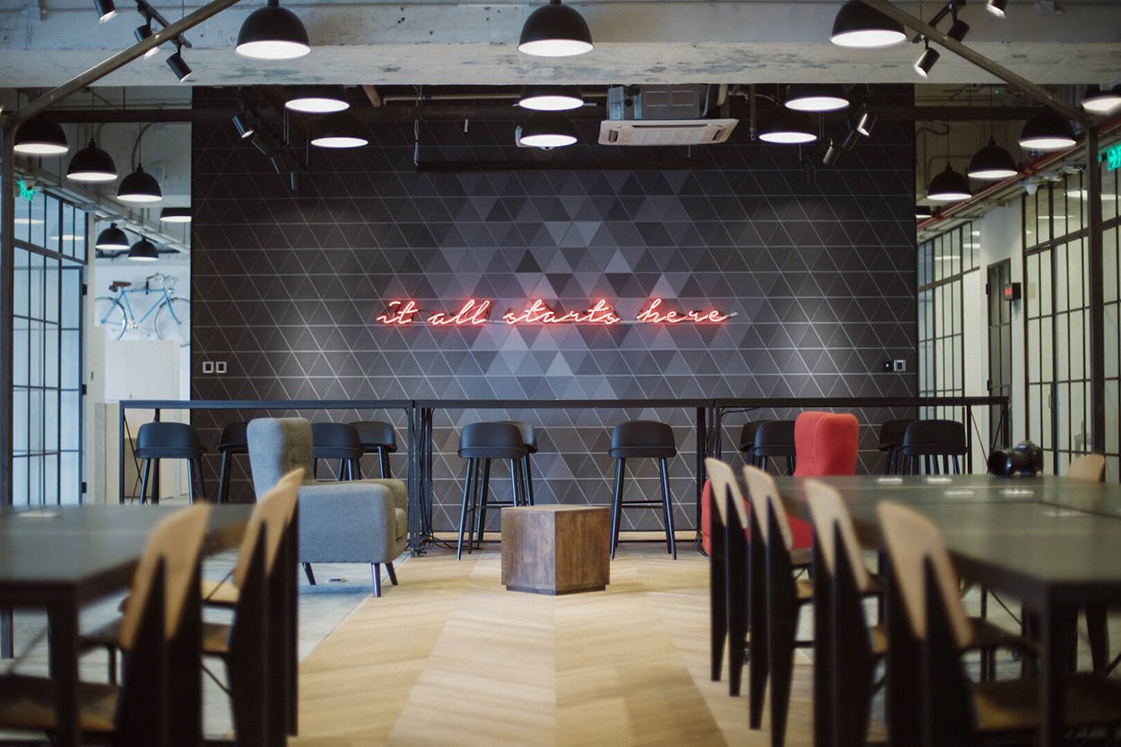
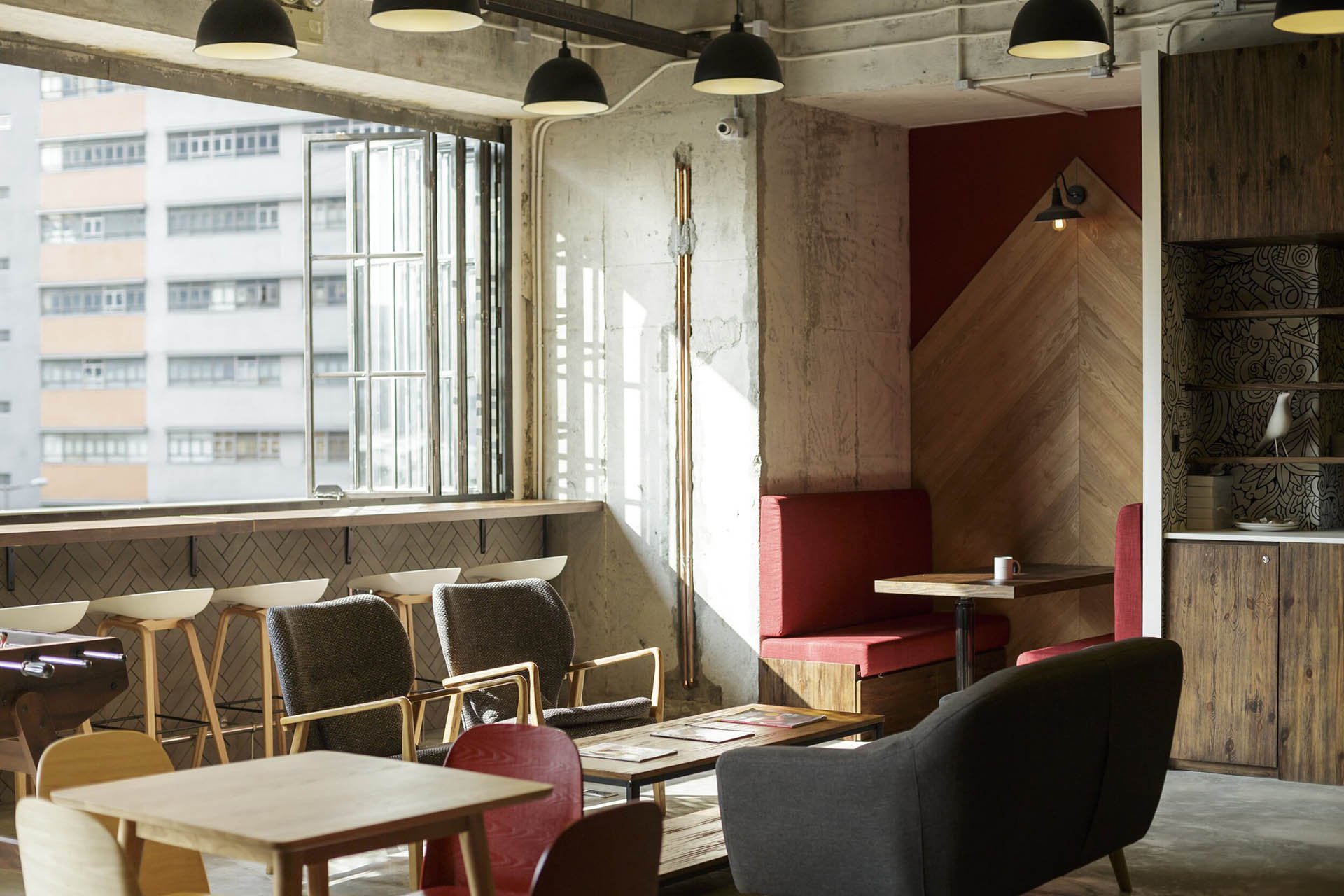
Neutral yet bold. Our designs for the company’s headquarters spell confident, empowering messages, without ever being overbearing. Eye-catching, floor to ceiling murals, hand painted and backlit signages, all in their custom made fonts. Wayfinding systems that are both elegant and easy to use. The tasteful mix of urban industrial fittings and natural materials pays homage to the duality of Hong Kong.


Moment
2019
Industry
Shared Space, Lifestyle
Services
Signage Design, Interior Design, Brand Environments, Messaging, Art Direction
