House of Forme

We Create Soul For Brands.
As a design & creative agency that pursues beautifully crafted communications anchored in strong narratives, we knew we needed to invest more time, energy and capital into our very own brand identity. First, for our clients to understand the subtle details that matter during production, and second, it was equally important for us to showcase what we represent. We knew we needed to create an identity that could celebrate our ethos, whilst maintaining neutral as a design company.
See website: www.houseofforme.com


The Name.
‘Forme’ - late 15th century: variant of ‘form’.
/noun/verb/
the visible shape or configuration of something.
a particular way in which a thing exists or appears.
bring together parts or combine to create (something).
conceive (an idea) in one's mind.


Humble Luxury.
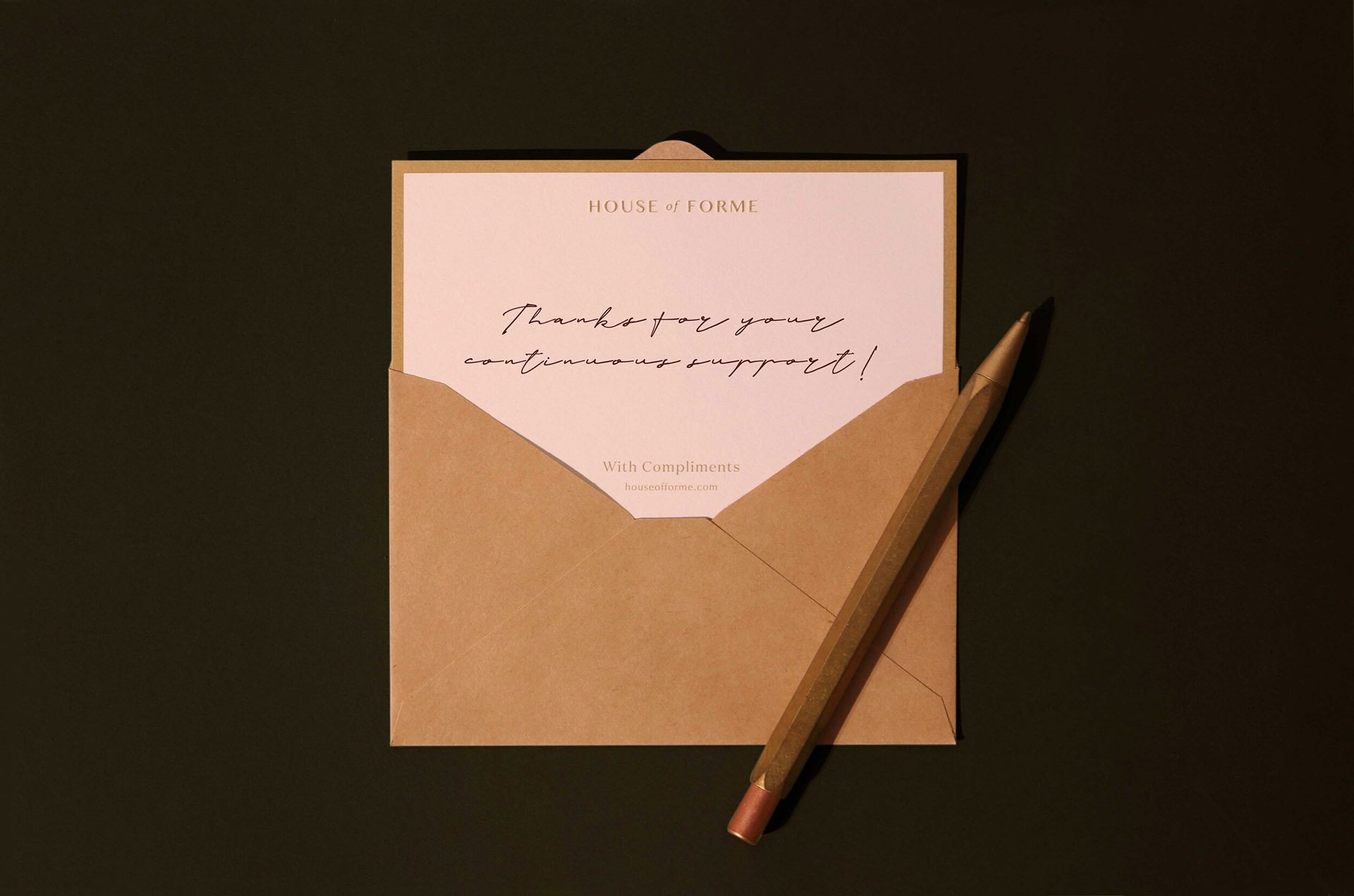
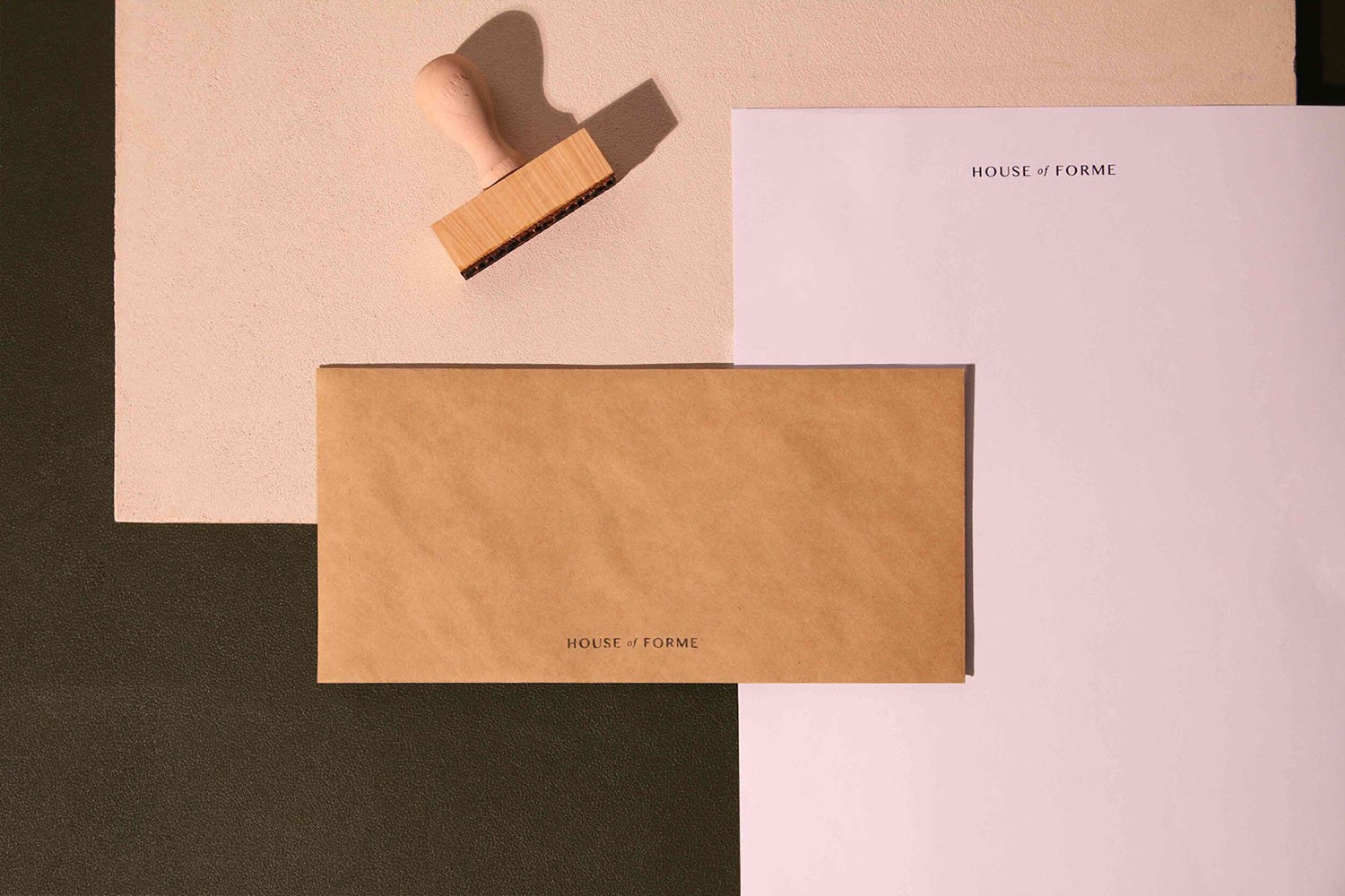
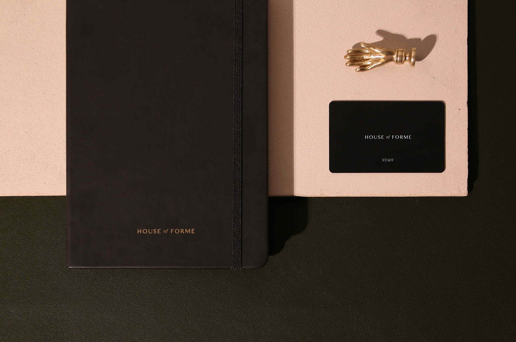
The House of Forme logotype is minimal yet luxurious. If you take a closer look, the details on the typography carries organic curves similar to a hand-written type. Using organic kraft papers that are recyclable and FSC certified, the collaterals are sustainable yet beautifully compliment our brand’s cream colour.
We also employed a hint of brass across our touch-points, which is an industrial material that ages with time;creating a unique composition that is both modern and vintage.


Moment
2019
Industry
Design, Lifestyle
Services
Brand Identity, Brand Strategy, UI & UX, Collaterals Development, Environmental Design, Signage Design, Print & Digital Production
