earthero studio

From Trash To Treasure.
earthero studio is a conscious curator, strategist and clothing label. Working with creatives globally, the brand aims to address the lack of sustainable and ethical clothing brands in Asia. With a primary mission to tackle the serious issue of huge wastage of offcuts and surplus fabric within the fashion industry.
The brand’s new visual identity was designed to be steeped in the principles of sustainability yet remaining fun and creative, embodying an ethos that invites people into a world of imaginative exploration in sustainable fashion.
House of Forme worked with the client on their brand concept, visual identity, branding collaterals, and content creation.
See their website: https://earthero.studio/


The Art of Deconstruction.
The new brand concept earthero studio has fashioned is deeply inspired by the practice of scrapbooking. In an artist's notebook, every page brims with attempts that may be messy, yet they provide an intimate glimpse into the creative process. This process is a journey of discovery, experimentation, and documentation of ideas, which culminates in the creation of unique pieces of art.
The visual route earthero studio treads is heavily influenced by handmade graphic treatments. These include design sketches, stitches, fabric swatches, and collages. Each element contributes to the overall aesthetic, evoking the sense of a scrapbook come to life.


An Ode to Spontaneity and Individuality.
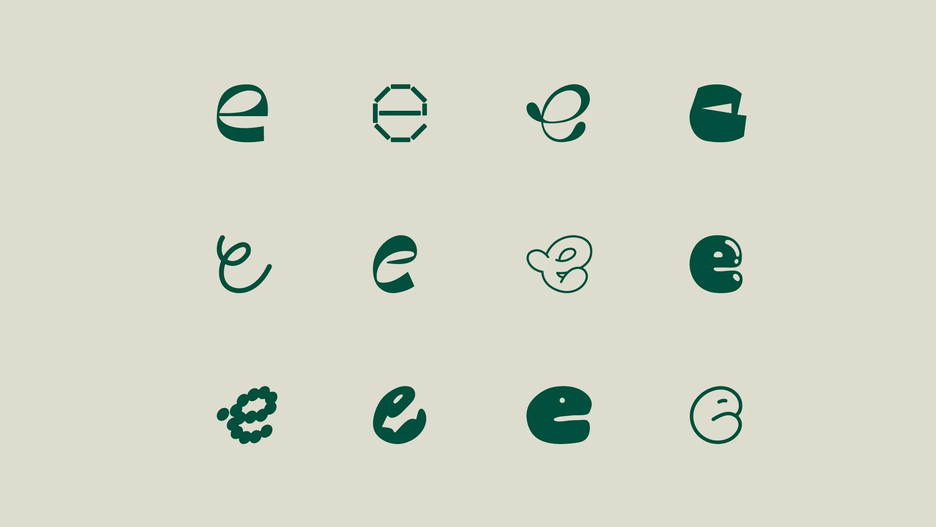
earthero studio's logo encapsulates the spontaneity of stitches and sketches, reflecting the free-flowing process of upcycling and creating. Quirky lines are used to offset the simplicity of the typeface, imitating the hand-drawn strokes found in an artist's sketches.
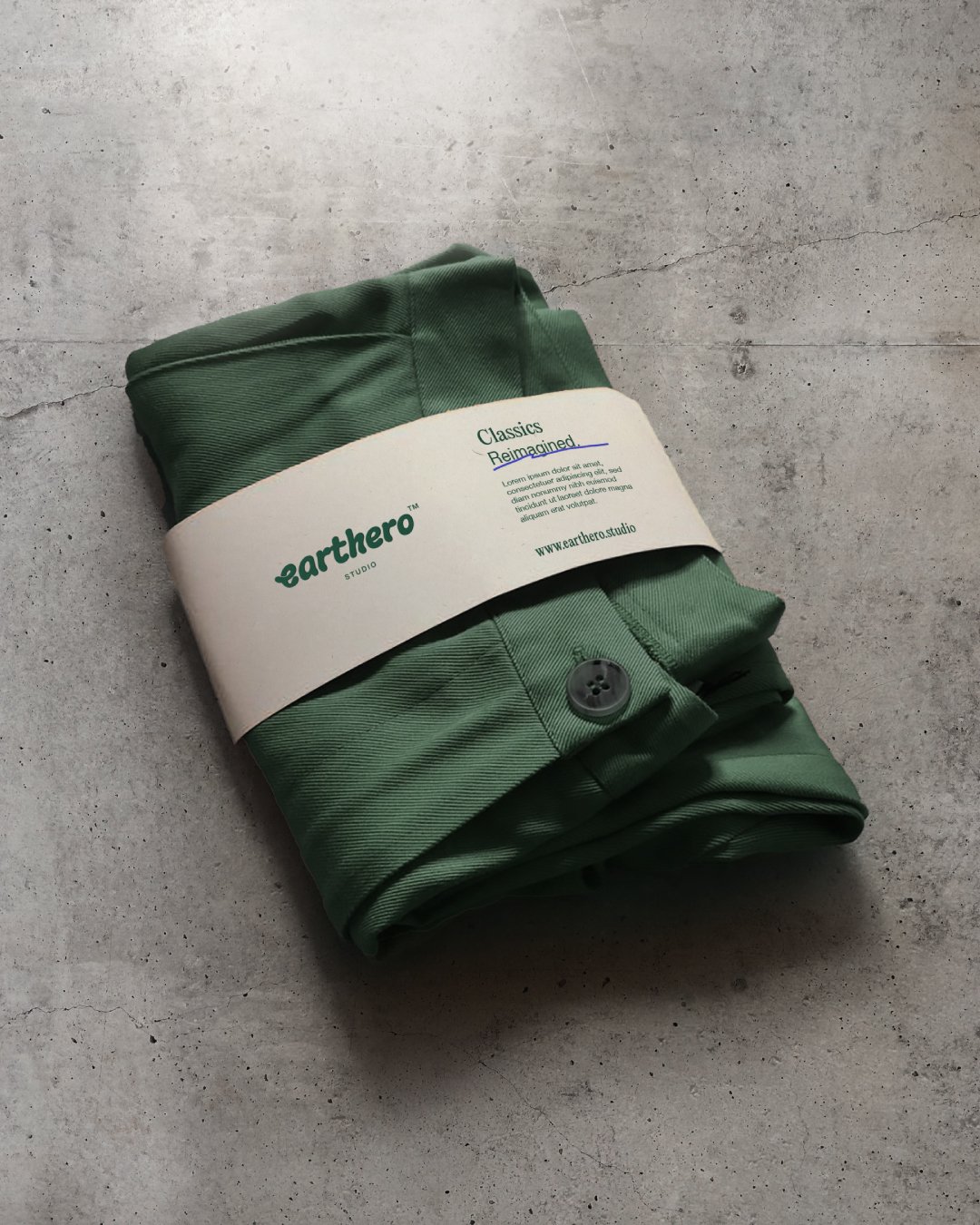
earthero studio's brand fonts blends serif and sans-serif fonts, mirroring the upcycling process of uniting diverse materials to craft something novel and unique. To further enhance this narrative, rough lines reminiscent of an artist's sketch, are used to highlight keywords in the headers. This subtle yet impactful design choice provides a tangible reflection of the artists' creative process, further reinforcing the brand's commitment to artisanal, sustainable fashion.
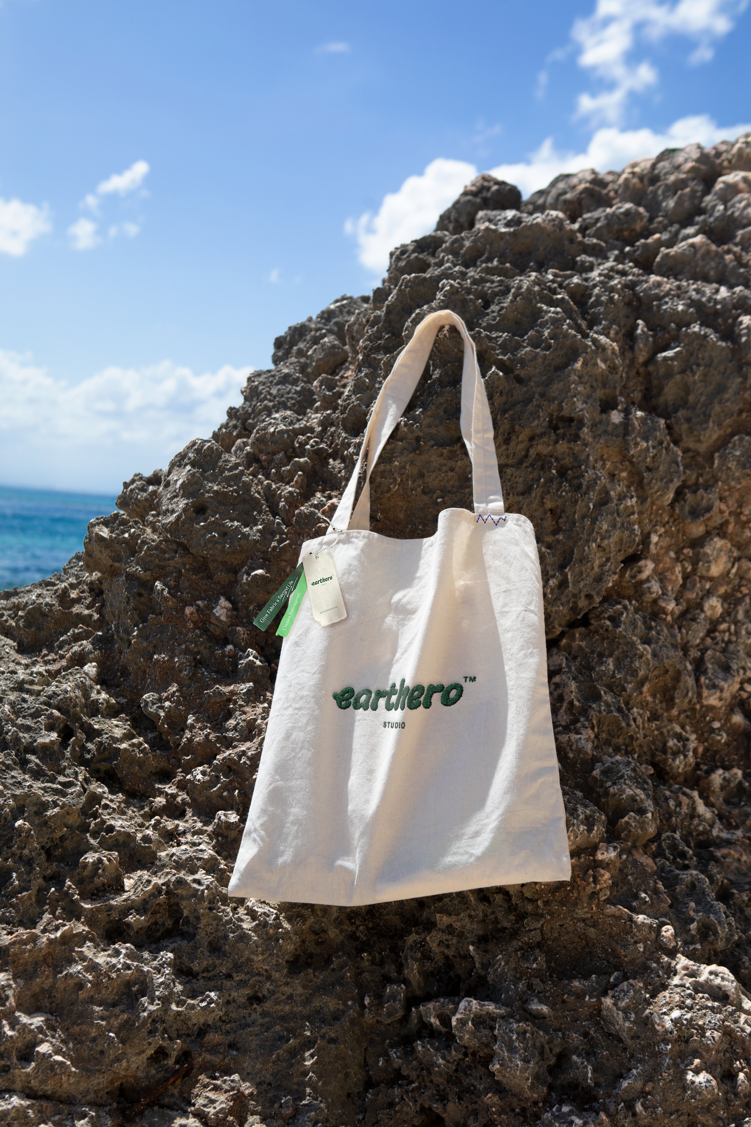
The brand also makes use of a dynamic ‘e’ logomark to represent individuality and its collections. To distinguish itself visually, earthero studio utilises a vibrant colour palette inspired by markers and paints, infusing a playful artistic flair into the brand. While the inclusion of earth-toned colours subtly underscores the brand's commitment to sustainability, seamlessly integrating their mission into their identity.
Customised. Fun. Sustainable.
In the brand's collaterals from online to offline, there's an organic integration of rough doodles, handwritings, and collages. Crafted from ripped fabrics and paper cutouts, recreating the spontaneous charm of scrapbooking. While zig-zag embroidery stitches are used to express the brand’s free flowing creative spirit.
earthero studio goes a step further to make each purchase special. Custom embroidered labels are added to each garment, lending a sophisticated touch to the piece. Leftover strips of fabric find a new purpose in the product packaging, such as clothing hang tags. This incorporation is a testament to the brand's relentless pursuit of sustainability, adding yet another layer to its comprehensive ethos.
In a world where fashion often comes at a cost to the environment, earthero studio is a breath of fresh air. This brand has effectively harnessed the art of deconstruction, transforming it into a revolutionary fashion statement that is as conscious as it is creative.