THE BOX 一盒

Branding Beijing’s New Youth Energy Destination
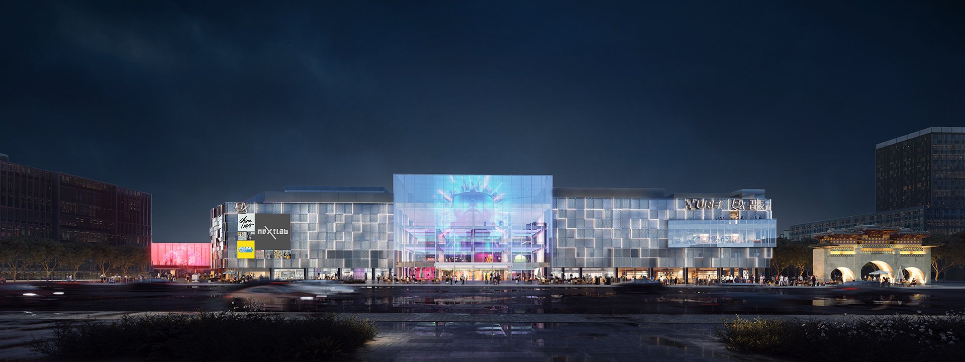
Located in Beijing’s vibrant Chaoyang District, THE BOX 一盒 by URF group is China’s first Urban Innovation Centre (UIC). Spanning across 103,544 Sq.m., the property blends culture, community, and consumption in a unique narrative of innovative retail storytelling, positioned strategically for the next generation of Youth Energy. THE BOX 一盒 is more than just a space; it is a dynamic destination that never sleeps, igniting curious minds with a vast array of experiences on a 24/7 basis.
House of Forme worked with the client on their brand concept, visual identity, print & digital collaterals and brand environments design.


A Symbol of Infinite Possibilities
Drawing inspiration from the name and architecture, our design concept for THE BOX 一盒 takes inspiration from the Rubik's cube, a classic game of problem-solving. This notion celebrates the infinite possibilities that a Gen Z-led culture can unlock. It is said that the numerous permutations of a Rubik's cube surpass the number of observable stars in the Milky Way, mirroring the endless experiences and opportunities that THE BOX 一盒 provides. This concept invites everyone to delve into the different dimensions of the cube and explore the wide range of experiences THE BOX 一盒 has to offer. It stirs curiosity, making THE BOX 一盒 the go-to destination for all trendsetters and fun-seekers.


Play Inside THE BOX, Think Outside THE BOX.
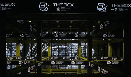
THE BOX 一盒's logo takes cue from the multifaceted cube, symbolising the brand's dedication to unending creativity. It encapsulates the idea of thinking outside the box while playing within it, echoing the innovative and interactive spirit of the brand. This ingenious use of symbolism establishes a visual connection with the target audience and communicates the core values of THE BOX 一盒.
THE BOX 一盒’s logotype, characterised by a pixelated touch and geometric forms, is also inspired by the structure of a cube. The cubic form subtly mirrored in the English typography enhances the 3D quality, tying back to the Infinity Cube concept and reinforcing the brand's theme of limitless opportunities. When combined, it presents THE BOX 一盒 as a modern, dynamic, and cutting-edge brand.

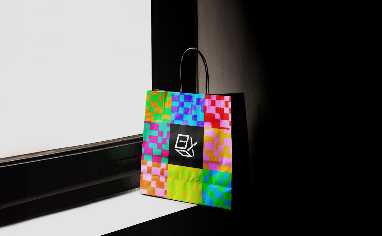
Channeling The Power Of Pixels
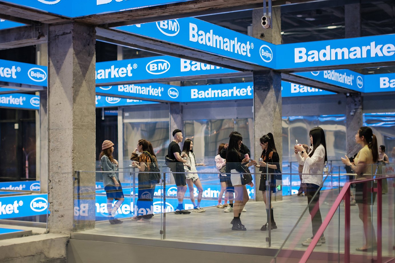
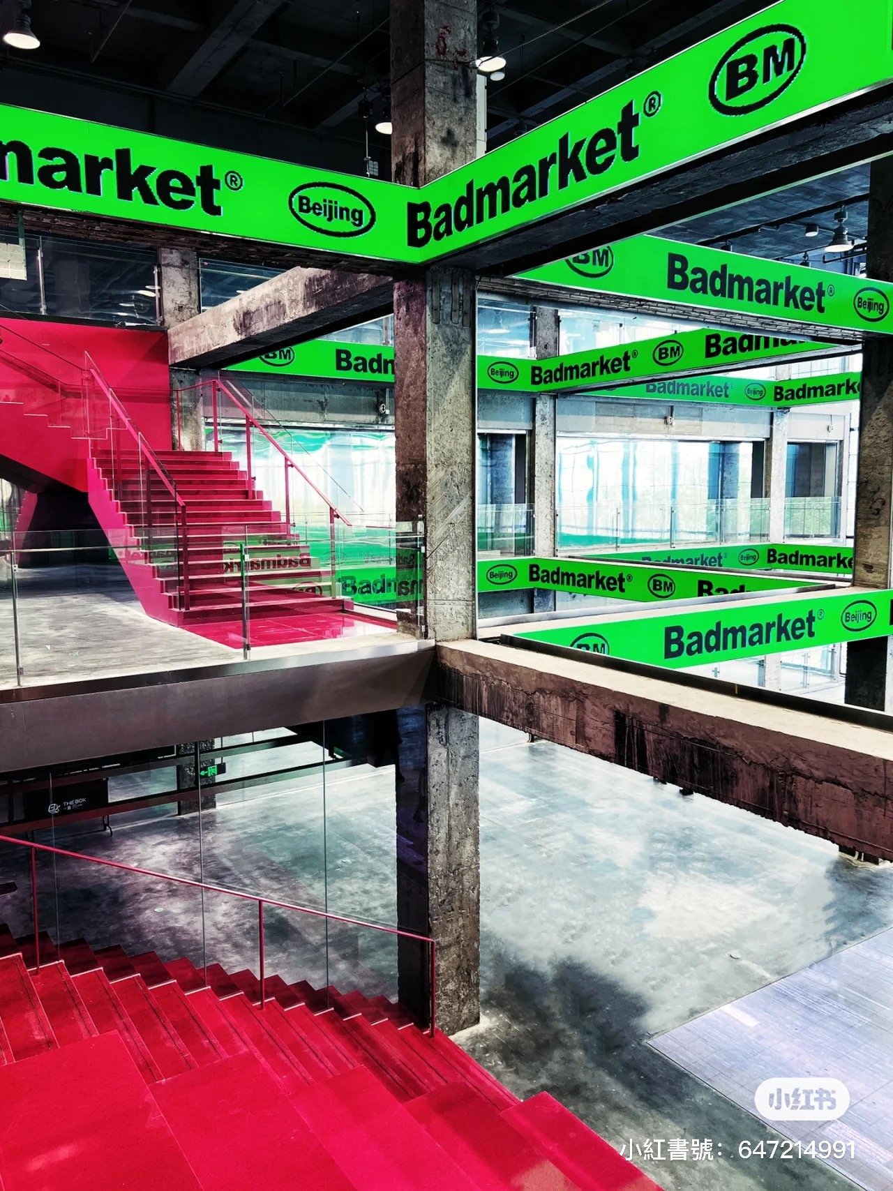
THE BOX 一盒’s dynamic graphic system is built around rectangular arrangements, utilising a hidden grid system. The key graphics or iconography are a mixture of geometric and pixelated illustration, which when combined with using a range of bold and bright colours, collectively they generate an elevated and attractive energy.
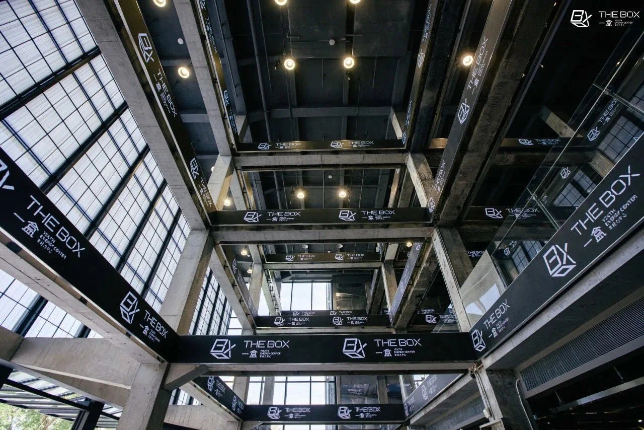
Interior environment also integrated subtle grids, LEDs, or haptic installations to match the vibrant personality of THE BOX 一盒 and its demographic. Everyone’s journey in THE BOX is different. Tailored to early birds and night owls, foodies and fashionistas, THE BOX has all the fun, retail, food, fitness and play to ensure that no one has to go really far for what they want to do; hence why categories of information and experiences are represented through a distinctive and easily recognisable graphic system throughout the interior signages, crafting a uniquely fun yet still convenient customer experience at THE BOX 一盒.


Bringing THE BOX To Life.
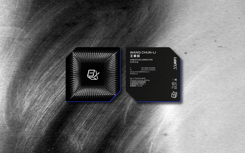
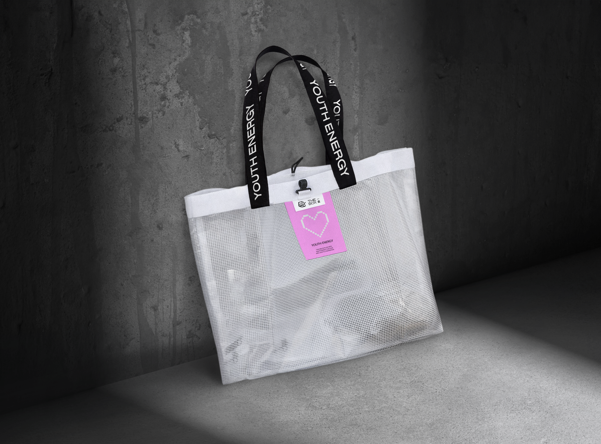
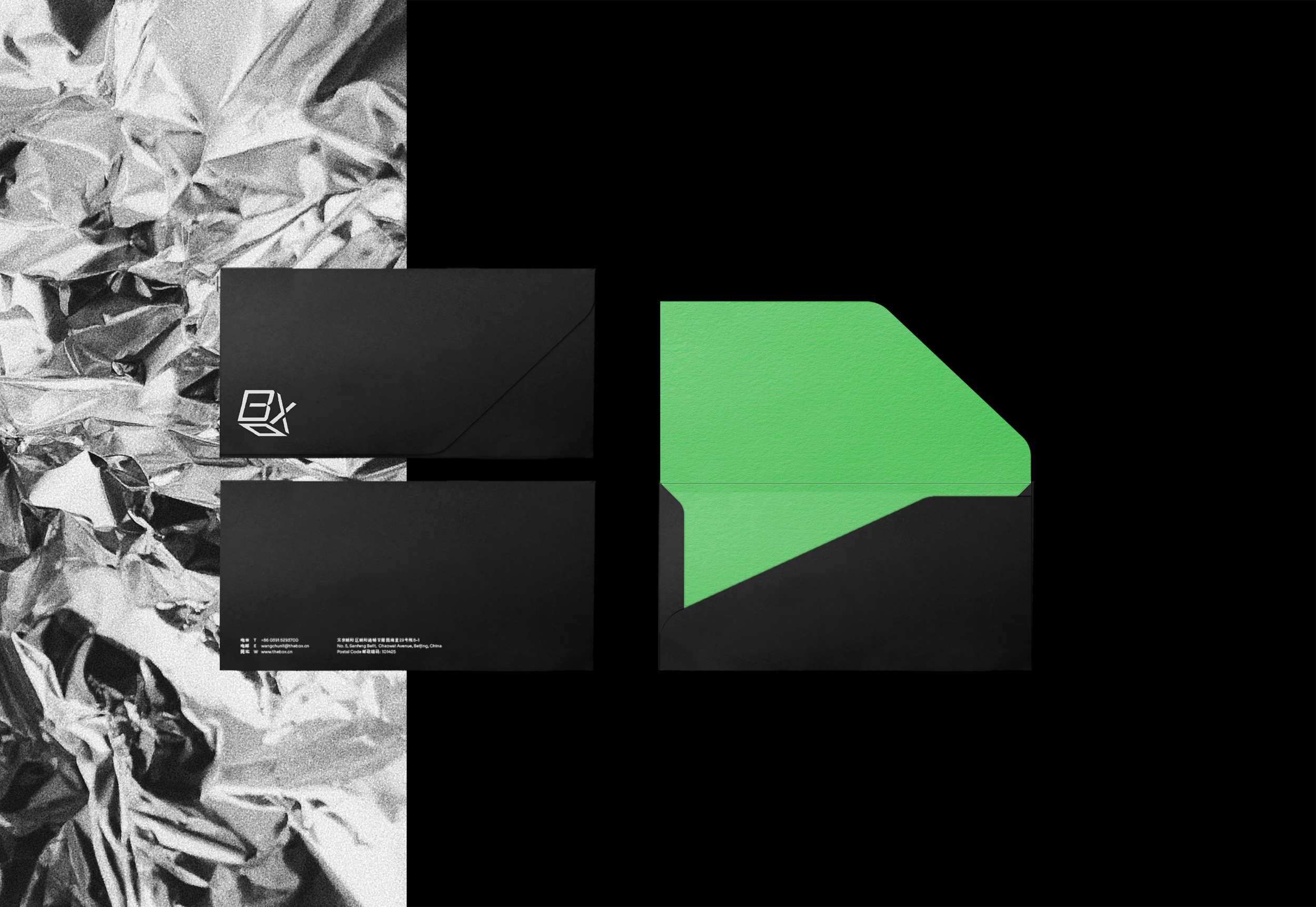
We designed brand collaterals that would bring facets of the cube into tangibility. The illustrations are largely used on printed collaterals from brochures, to staff uniform. notebooks, tote bag, paper bag and even digitally on different social media platforms. Bespoke business cards have been crafted with a dynamic element to reflect the unique personality of each staff; all helping to cohesively form a strong innovative brand for THE BOX 一盒.


Moment
2023
Industry
Property, Retail
Credits
Architecture- COO
Images- THE BOX
