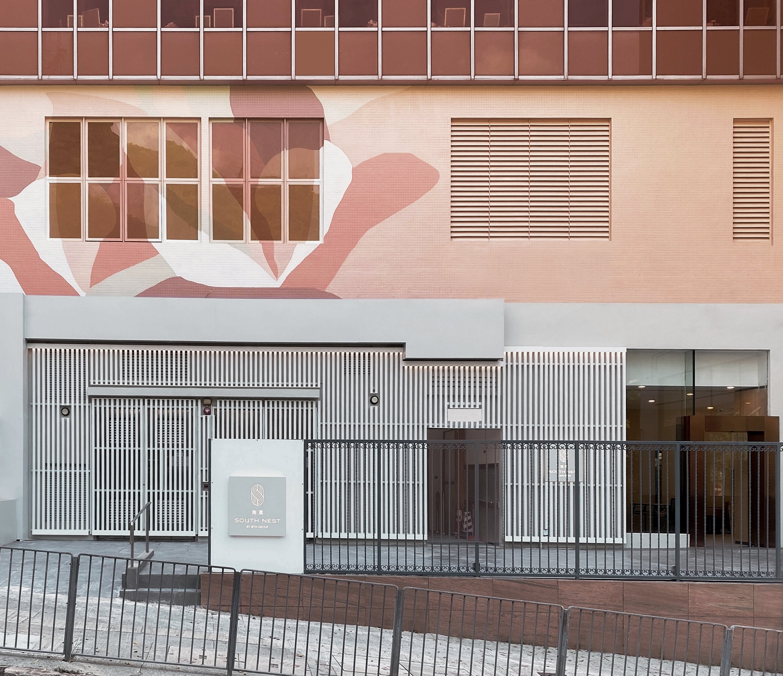
SOUTH NEST

A Locally-Inspired Community Hub.
Located at the edge of Aberdeen Harbour in Tin Wan, South Nest is a 500 Room co-living and hotel designed around human needs that we all have in common: a need for privacy, a need to be surrounded by nature, a need to eat well, sleep well and be a part of something bigger.
Playing a role of a locally-inspired community hub for a reviving neighbourhood, South Nest is a place where purpose-driven travellers and passion-driven globally-minded locals can find both relaxation and fulfilment – empowering them to discover the future of possibilities.
House of Forme worked with the client on their brand naming, brand strategy, visual identity, branding collaterals and brand environments.
See their website: https://southnesthk.com/


Rooted In Hong Kong.
Our identity design for SOUTH NEST contemplates the endeavouring connotations of open fields while paying homage to the history of the land in Tin Wan.
By using lines and patchworks conveyed through our graphic language, our identity system celebrates self-discovery, and exploration, and welcomes a space for the community to live, share and connect. Truly celebrating the brand’s core values and inspiring limitless endeavours that evokes mindful connections.

To Grow, We Must See, And To See, We Must Explore.
Echoing the SOUTH NEST’s brand archetype as ‘The Explorer’, our identity system inspires each guest to live life to the fullest.
The S & N logo icon pays homage to the agricultural background of Tin Wan, capturing the meandering curves derived from drone view of fields. Taking inspiration from the raking patterns of fields, the interconnectedness of the details symbolizes community, heritage, and unity, further consolidating the brand’s celebration of inclusivity.
Its logotype takes on rounded details of twigs of a nest, as well as hand painted signages that used to roam the harbour. A nostalgic design that further reinforces the brand’s DNA as rooted in Hong Kong.


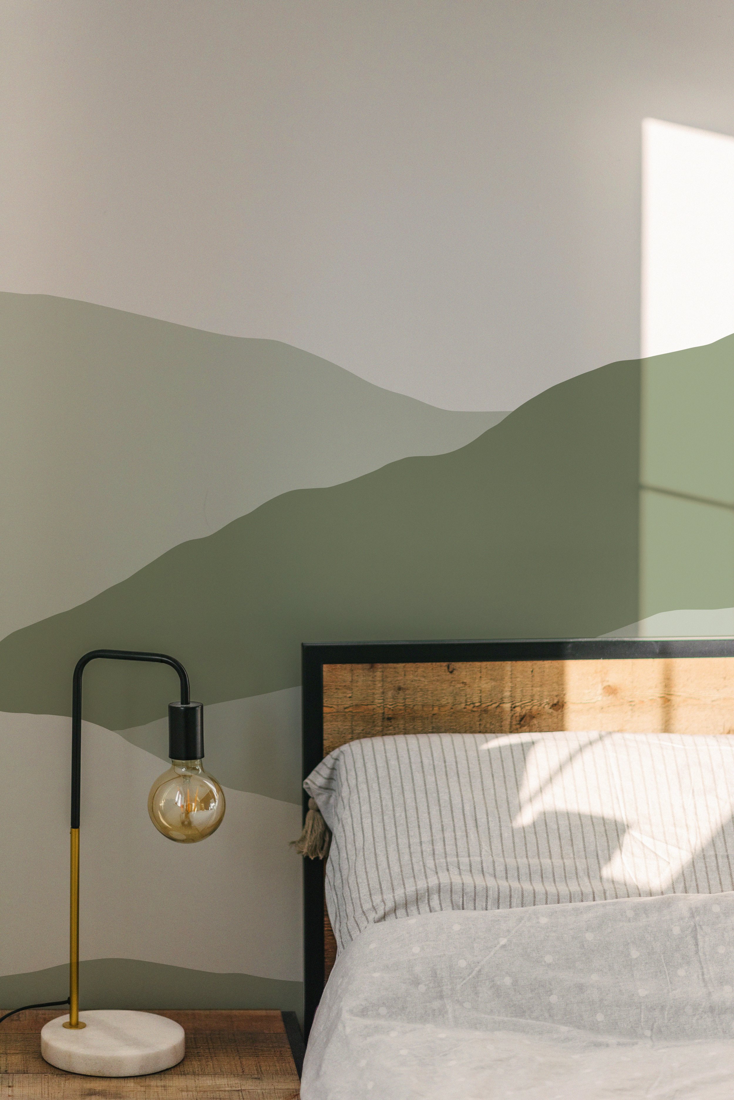
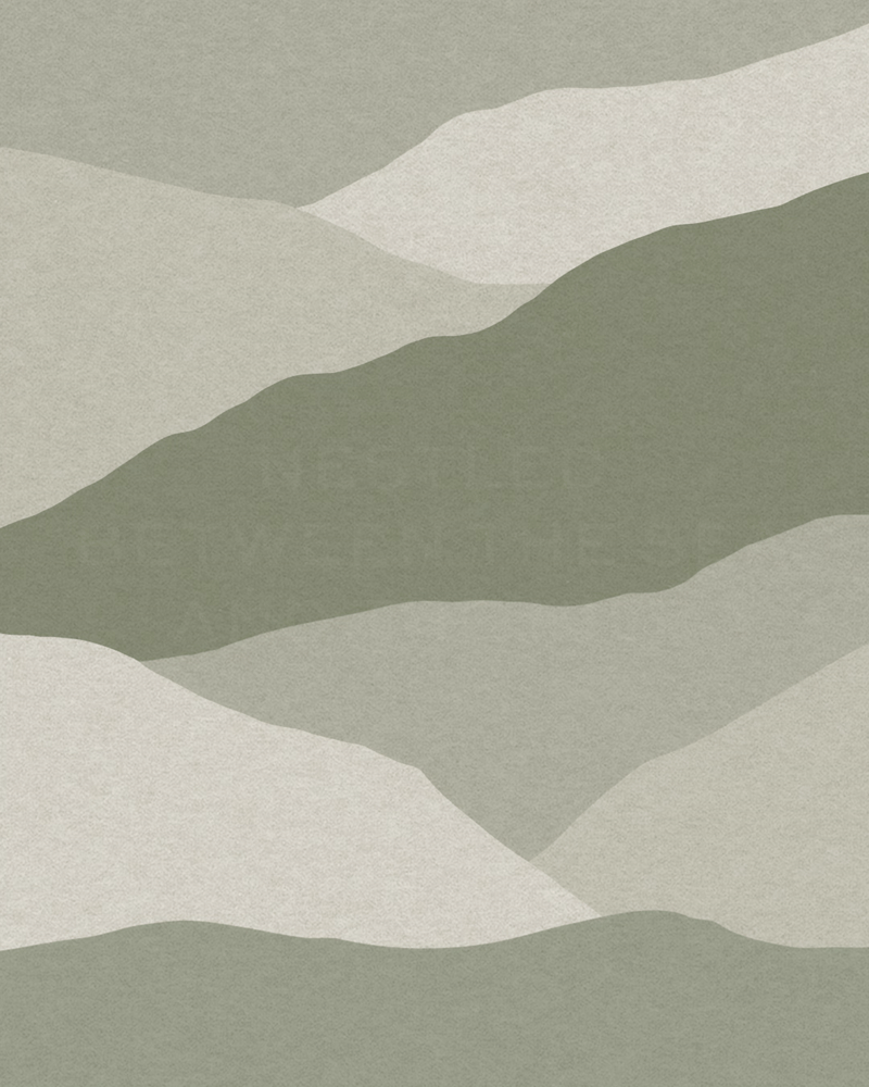
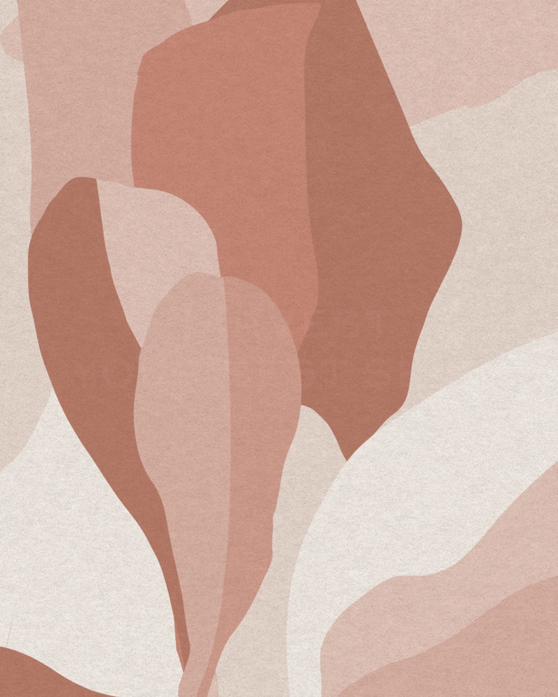
Nestled Between The Sea and The Hill.
Nestled between the sea and the hill, SOUTH NEST’s secondary graphics and colour system are reminiscent of its surroundings. Through organic patchwork-inspired illustrations, and nature-inspired pastel colours, the graphics are imbued across the property as well as collaterals, from business cards to room card holders, and signage details.
Within these elements, one can observe the intricately designed graphics resembling the mountains, the sea and the sky surrounding the property. They then create a cohesive graphic language that foster a harmonious connection between the inside and out, providing maximum comfort and relaxation for those nesting at SOUTH NEST.


Moment
2022
Industry
Hospitality, Co-living
Services
Brand Management, Collateral Development, Brand Environments, Website Design
Credits
Images- South Nest
