THE SLOW

An Immersive Experience For The Mind & Body.
The Slow is a massage and wellness brand that aims to make wellness accessible to all, whilst promoting the value of mindfulness. Drawing inspiration from the age-old concept of yin and yang, the brand aims to restore balance in both body and mind through modern massage therapy techniques. House of Forme was commissioned to design its Tseung Kwan O location and refine the branding to accommodate its unique positioning.
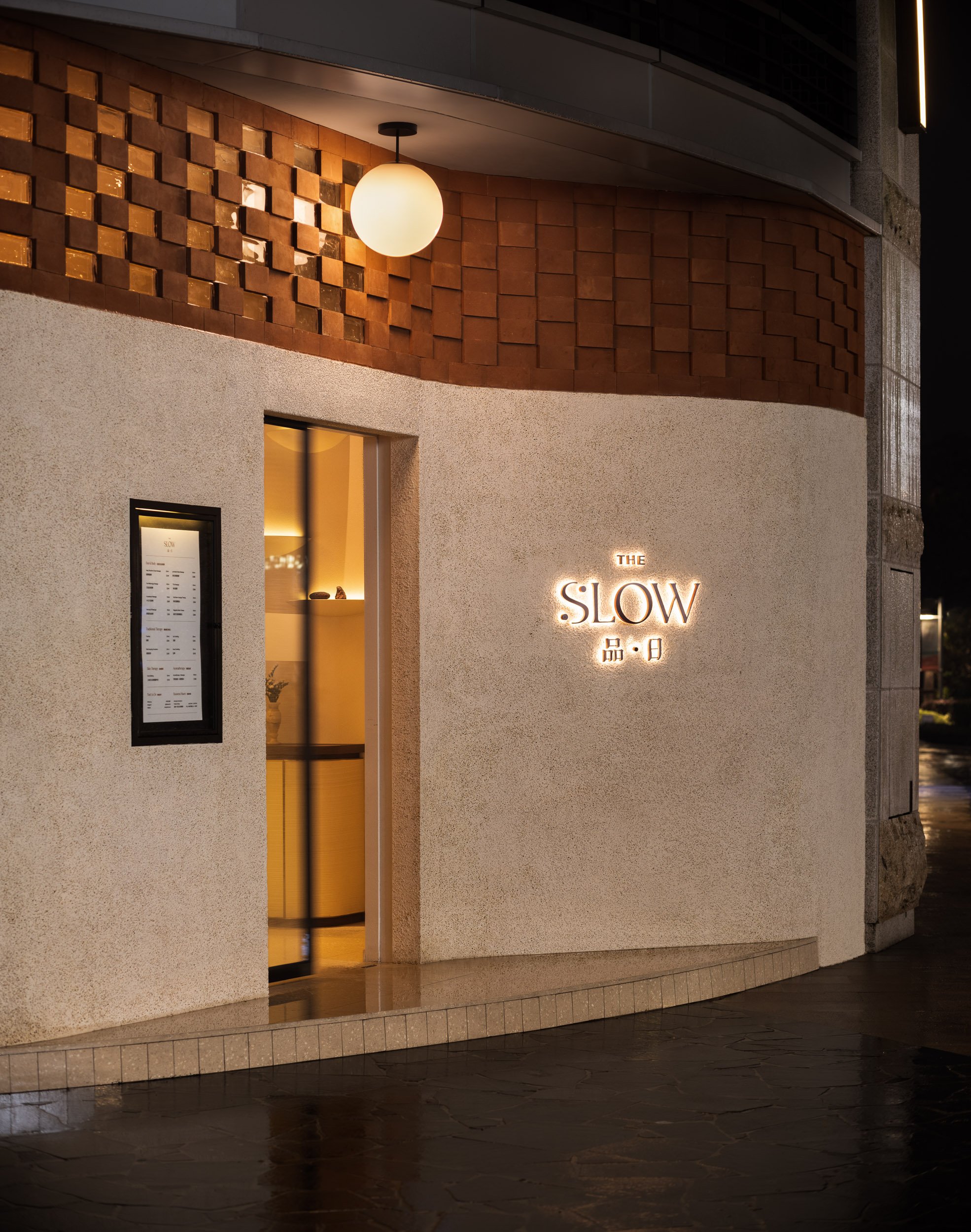
Situated right by the scenic Tseung Kwan O Waterfront, yet conveniently tucked away from the crowd, The Slow TKO celebrates massage as a means of holistic healing and a way to foster well-being within communities. The interior of the space transports guests on an immersive and haptic journey with an overarching design narrative that draws inspiration from the "Human Anatomy”.
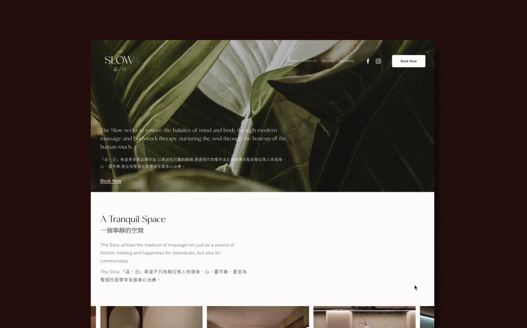
House of Forme worked with the client on the brand concept, visual identity, content creation, collateral development, interior design, brand environments, FF&E design and website design.
See their website: https://www.theslowhk.com/


Unknown, Igor Sava


The Human Body As A Design Narrative.
Our concept for The Slow’s Tseug Kwan O shop celebrates the human body as a literal design narrative. By dissecting the human anatomy to take visual cues from our skin, bones, and to our inner body flow and muscles. Each of these unique elements are deeply rooted in bodywork therapy and was reinterpreted into lines and shapes capable of crafting a truly unique environment that is distinctly human and immersive.
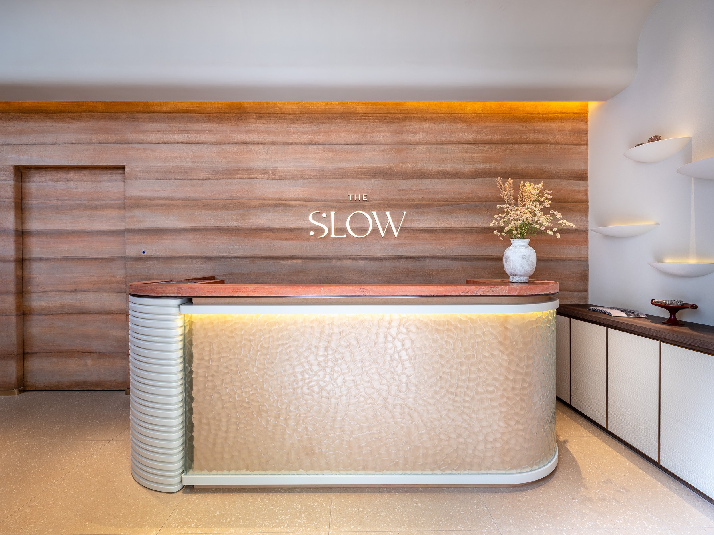
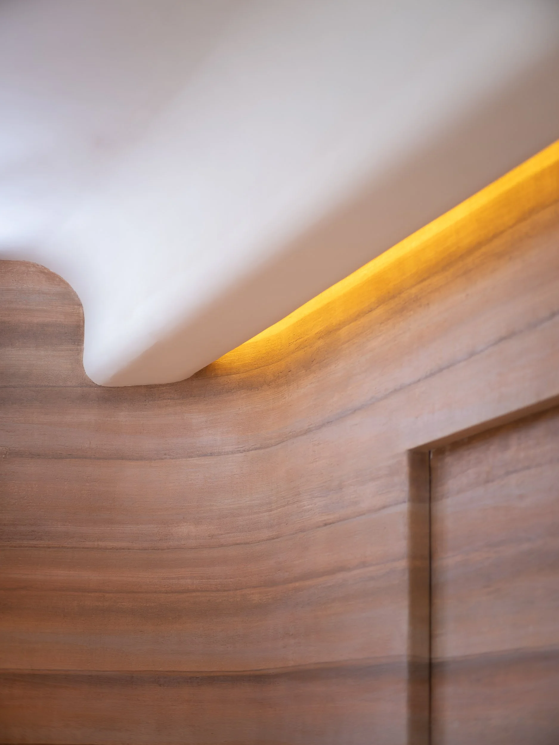
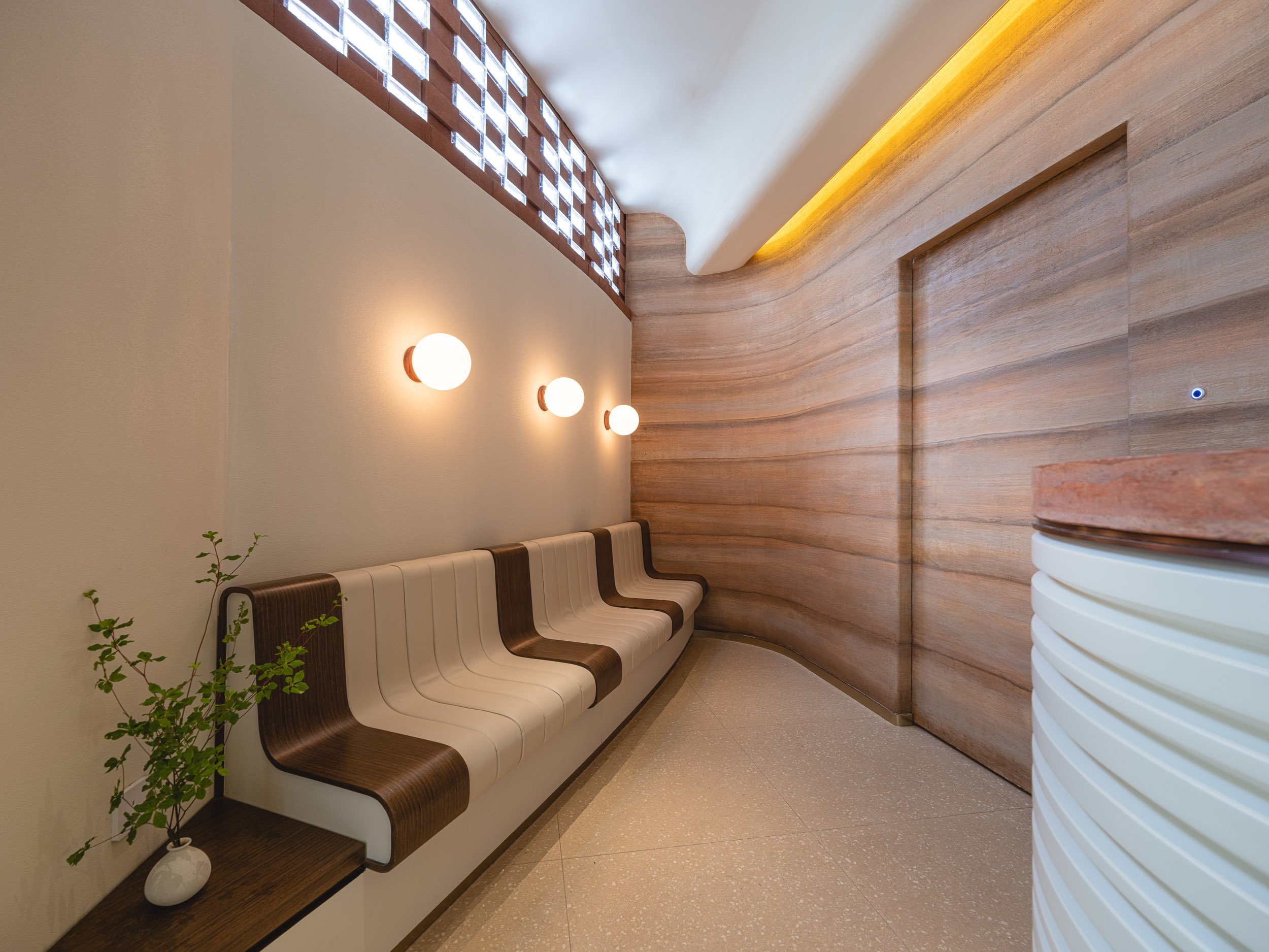
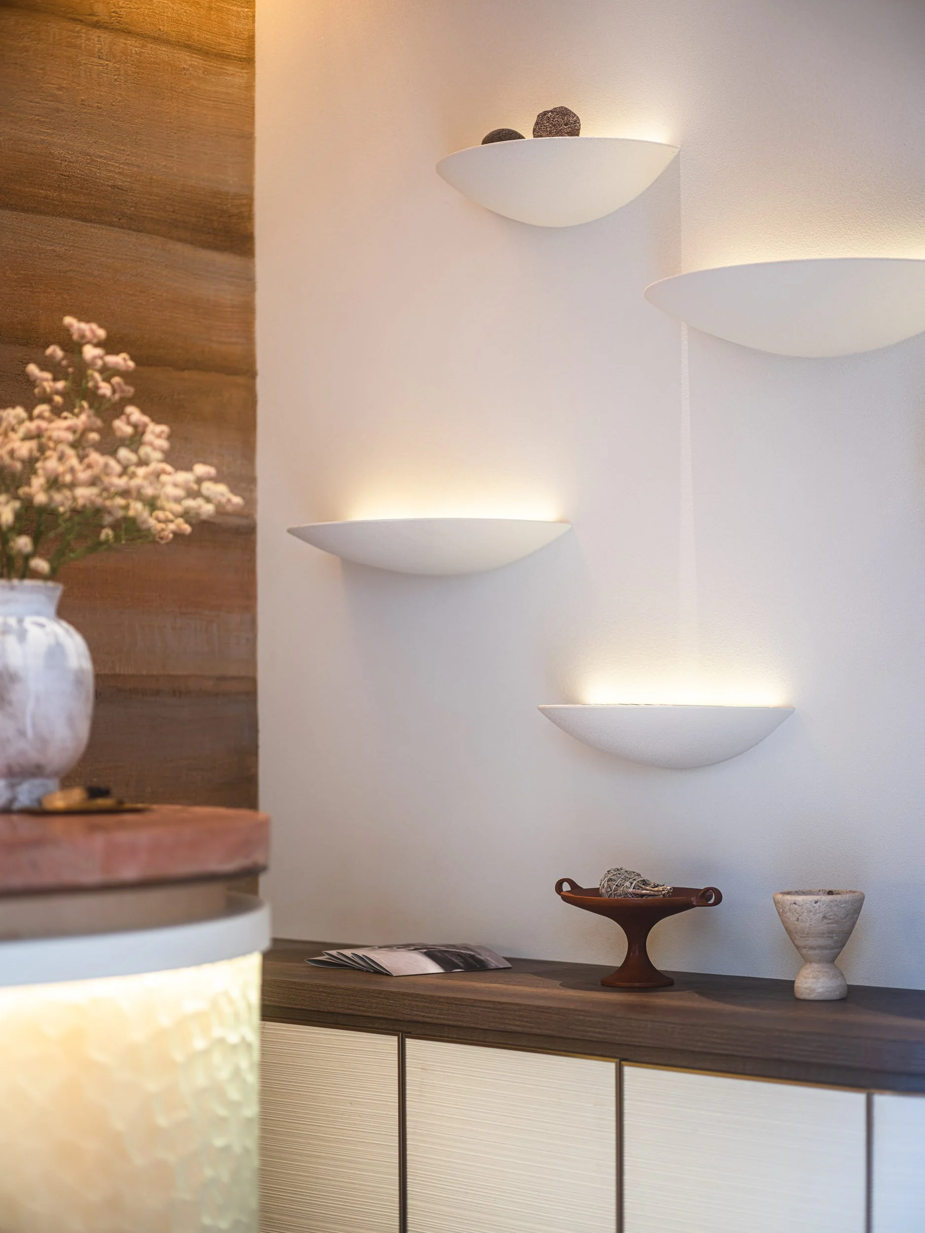
The natural curves of the architecture are kept to simulate the curves of a human body. The light minimalist exterior features a unique aggregate concrete finish to resemble the colour and texture of the human skin. The upper facade incorporates geometric bricks infused with textured glass connecting the inside with the outside. Walking into The Slow resembles the voyage of delving into the human body. Once inside, guests are greeted by a sculptural yet warm reception and waiting area, where subtle elements draw inspiration from the intricate structures of human bones and bone marrow, from the reception counter to the couch.

C. Landseer, ca. 1815

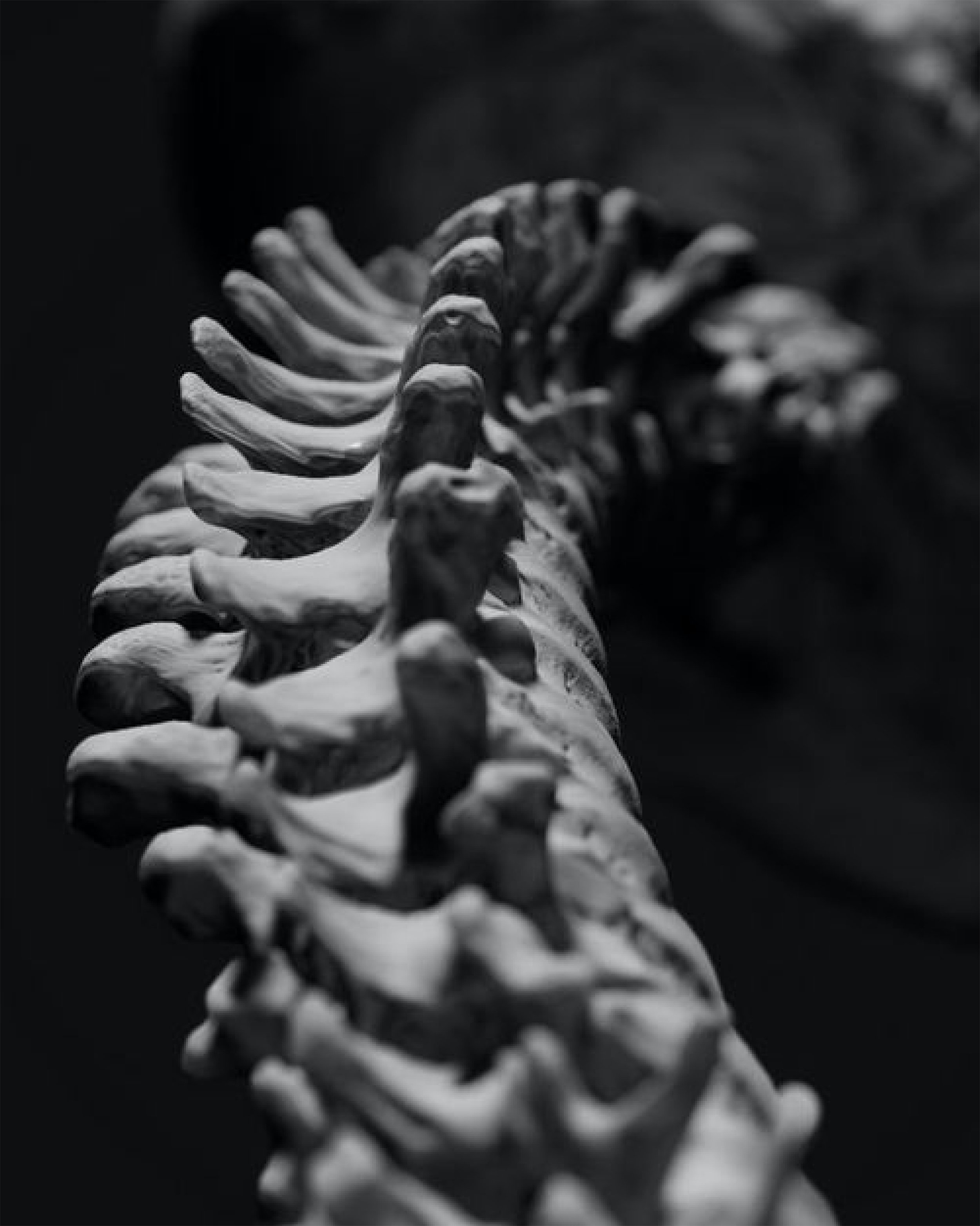
The Spine Of The Space.
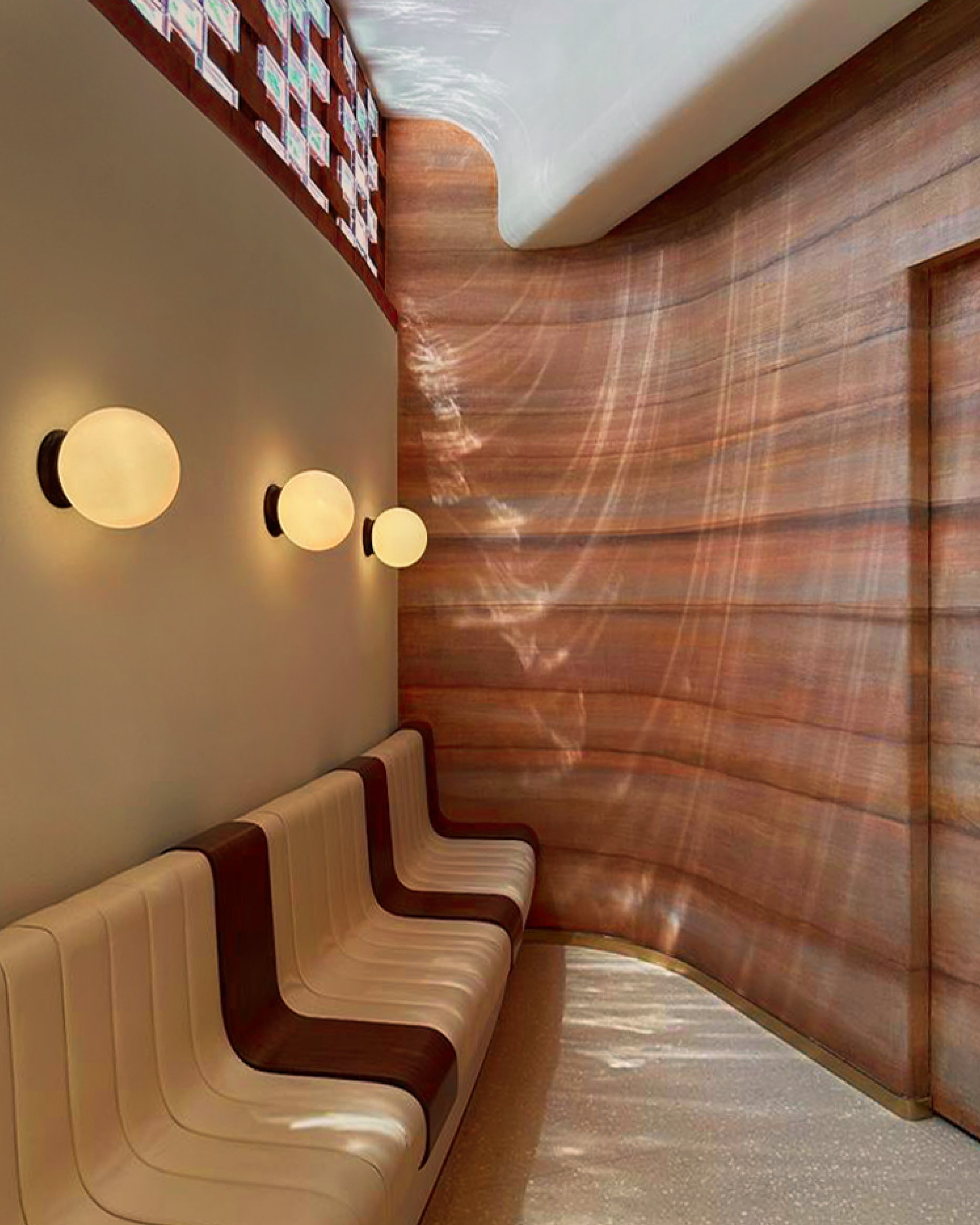
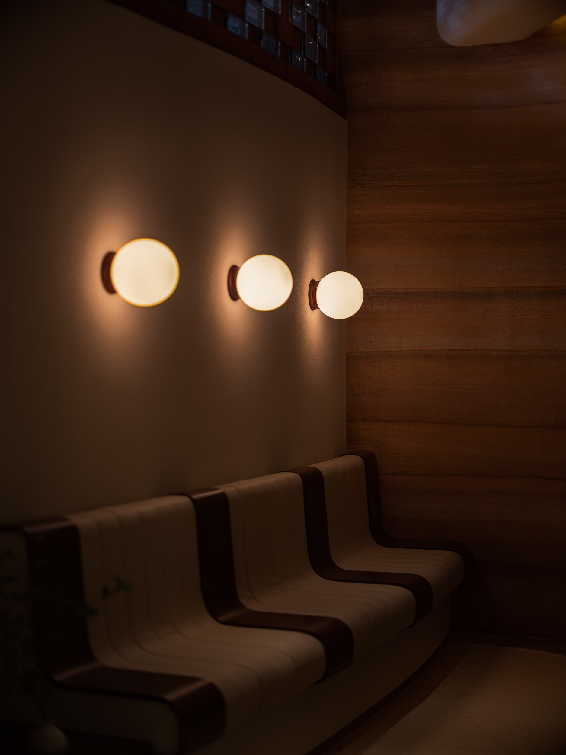
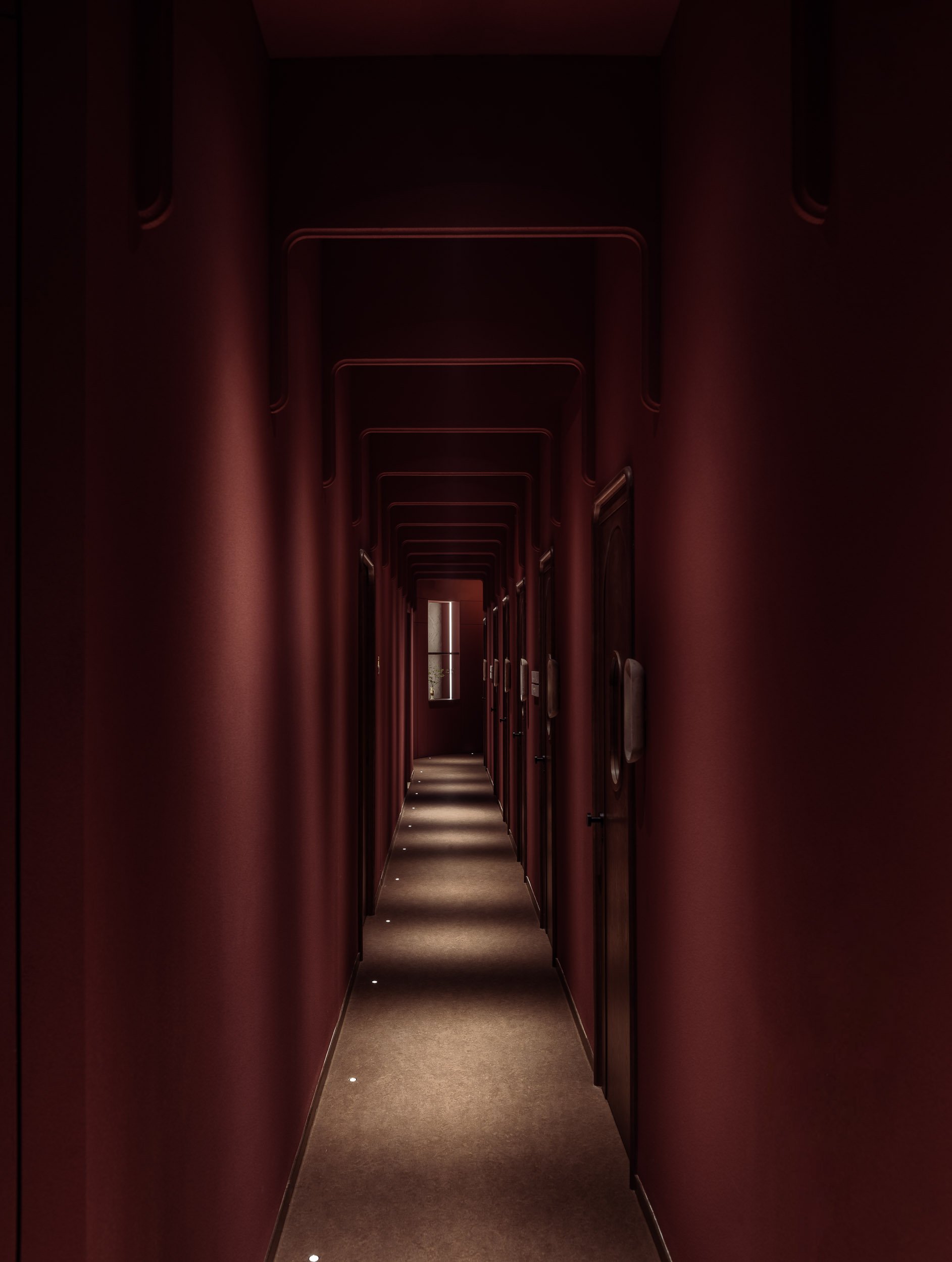
Venturing further within, the corridor and massage rooms feature walls painted in an almost bloody colour; with repettitive arches inspired by the human spine, creating an architecturally immersive experience. The floors are also thoughtfully adorned with acoustic linoleum, enhancing the shop’s acoustic performance within this mysterious and sensory space.
To improve the overall user experience, custom signages and wayfinding were also designed. The texture of the signs resembles subtle hints of human bones handpainted in off-white with backlit lettering.


Designed For Tranquility And Functionality.
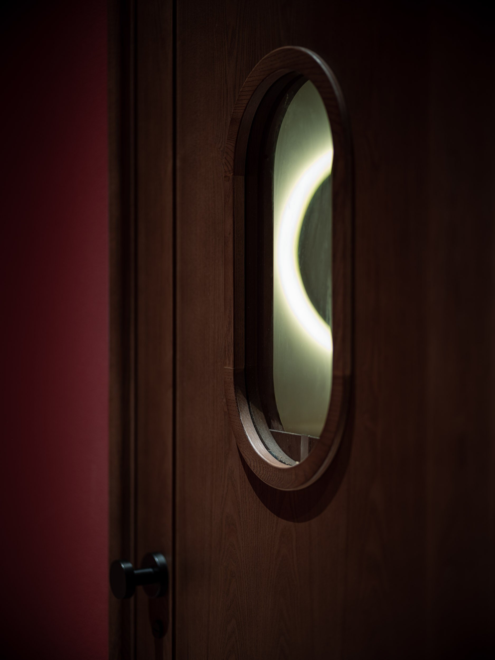
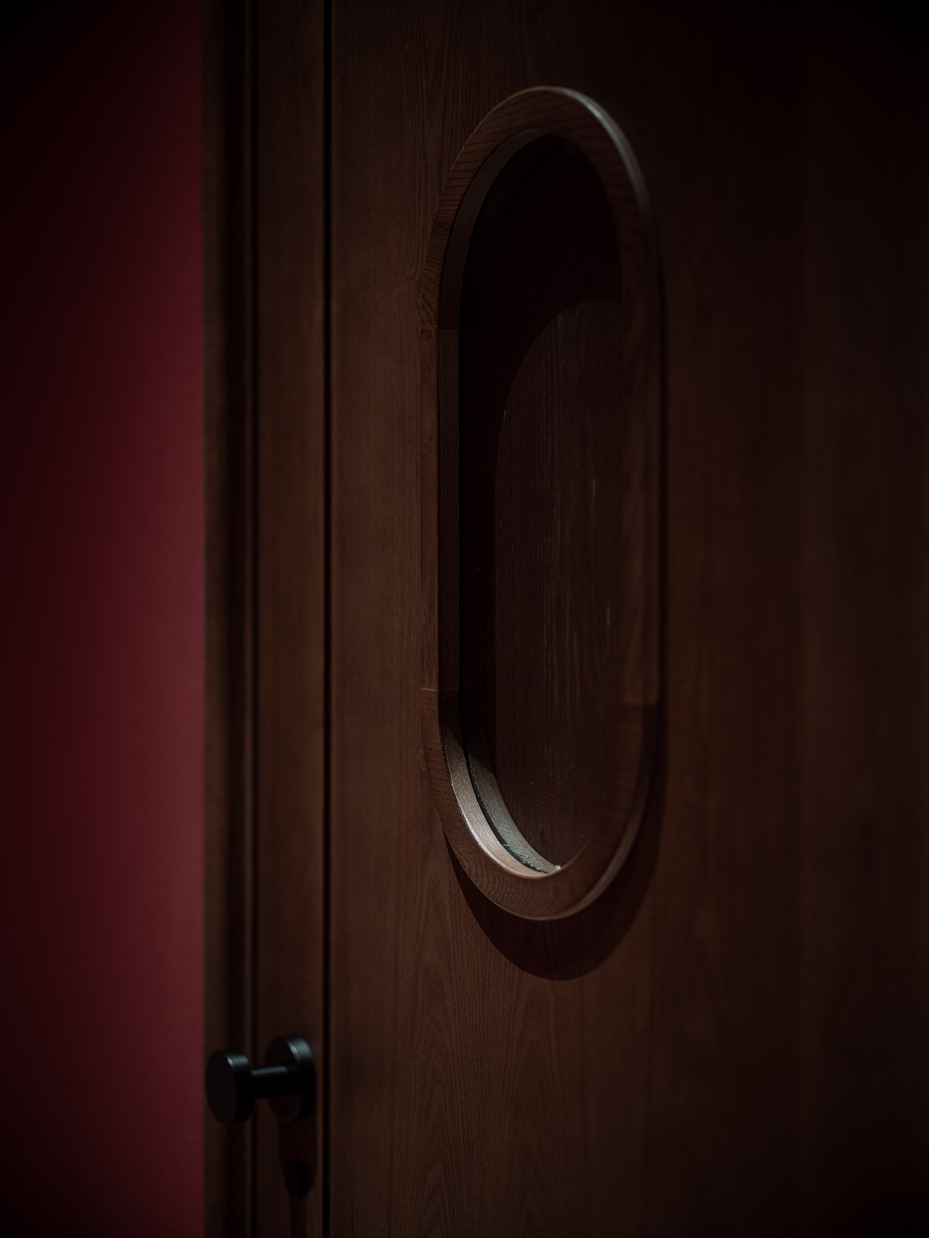
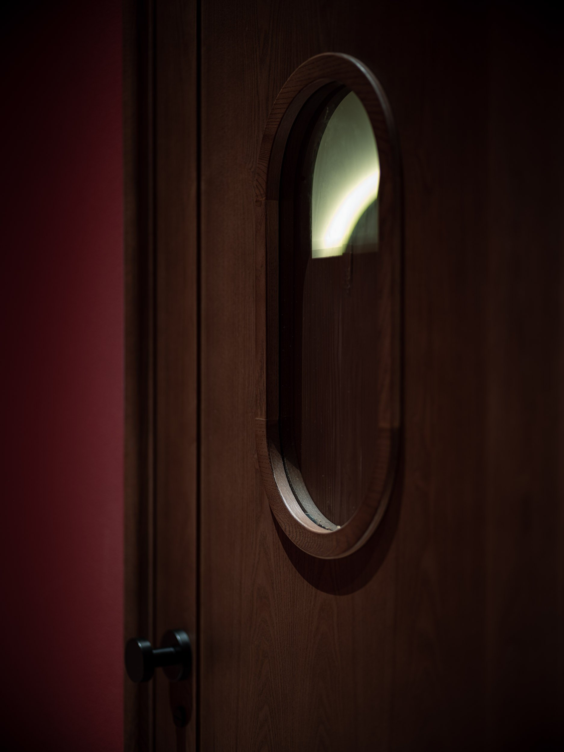
The massage rooms emanate a sense of calmness, featuring beautifully patterned acoustic wallpaper and nude-colored curvy cork tiles that enhance both aesthetics and soundproofing. An organically shaped mirror provides a practical touch-up area for guests while creating the illusion of a more spacious room. Windows are built into solid wood room doors with a magnetic mechanism providing privacy as desired.


At One With Nature.
With a completely distinct design, the foot room maintains the same tranquility. Four ergonomic massage chairs are present, each paired with a custom side table, in a spacious, nude color setting. Paired with organic, rounded oak flooring that is set in a herringbone pattern to resemble human fingers, a crucial component of foot-work treatment. With rotating lighting that mimics water reflections mirrored by a unique glass cover and liquid metal ceilings that simulate a rainy afternoon, the space also strives to bring guests closer to nature.


A Veiny Extension of The Space.
The restroom is also an extension of the identity. With the same ambiance as the corridor, characterised by the sanguine textured paint, light mosaic tiles were used to complemented to create a striking contrast. The veiny marble surfaces further juxtapose the dark elements, creating a rich yet harmonious blend of colours and materials. The pendant lighting, with its circular form reminiscent of the human form, maintains a sense of continuity with the furniture and design elements that grace the entirety of the space.


Crafting A Timeless Identity.
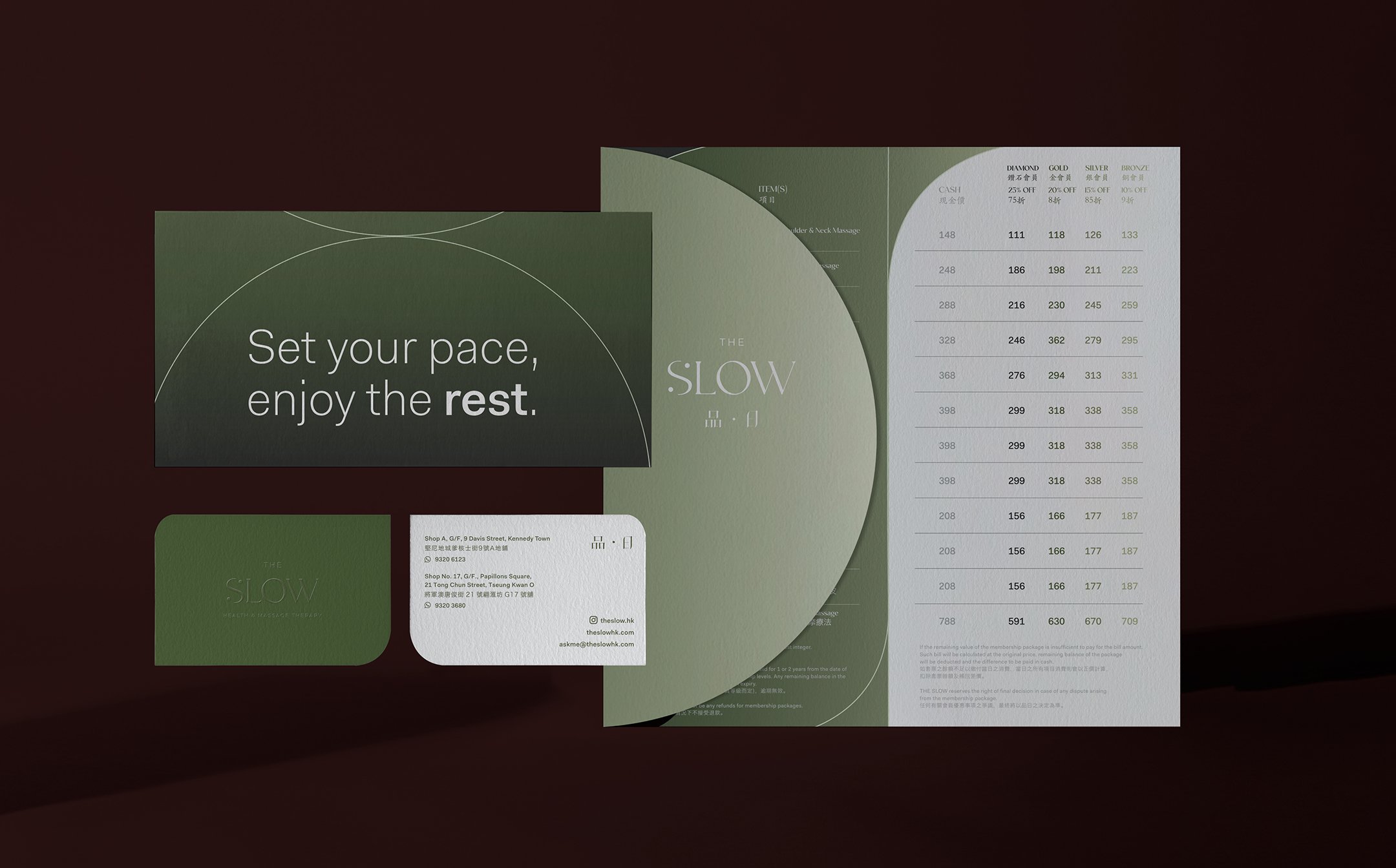
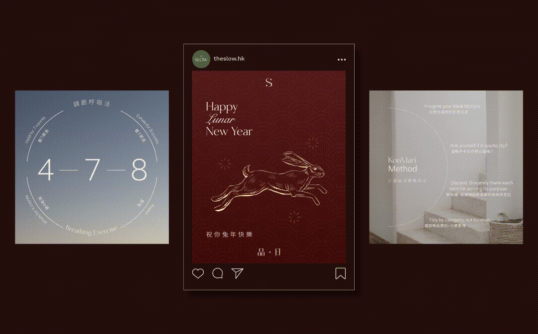
Besides the interior, the overall brand identity we have created for The Slow is timeless, natural, and serene. Through The Slow we want to create an urban retreat that allows people’s mind to wander. The Slow is not a mere massage brand, they make it the brand’s mission to introduce the lifestyle of slow-living, and to encourage people to take time to love and treat themselves apart from the hectic Hong Kong pace. To widen the brand’s appeal, we created a Chinese logo in line with the balance of the yin and yang found in the english logo. The element of serenity is heavily embedded in all the brand’s collaterals from signage and hoarding, to gift cards, and to their social media and website. Customised strategies were also developed for The Slow's Instagram grid design. Besides promoting services, it is a platform to promote The Slow’s unique philosophy, lifestyle tips, festive announcements and words of wisdom, in which the goal is to inspire people to embrace the art of Slow living.

Moment
2023
Industry
Wellness, Lifestyle
Services
Brand Management, Interior Design, Collateral Development, Brand Environments, Website Design
Credits
Images- Dennis Lo Photography
