再敘三點三

An Industrial Third Space.
A developer owned restaurant, 再敘三點三 is a modern interpretation of a classic cha chaan teng experience in Shenzhen’s Longhua District. Named after Hong Kong’s afternoon tea tradition of gathering at 3:15 p.m., the space aims to be more than just a quick lunch spot, but a community gathering venue that honours the district’s unique background of an industrial town, surrounded by abundant nature. Ultimately create a welcoming ‘Third Space’ for the building’s tenants and local neighbourhood.
House of Forme worked with the client on their brand naming, brand identity, interior design, collaterals development, FF&E design and art direction.


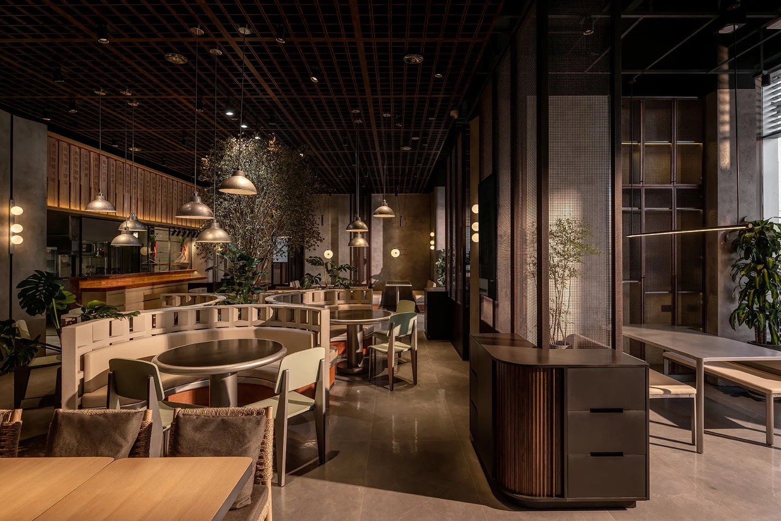
Brutalist By Nature.
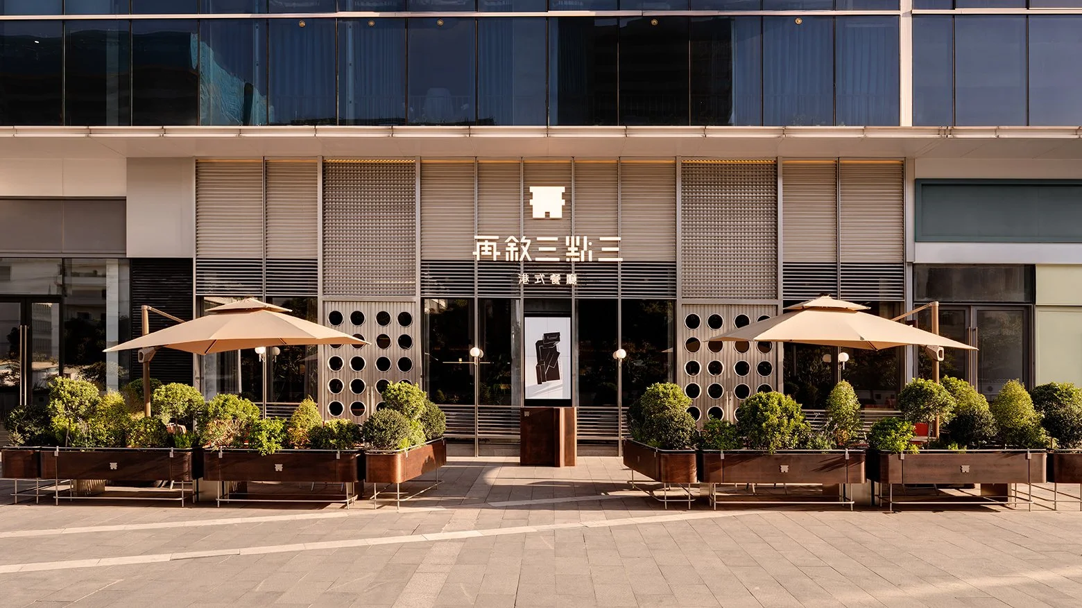
The modern industrial experience at 3.3 begins on the patio, transformed into an inviting outdoor dining garden. Enclosed by low hedges, the seating area shaded with canvas creates a tranquil escape from the industrial bustle, inviting guests to relax in the warm sunlight. A variety of seating options, from benches to sun chairs, encourages people to gather together, whether for a quick coffee, a simple snack, or a hearty meal, 3.3 is to cater to every culinary desire within the community.
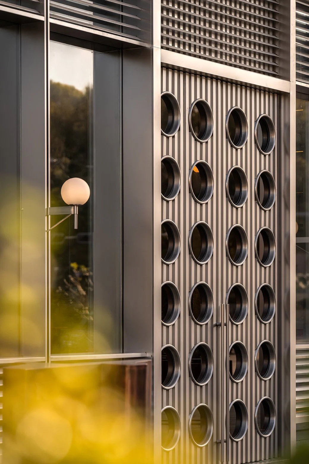
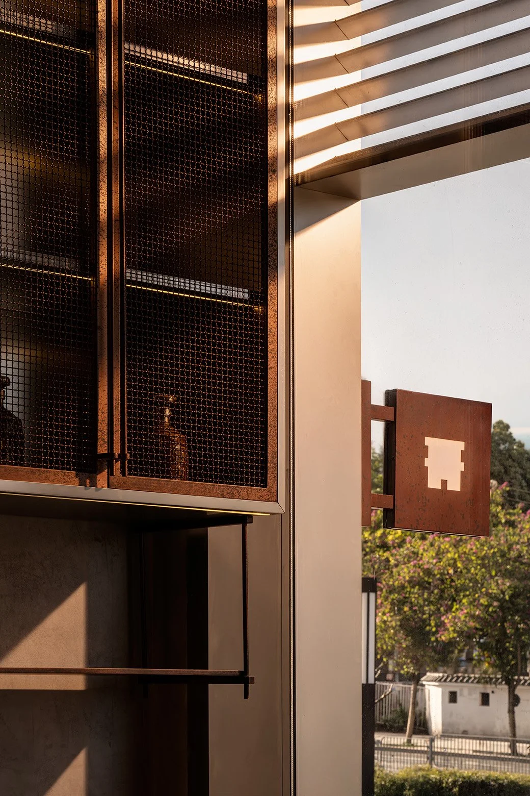
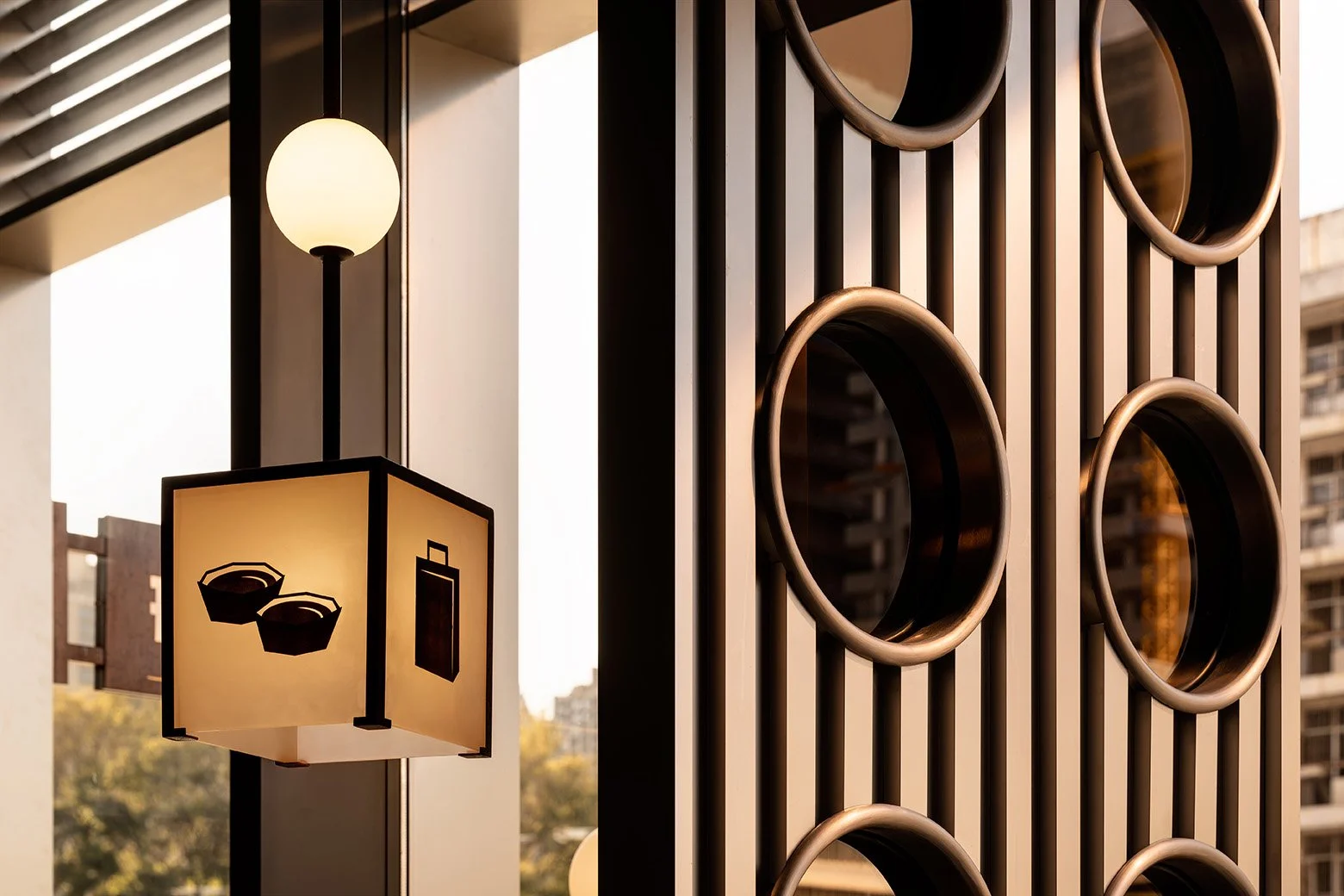
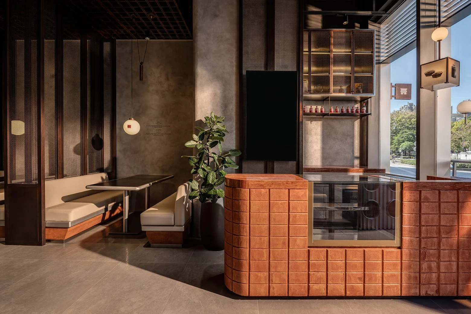
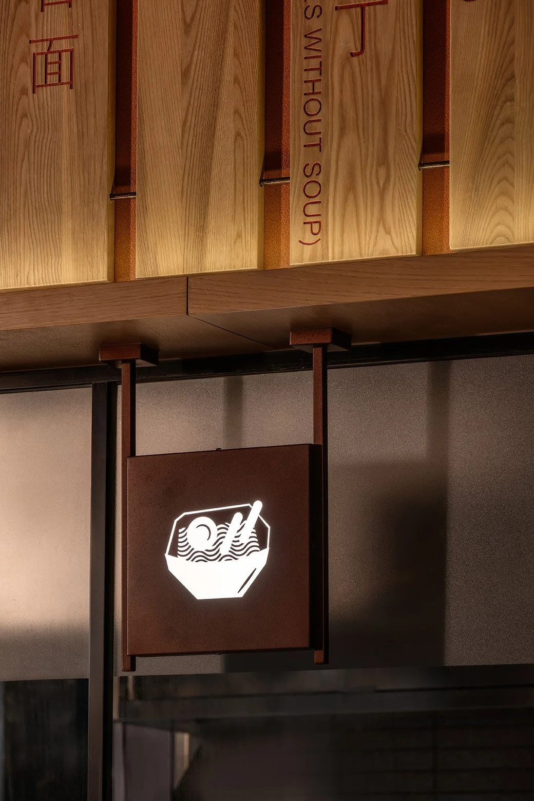
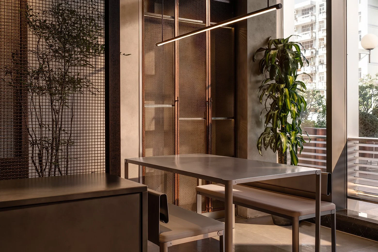
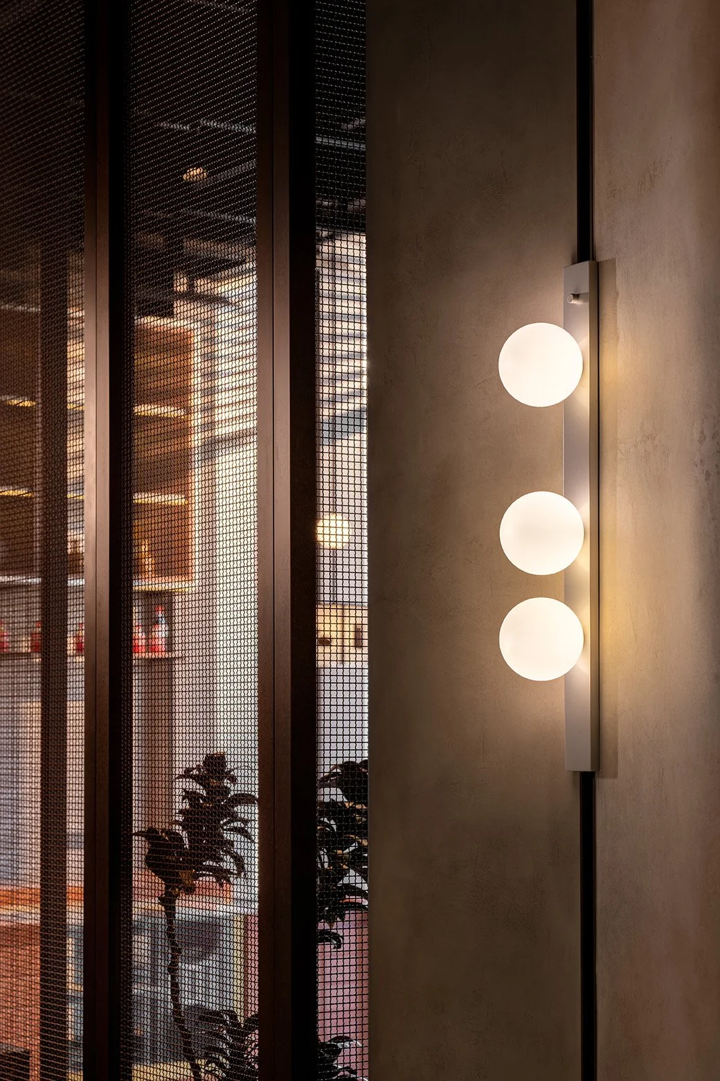
To create a striking impression from a distance, the facade is designed with contrasts. Stainless steel wraps the exterior of the restaurant and is balanced by circular windows that soften the industrial aesthetic. Upon entry, guests are greeted by a bespoke welcome counter made of oxidized steel, ensuring a warm greeting for every guest. The facade is subtly illuminated by LED lights and wall sconces, creating the perfect dining ambience both day and night.


Industrial Charm.
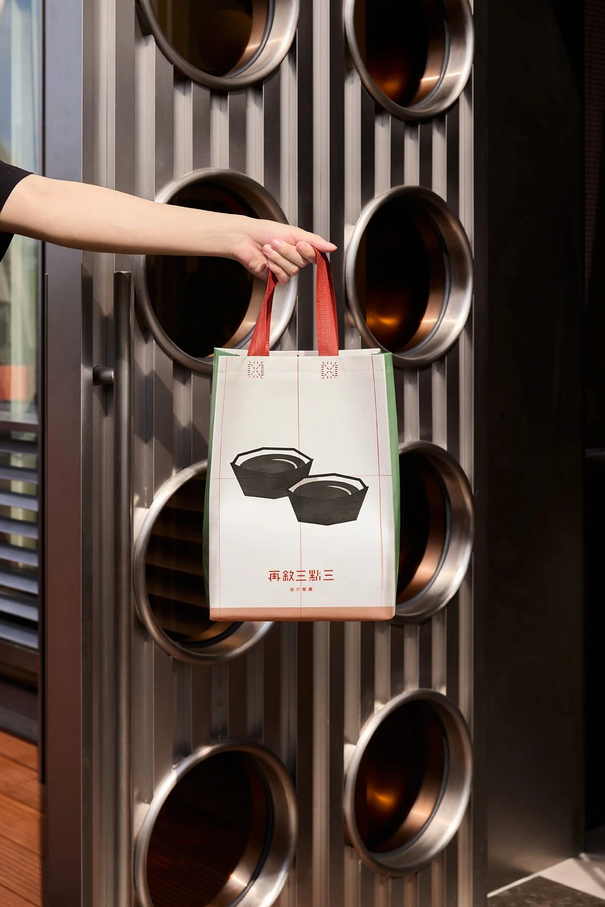
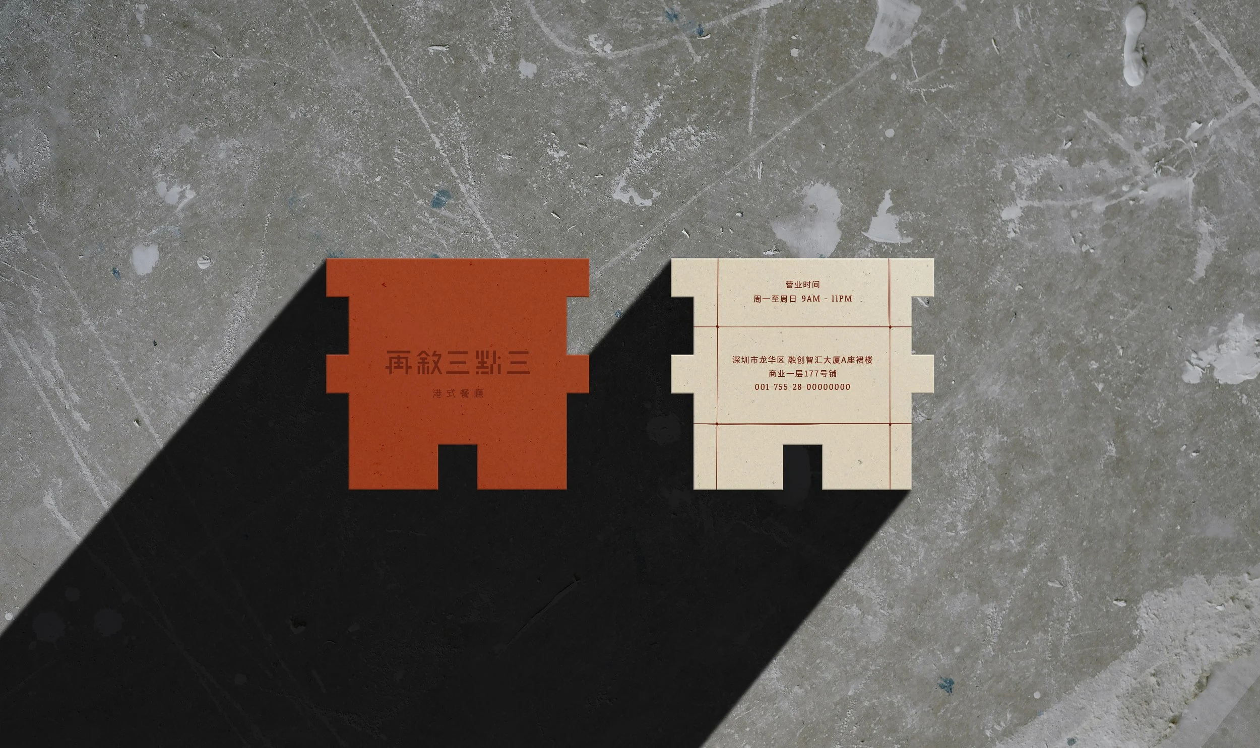
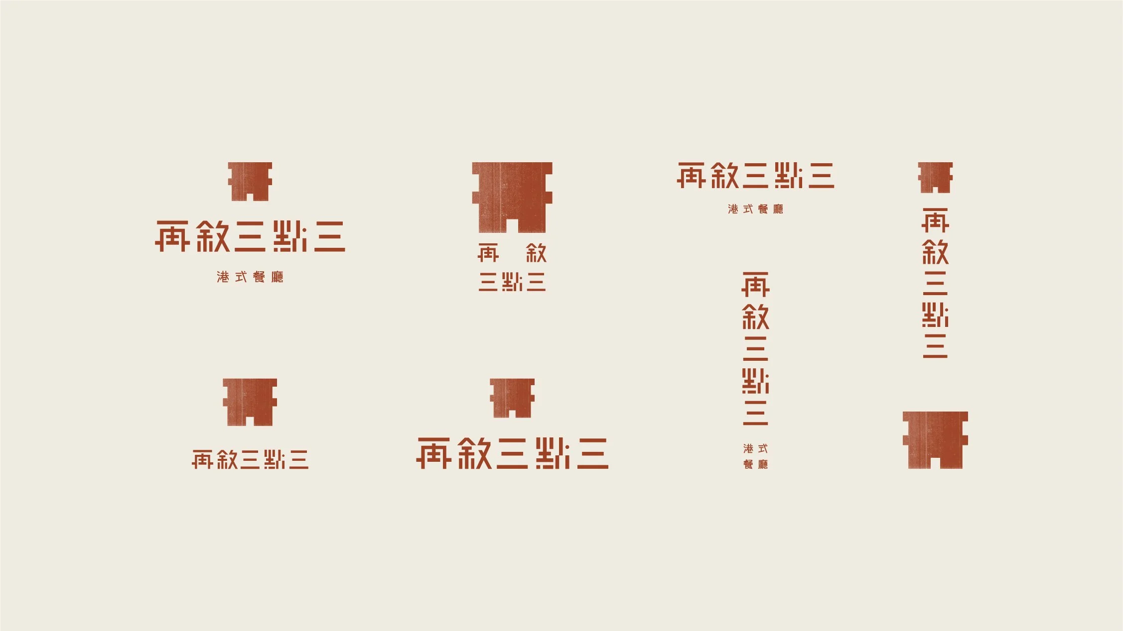
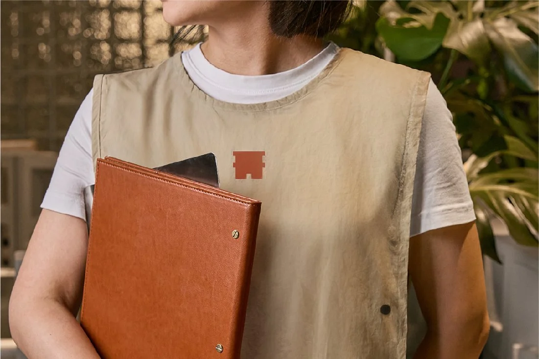
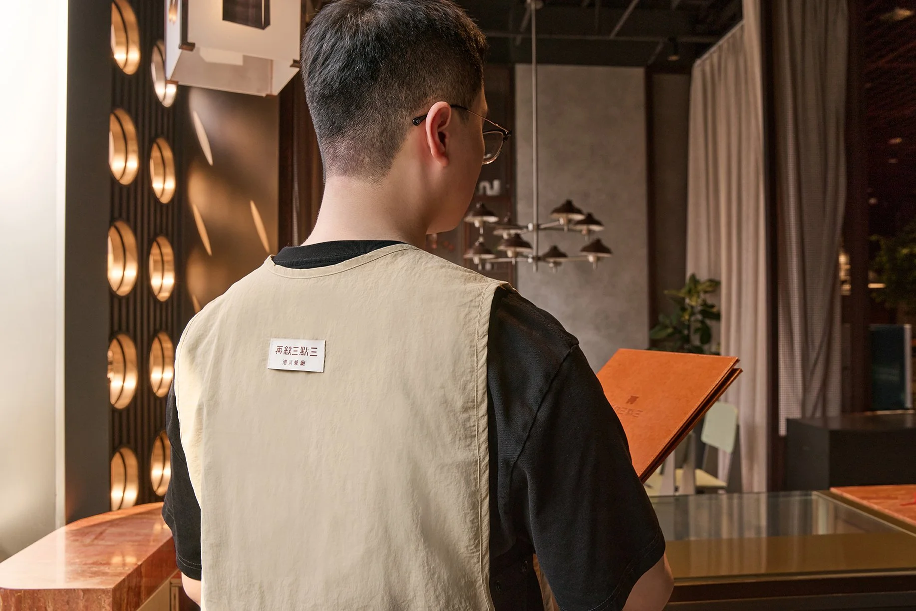
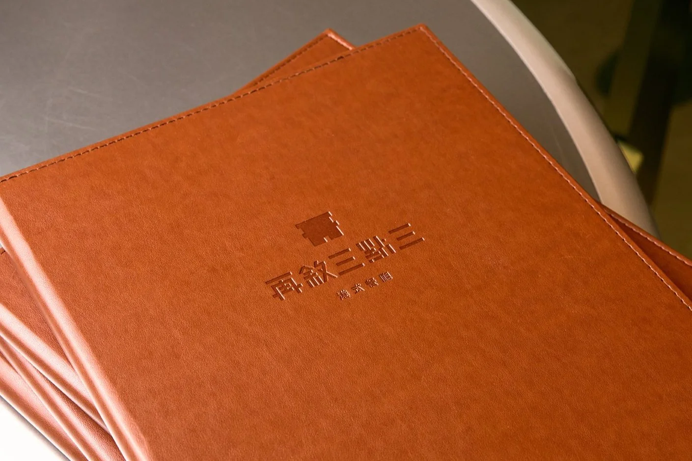
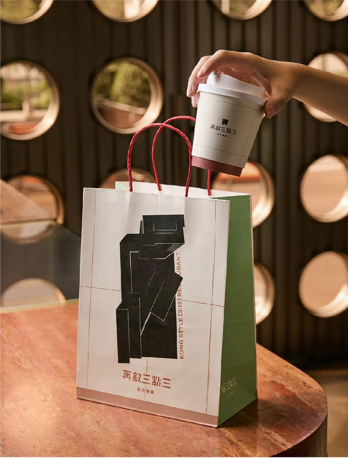
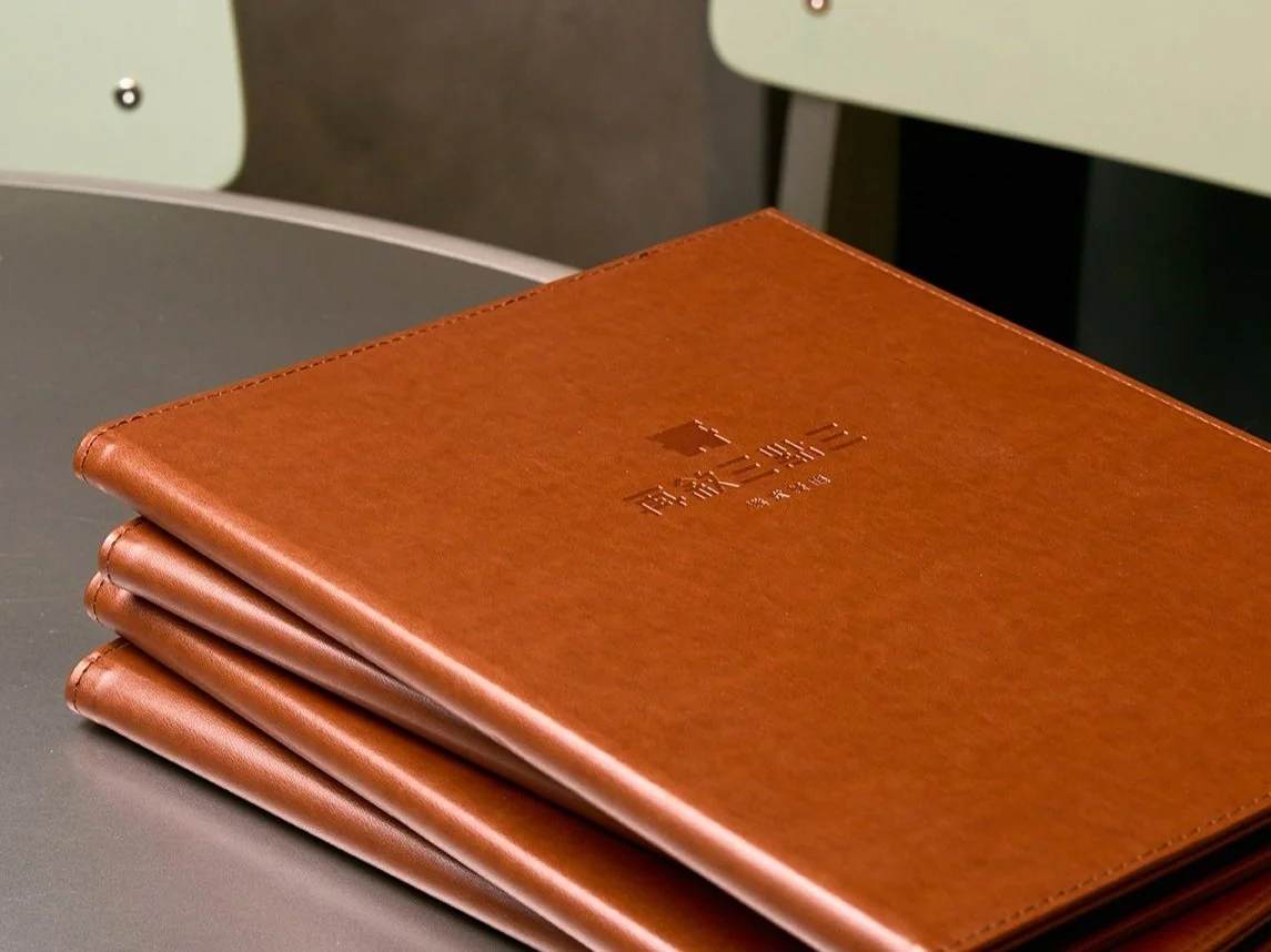
Our logo mark was designed to resemble a small house, whilst incorporating the brand’s first Chinese character “再“ into it. This simple shape can be found across the space, from the bespoke uniforms to custom signs, and packaging. Complimented by a stencil-like logotype that pays homage to the district’s industrial past, the brand logo evokes a sense of craft and imperfection, capturing the warmth of the old industrial era’s human connection.
A Homage to Nature.
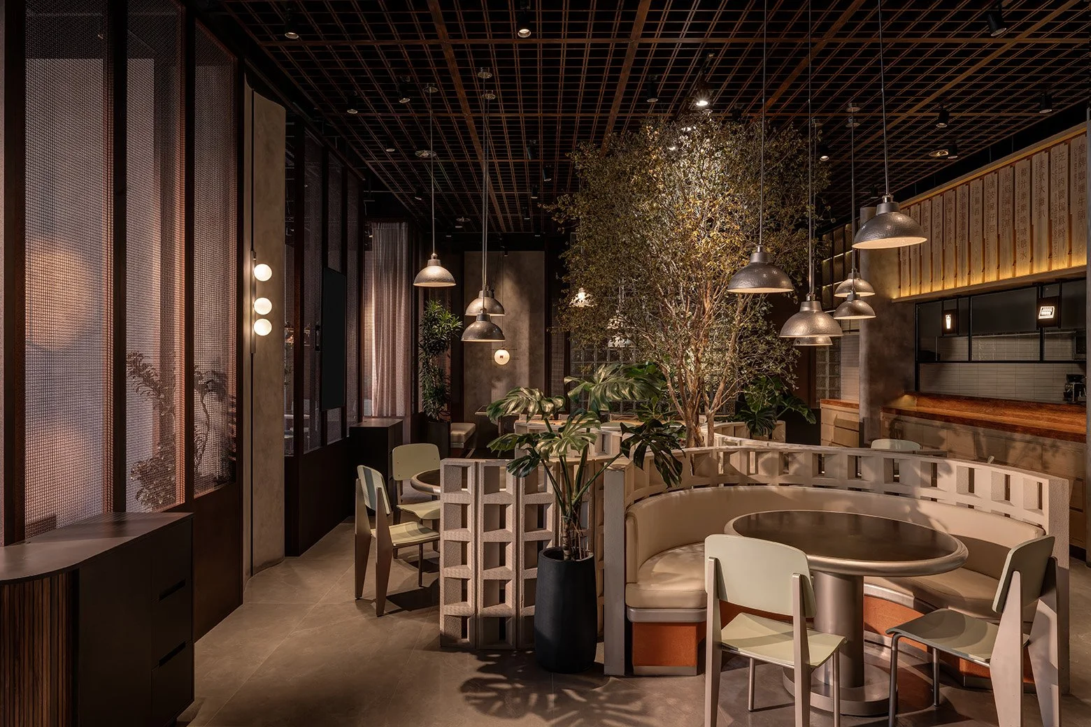
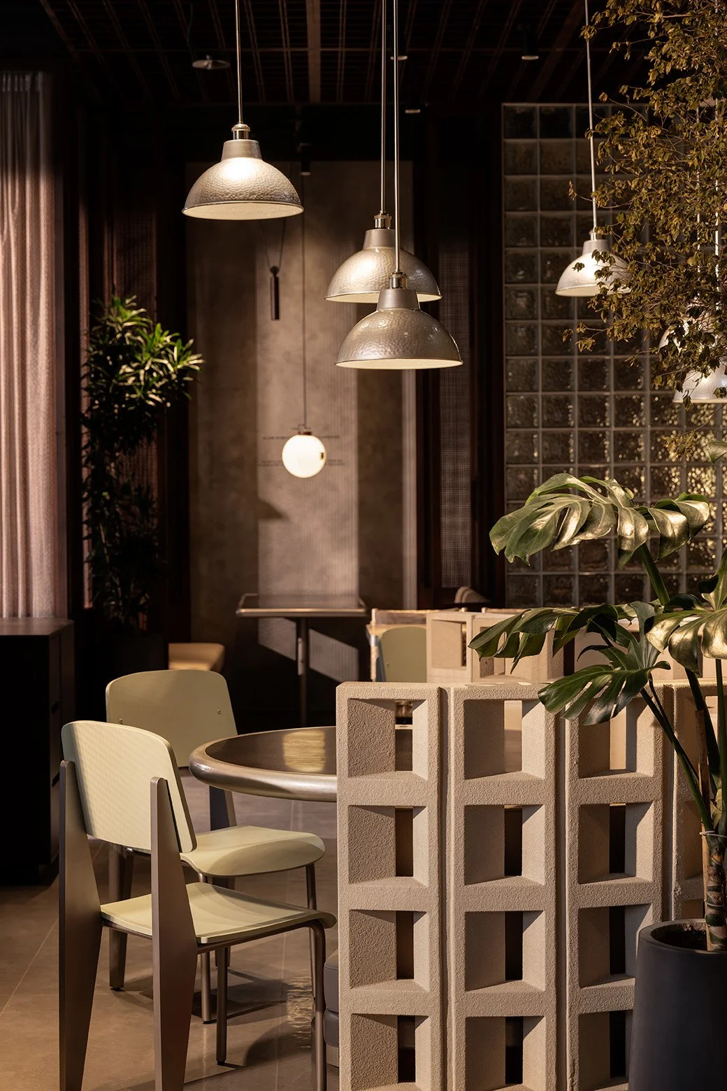
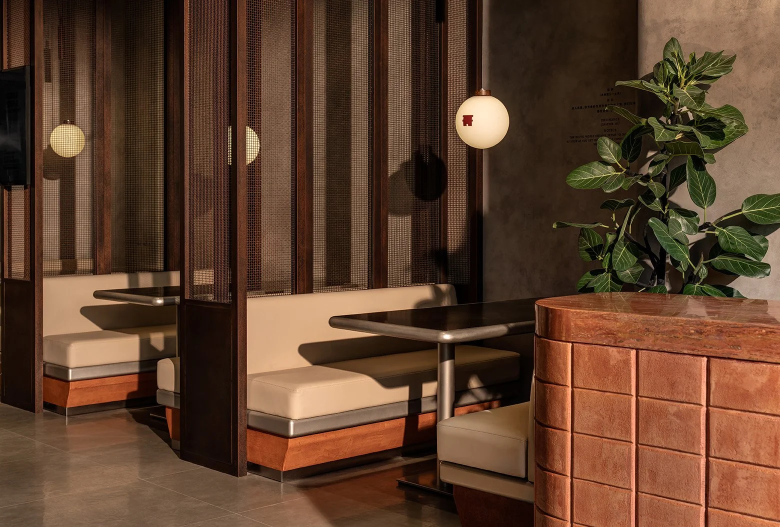
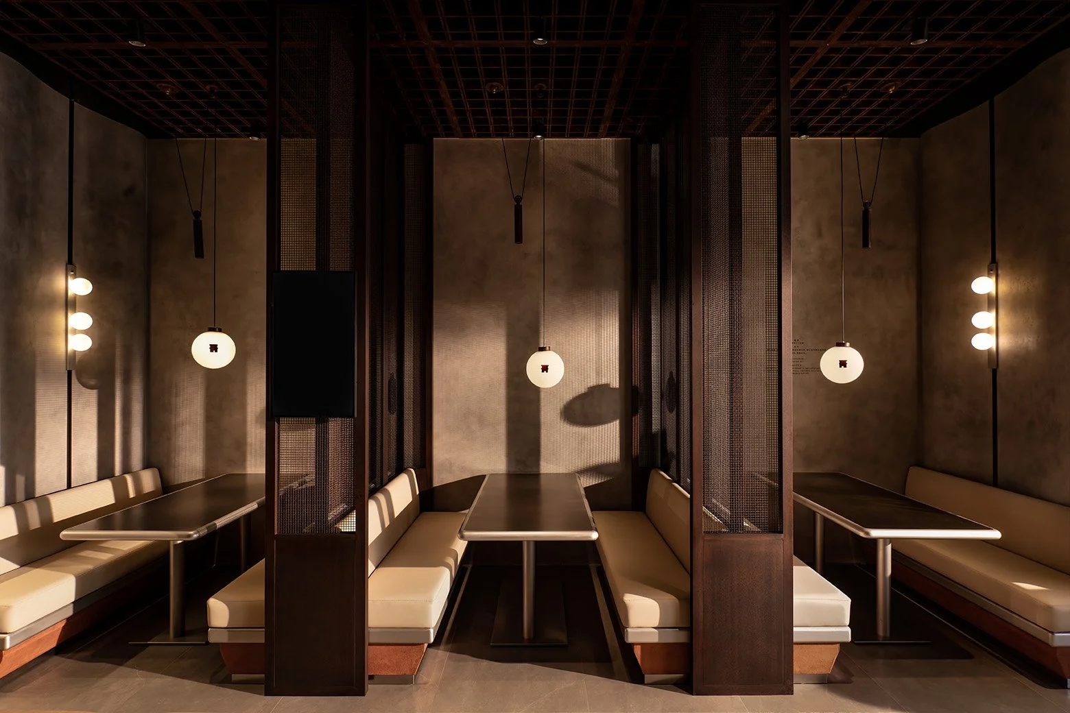
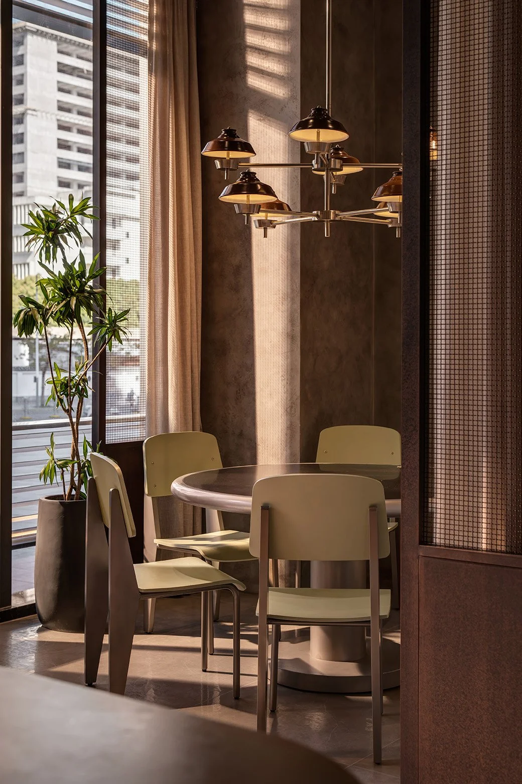
The Longhua district is home to a distinctive landscape, where an industrial area is surrounded by mountain trails. To embrace this duality, raw concrete, terracotta tiles, and sturdy metal frames are utilised in the restaurant showcases the district’s industrial nature. To honor the surrounding greenery and to soften the bold industrial elements, a sculptural tree is placed at the centre of the space, serving as a striking focal point, injecting liveliness into the environment. The overall interior design also subtly references an old industrial canteen, at the same time, infused with the cozy aesthetic of a modern coffee shop.
Bespoke Objects That Tells A Story.
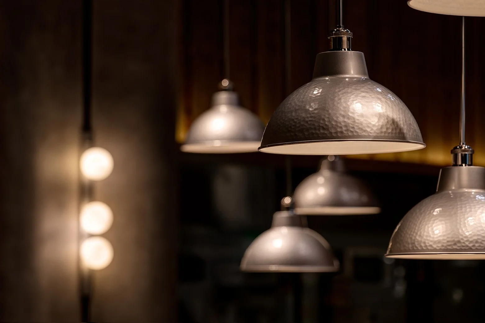
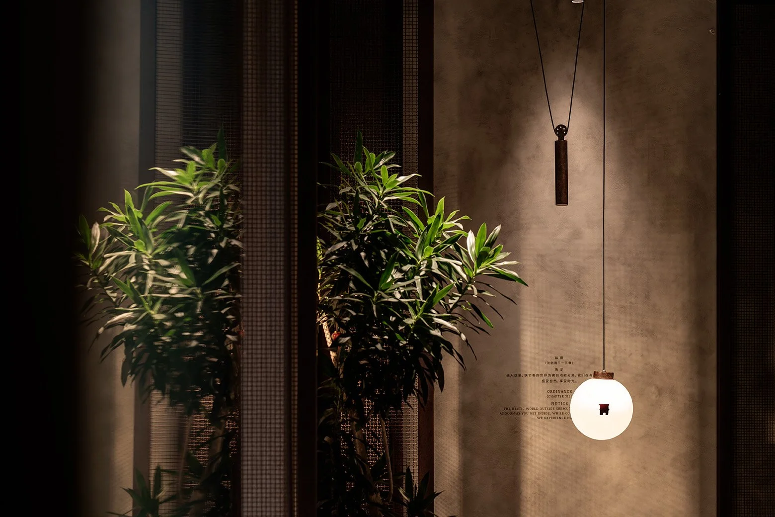
Deeply influenced by the tactile nature of industrial aesthetics, each furniture and lighting piece features custom metal accents and exquisite craftsmanship. The bespoke lighting is a particular highlight, including hand-hammered lampshades and crane-inspired lights where bulbs are balanced by counterweights, both echoing the industrial theme. In the private dining room, clay pot rice lid-inspired lights are to pay homage to Hong Kong’s culinary traditions and mirror the cuisine 3.3 has to offer.
These elements pay tribute to the neighbourhood’s rich industrial history and the brand’s heritage, while also evoking a sense of nostalgia in all customers. The addition of richly textured wood, oxidized steel, and soft fabrics, all carefully selected to align with the brand’s colour palette, creates an unexpected elegance and a unified aesthetic, a harmonious fusion of style and substance that sets it apart from typical cha chaan tengs.

Brutalist Details From Offline to Online.
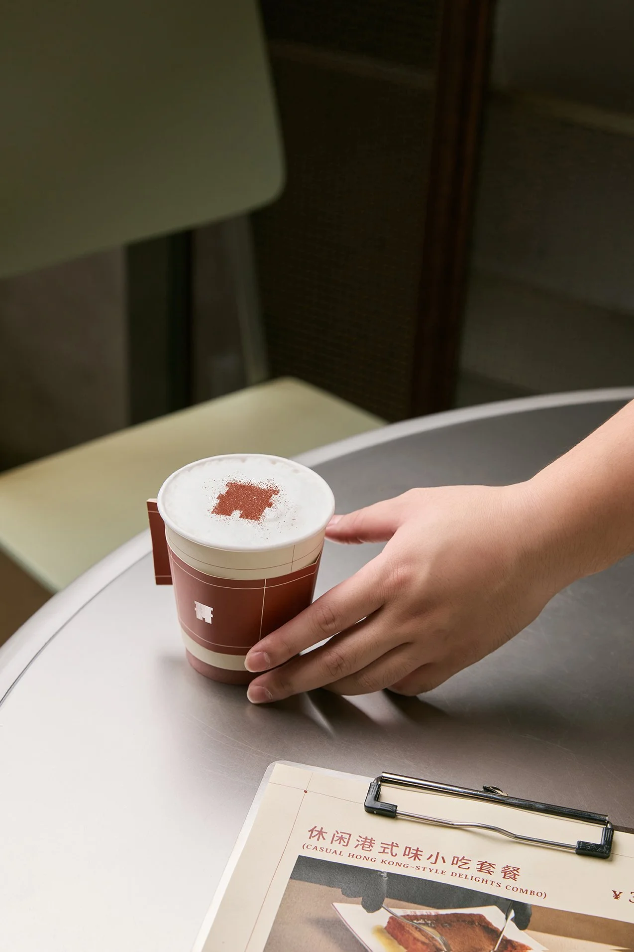
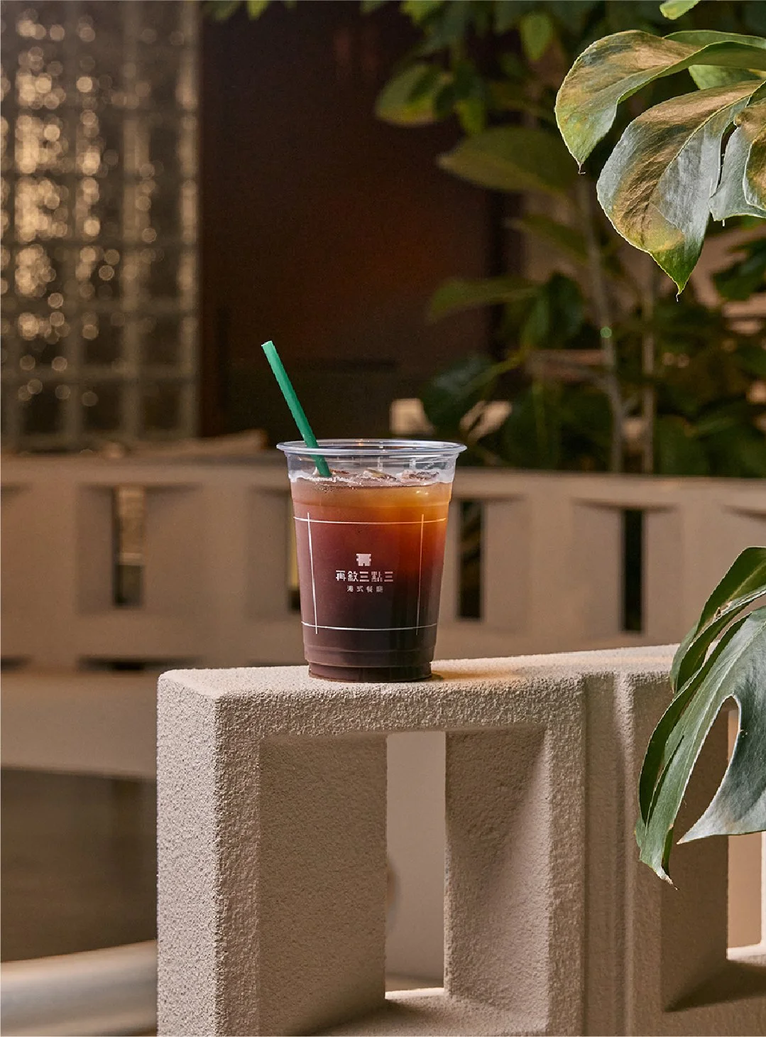
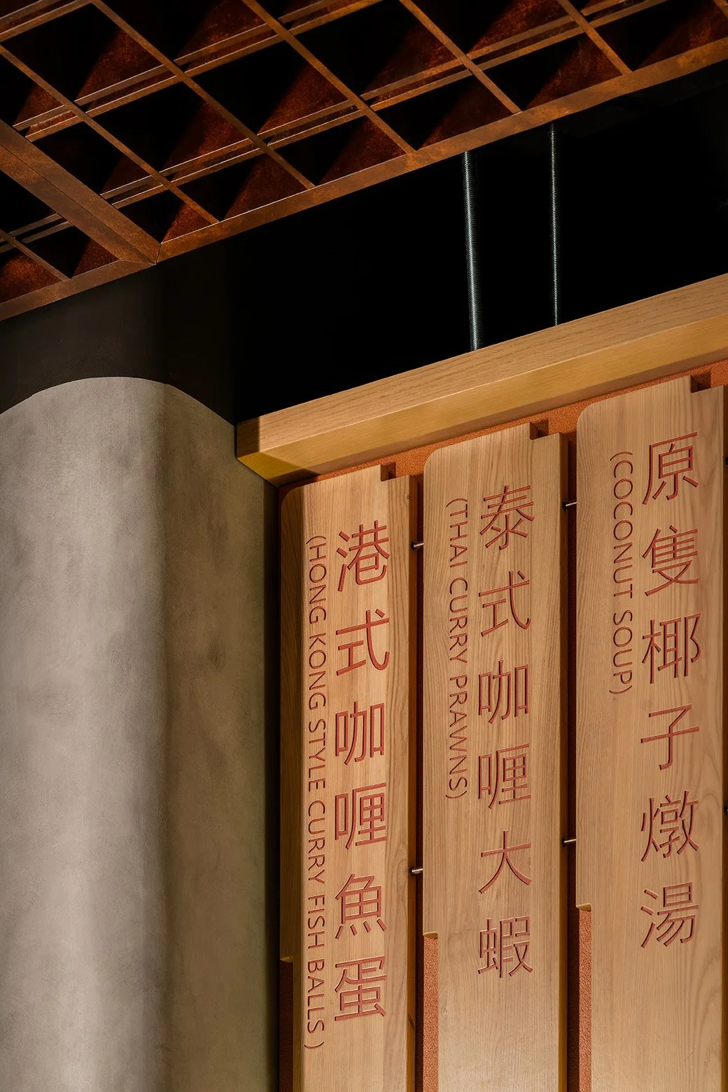
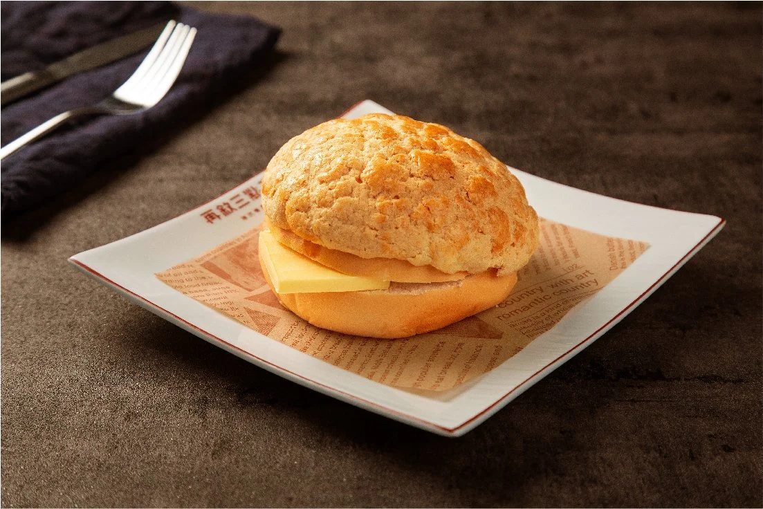
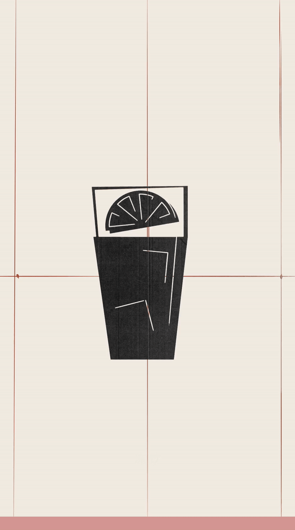
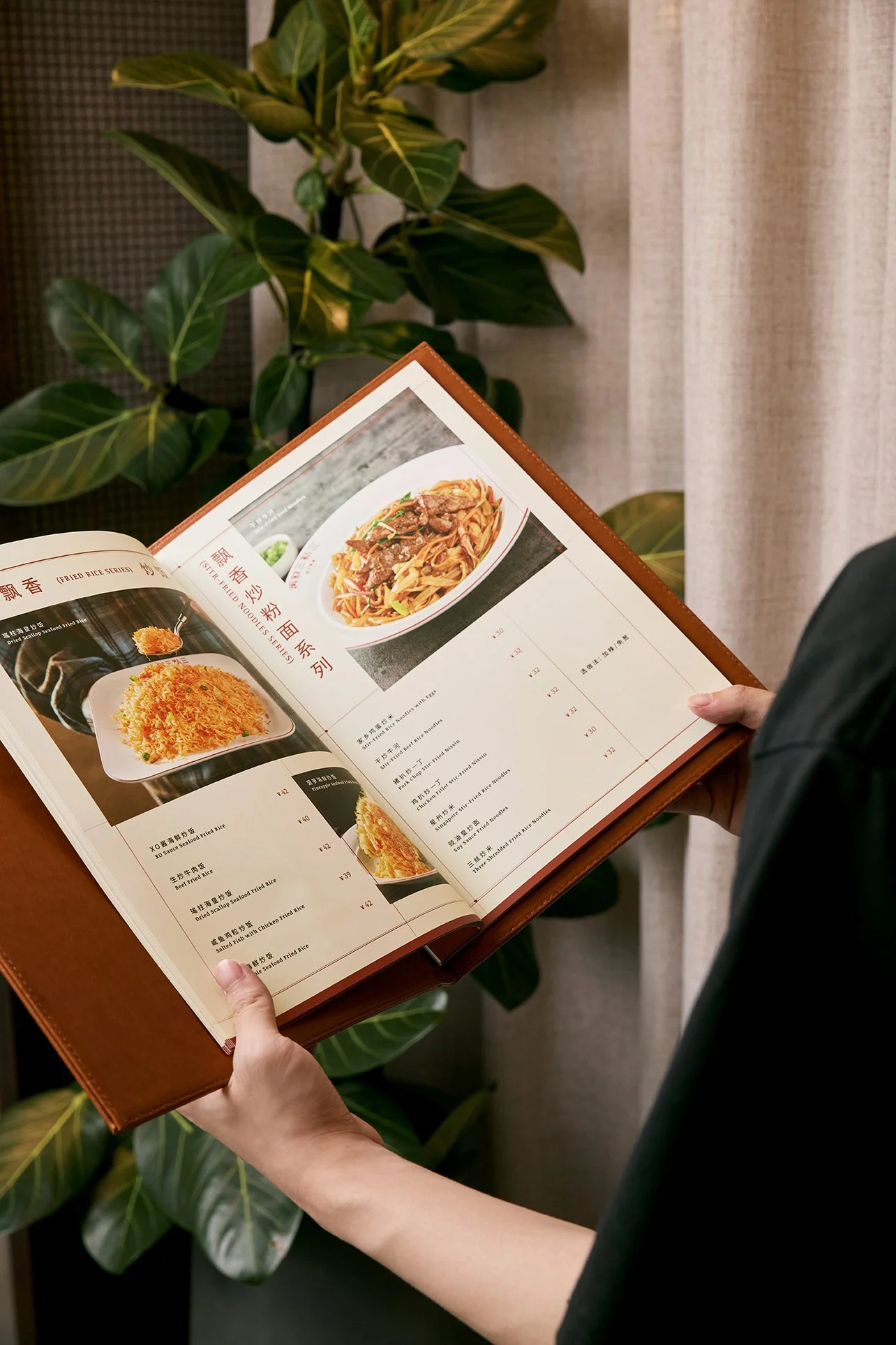
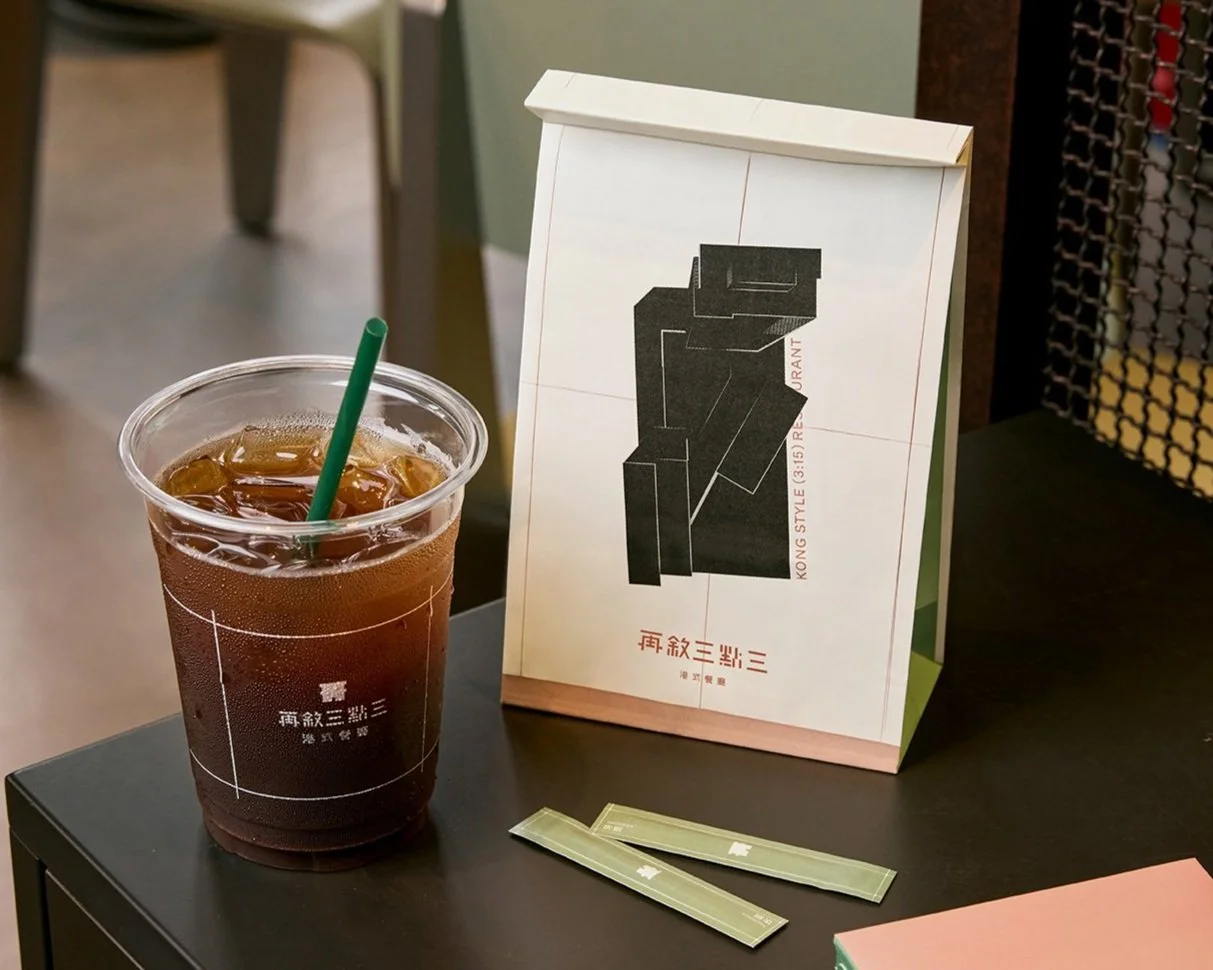
The 3.3 collaterals further activates the overarching brutalist aesthetic through careful details. Stencil like iconographies and contour inspired graphic gridlines are embedded onto coffee cups, takeaway packaging, menus, and dynamic posters, every collateral was considered to deliver a holistic brand experience. Strategic usage of brand colours can also been seen across the interior materials to create a strong synergy across all touch points.
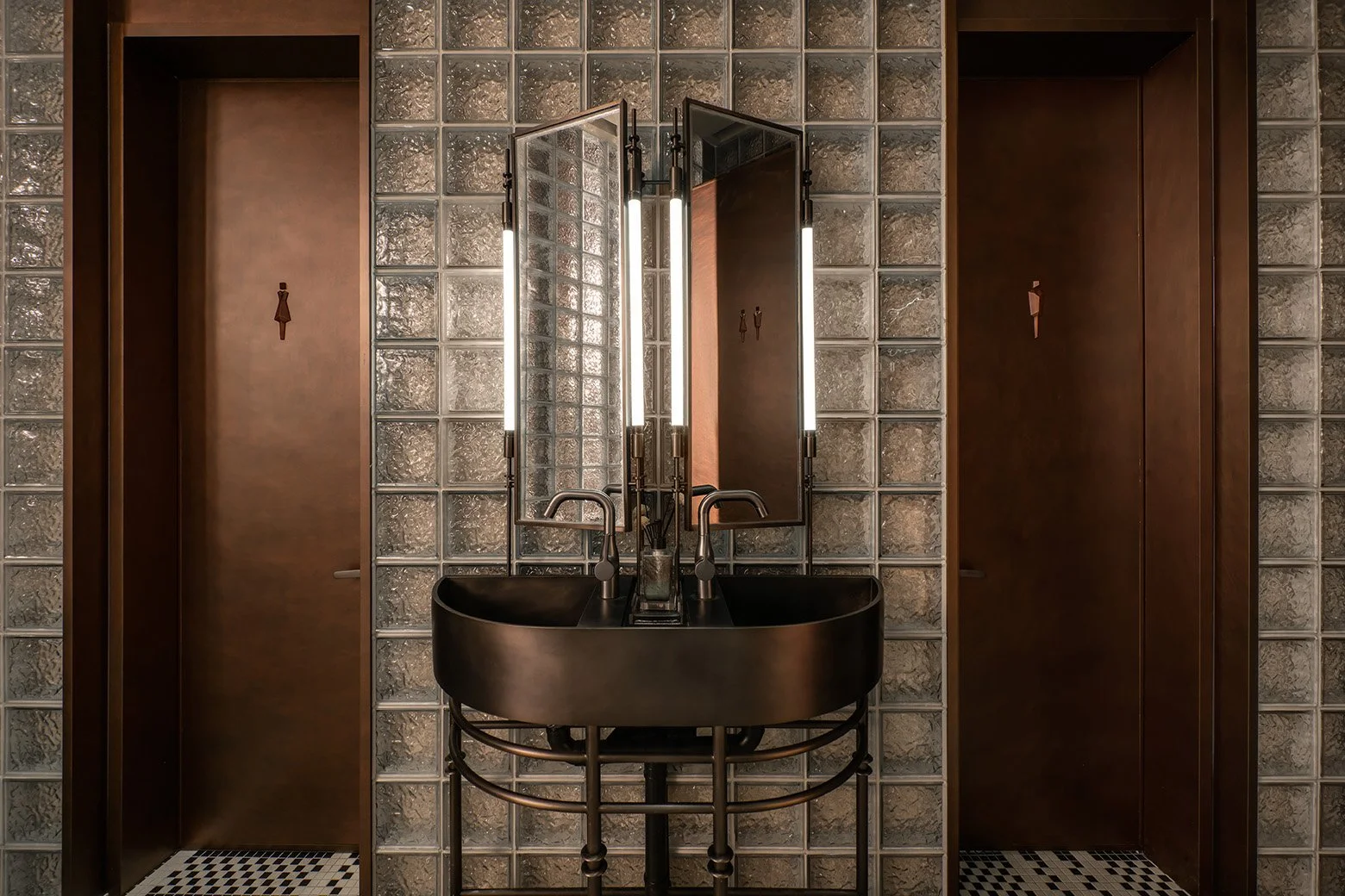
Industrial Accents.
The meticulous industrial aesthetic used in the venue extends all the way into the bathroom, where exposed pipings and distinguished glass bricks create a refined yet rugged ambiance. The flooring are contrasted with hand laid mosaic to create a multi sensory experience.


Moment
2025
Industry
Gastronomy, Hospitality
Credits
再敘三點三
Services
Brand Naming, Brand Identity, Interior design, Collaterals Development, FF&E, Art Direction
