DOCK 1A

The Heart of the Village, The Soul of Sai Kung.
In the heart of Sai Kung, DOCK 1A is the newest community lifestyle hub, created by and for the community of Sai Kung. Located near the Town Centre and Pier, this establishment spans 56,000 sq.ft. with four floors of retail space and ten floors of parking. Under new management, it is dedicated to serve the Sai Kung community and share its spirit with the world. Designed to blend necessity, utility, and entertainment, DOCK 1A is the manifestation of the village, a spirit that shines so bright, that travellers from near and far come to get a taste of Sai Kung’s charm.
House of Forme worked with DOCK 1A on their brand naming, strategy, identity, interior design, collaterals development, FF&E design and Art direction.


Dock Here & Embark on a Sai Kung Adventure.
“DOCK 1A” is a name that speaks to Sai Kung’s soul. “DOCK” reflects the area’s harbour and waterfront location, a vital part of the community. It also signifies the role of it as a place to “dock” or park before exploring Sai Kung. “1A” refers to the address, 1A Chui Tong Road, while also suggesting a sense of arrival by using the first number and letter in the alphabet and arithmetic value.

Dock. Eat. Play. Repeat.
Sai Kung is more than just Hong Kong’s backyard, it is a melting pot of tradition and modernity. A fishing village with its own captivating spirit, a haven nestled between land and sea, an old town brimming with idyllic charm, and a tight knit community with an eclectic character. Through the branding of DOCK 1A, we aim to capture and convey this multifaceted beauty of Sai Kung.
Our brand system draws heavily on Sai Kung’s maritime heritage. Stamp-like graphics resembling the stamps on ship tickets, combined with dock-inspired fonts and layouts, acts as an invitation for visitors to explore Sai Kung. Inspired by shapes and silhouettes that shape Sai Kung, we utilised kaleidoscope-like adaptive patterns derived from these local elements like roof tiles, rattan baskets, fishing and boat knots, and kite structures to further emphasise Sai Kung’s rich history, culture, and diversity.


A Love Letter To Sai Kung.
The DOCK 1A logo is a love letter to Sai Kung. The bespoke spray-painted typeface is inspired by dock lettering, a reflection of the structure and form of the waterfront. The logo itself is a continuation of the brand system’s stamp motif, combining the Chinese character “壹” with a dock structure. The graphic also resembles a Hakka village roof, honouring the original residents of Sai Kung.
The vibrant spirit of Sai Kung is conveyed through DOCK 1A’s welcoming colour palette. Taking inspiration from Sai Kung’s Public Pier and the surrounding natural landscape, these brightly neutral colours highlight the area’s attractive scenery and express a sense of limitless potential.
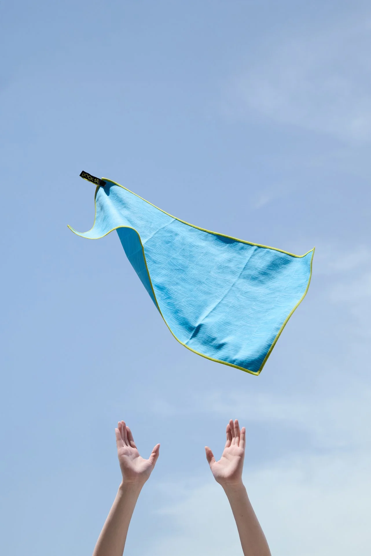
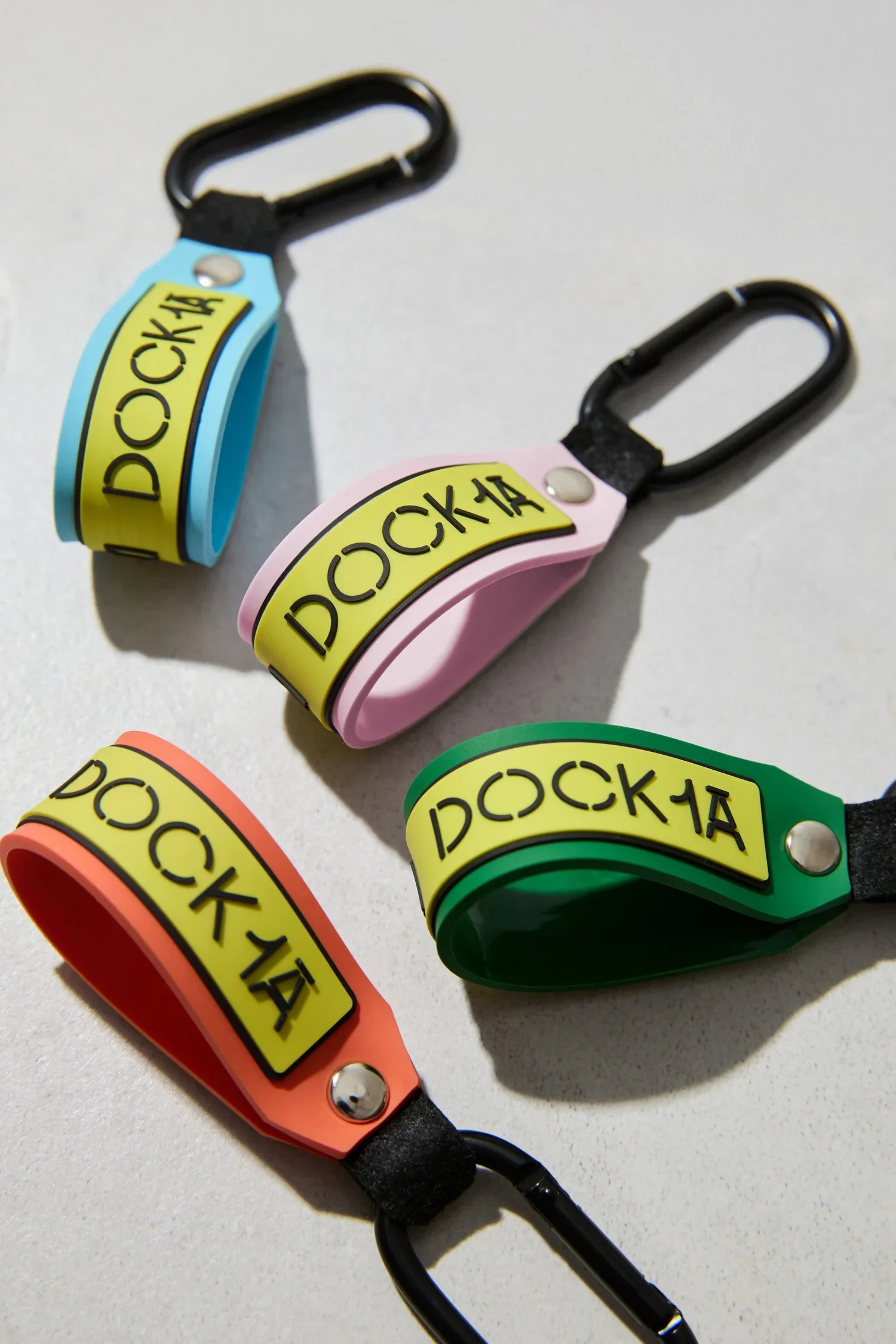
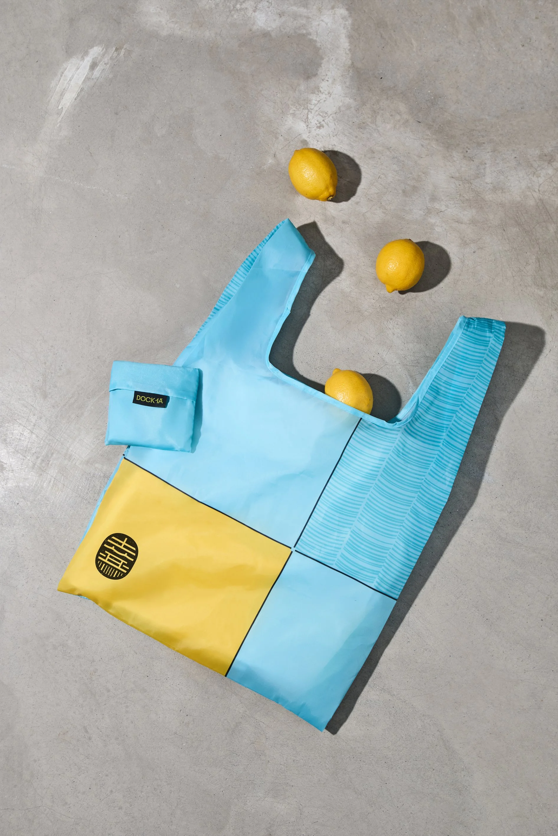
To celebrate the opening of DOCK 1A, a launch activation gift set was designed to strengthen brand awareness and commitment towards its community. The set includes a range of useful items for all: a waterproof transparent bag for carrying travel essentials, a quick-dry towel for car owners and outdoor enthusiasts, a portable fan perfect for hikers under the hot weather, an environmentally friendly reusable bag handy for various occasions, a vibrant key ring for carpark tenants, and a pen with embedded brand messaging as practical utility.


Where Land Meets Sea; Lifestyle Meets Community.
To highlight the entrance of DOCK 1A, which was tucked away from the Main Street, we added a wooden canopy to create an inviting and refreshing experience, embedded with a custom Brand signage that illuminates the streets. The facade windows have also been completely replaced to enhance transparency to maximise its connection with the outdoors.
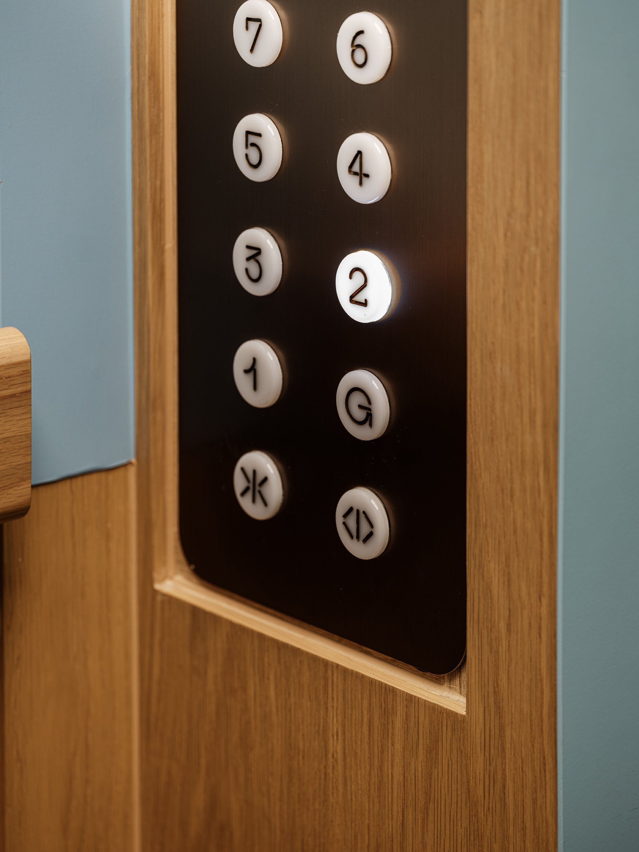
Upon entering the space, visitors are surrounded by cozy, dark timber panels. Designed to juxtapose with the rest of the building, the ground floor interior offers a sensory experience. Equipped with rattan basket-inspired lighting and classic Chinese tiling details that add unique cultural touches to the zone. The flooring utilises a lighter combination of concrete like wooden flooring to produce a sense of depth and texture, while the lift button joinery is thoughtfully designed to resemble a growing bamboo shoot.


By The Community. For The Community.
The lifts at DOCK 1A are brightly coloured with the brand’s signature blue. Building upon the existing lift structures, the ceilings are inspired by ship structures, and are embedded with LED lightboxes to illuminate the space. The flooring is a collage of different wood shades, creating a special floor pattern that reminds one of Sampans, traditional wooden boats found in Sai Kung. Crafted to resemble Mahjong tiles, the lift buttons add a distinctive and nostalgic touch that connects to Hong Kong’s cultural heritage.
Meticulous details that reflect Sai Kung’s unique character are also palpable throughout the lift lobbies and general areas at DOCK 1A. Textured paint adds a touch of elegance to the space, while rope details evokes the area’s fishing heritage. Along the escalator from ground floor to the first floor is a “fisher wall” with canvas weaving through wooden joinery like sails on a boat.


Nature In Dock.
The essence of Sai Kung as a natural escape permeates the general space at DOCK 1A, conveyed through organic forms, reflective surfaces, and nature-inspired hues. The motif of wave splashes is expressed through an eccentric lighting design beneath the escalator. A captivating ceiling decoration is installed in the atrium void, consisting of roof tiles in glass-looking finishing suspended from the ceiling. These tiles not only remind one of the multi-layered waves of the ocean, but also the traditional roof tiles found in Hakka villages, paying respect to their rich heritage.
As a port for visitors to dock and recharge for their adventures, DOCK 1A offers a generous array of seating areas, like checkpoints of a mountain hiking trail, these seatings were designed for visitors to rest as they navigate through the space. Each floor offers seating areas inspired by different aspects of nature: log-inspired seating with hand-carved tops for added comfort, alongside plaster-painted bowl bases and built-in planters; others showcase pebble-inspired seating, designed in round, white forms, with botanic pattern and earthy colours that add on to recreating the essence of mountain trails with surrounding vegetation.
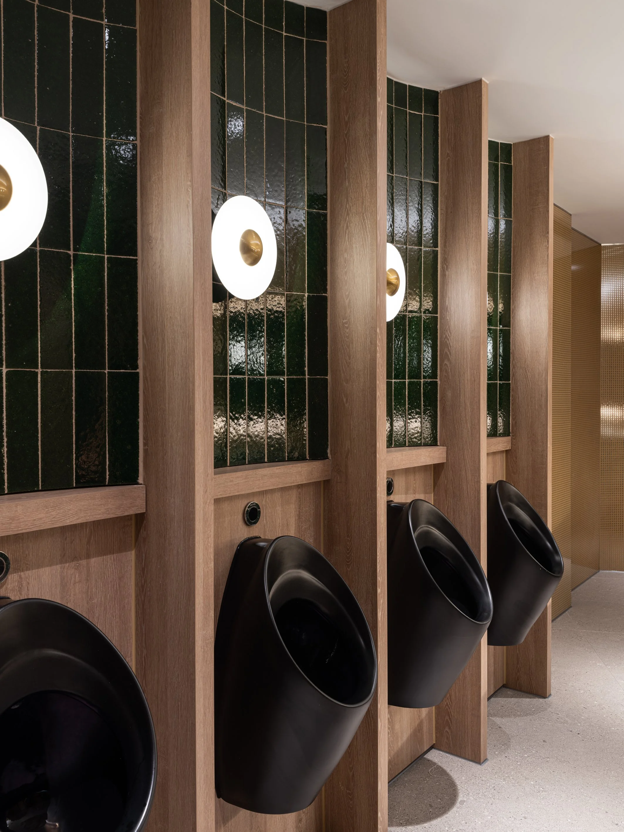
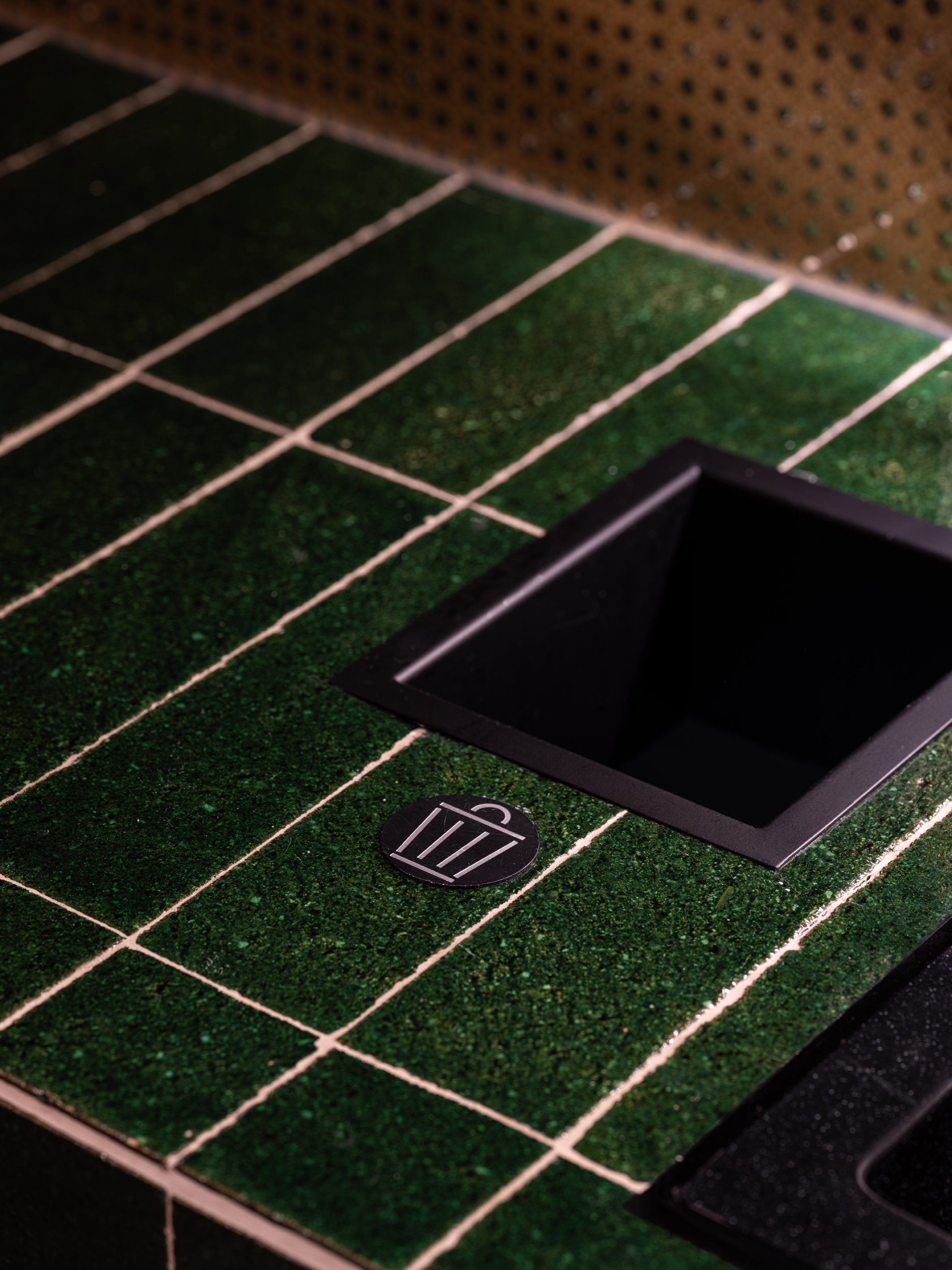
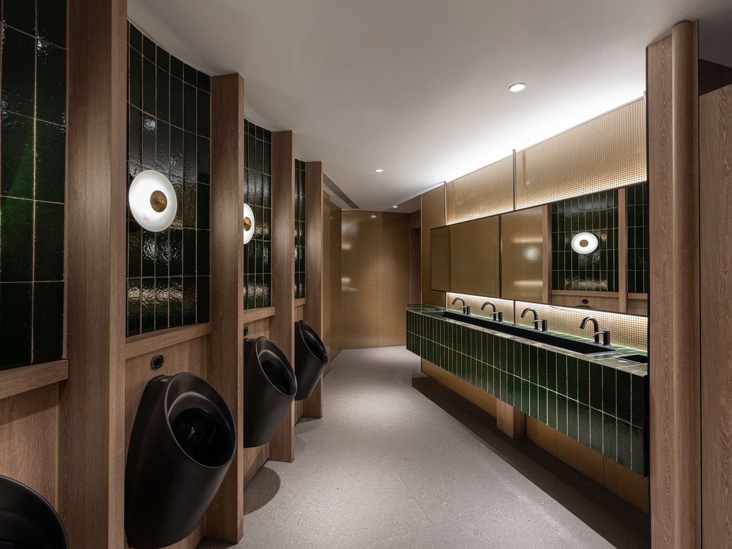
The washrooms offer a distinct experience, a celebration of the bustling Sai Kung markets. Influenced by the energy of these local markets, the design incorporates basket-like details, reminiscent of traditional market baskets, through wooden finishes and circular shapes. A juxtaposing colour palette, complemented by accented green tiles, creates a rich and immersive environment, transporting visitors on a journey through Sai Kung’s rich history.


Every Trip to Sai Kung Starts Here.
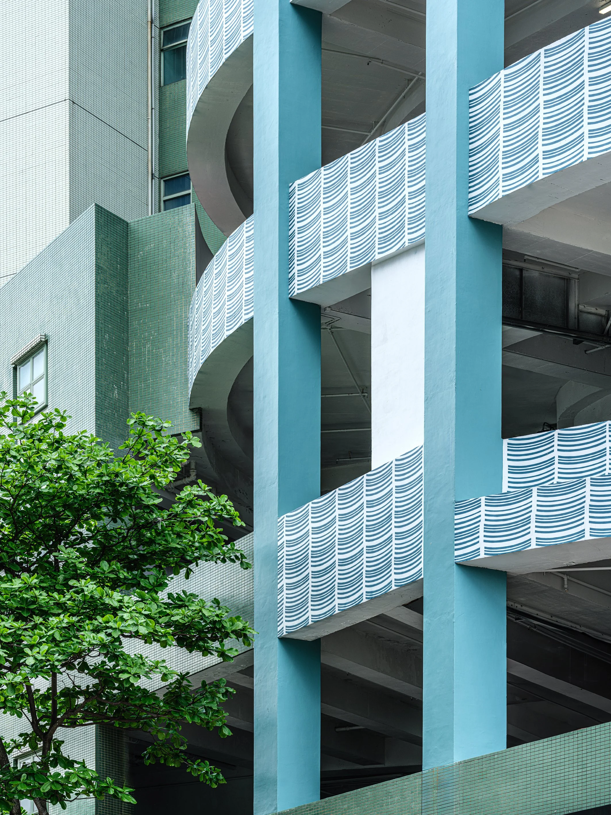
To bring a refreshing visual transformation to DOCK 1A and shed its old image, the exterior walls have been repainted in the brand’s vibrant colours to maximise its visual impact. Along with branded patterns to accentuate DOCK 1A’s appearance. A bespoke parking sign, designed with an old cinema aesthetic further enhances the facade, allowing drivers entering Sai Kung to easily locate the parking lot. Now easily recognisable from afar, DOCK 1A asserts its presence in the Sai Kung community.
A well-designed wayfinding system is essential for navigating DOCK 1A’s diverse offerings. Inspired by the theme of bamboo scaffolding, the wayfinding elements incorporated similar materials and aesthetics. Fixed wall signs are built for each tenant and positioned for easy visibility. Suspended and Standee way finding signage is also found on each floor.
As DOCK 1A is home to multiple levels of car parks, a clear and intuitive wayfinding system is essential for enhancing user experience. To highlight the location of the car park’s lift lobby on each floor, the vibrant brand colours are implied on the walls near the lobbies, along with custom brand iconography to capture attention and enhance consistency across all levels.


Moment
2025
Industry
Retail, Hospitality, Lifestyle
Credits
Dennis Lo Photographer- Interior Photography
Vizion Creation- Brand Photography
Services
Brand naming, Strategy, Identity, interior design, Collaterals development, FF&E design and Art direction.
