BING SUTT

Authentic Taste of Hong Kong in Paris.
"BING SUTT" (冰室) is an inviting Hong Kong-style cafe nestled in the heart of Paris. Located between the city’s burgeoning design scene and thriving business hub, BING SUTT is a space that was created to share the rich and multifaceted flavours of Hong Kong. Designed to introduce authentic Hong Kong delights to a new crowd while reinventing traditional European beverages with a Hong Kong-inspired twist; bridging the East and West through the universal language of good food.
House of Forme worked with the client on their brand concept, visual identity, branding collaterals, and content creation.


Retelling the Bing Sutt Story.
Emerging from Hong Kong's vibrant history, the fascinating narrative of BING SUTT unveils. As a haven that catered affordable meals and refreshing snacks to the working class during a time when refrigerators were a luxury, BING SUTT embodied a key tradition in the local community. Reflected through the lens of a bygone era, our concept for BING SUTT draws on the convenience and efficiency of the well-recognised Hong Kong staple. BING SUTT in Paris introduces an environment with Hong Kong roots and warmth for individuals to get to know the BING SUTT story.
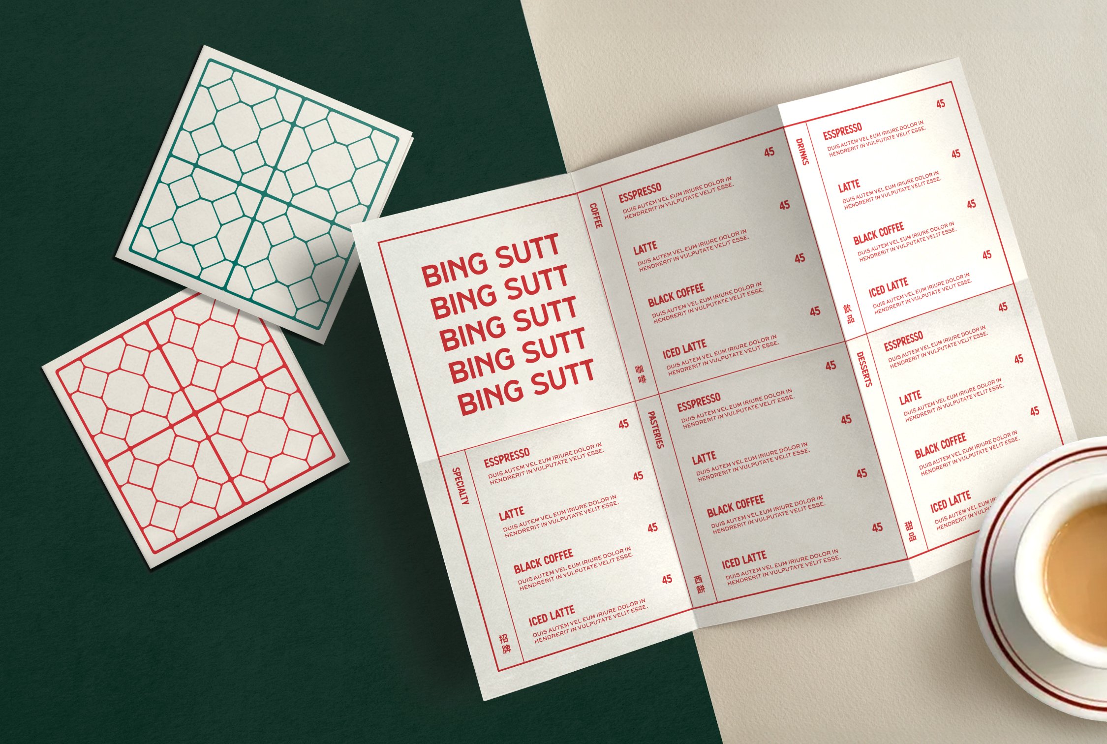
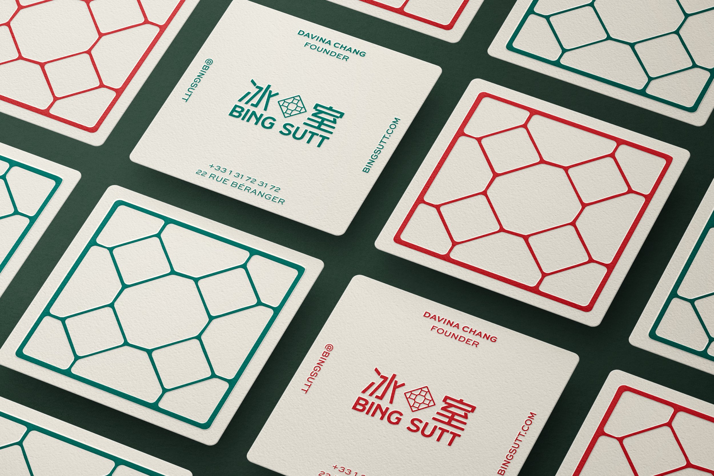
In the tribute to the past, the logo for the brand has been created with distinctive yet geometric lines, taking its cue from the iconic checkered floor tiles of the classic bing sutts and the form of ice cubes. This logo is then coupled with a logotype, borrowing the irregularity from the handwritten signages seen on the streets of old Hong Kong. The logotype employs the bold sans serif font that radiates the brand's efficiency, a hallmark of the traditional bing sutt, further consolidating the brand’s identity.


Blending Nostalgia and Modernity.
While the stacking of well-organised elements reflects the urgency in bing sutts, risograph elements reminiscent of retro posters and newsprints in the 50’s and 60’s Hong Kong have been incorporated in the brand’s secondary graphics to add another layer of nostalgia. The intentional inclusion of handwritten elements in the shop card resemble the handwritten bills typical in the old bing sutts, while grid lines are applied in the menu design to infuse a contemporary flair; echoing BING SUTT"‘s mission to balance modernity with nostalgia.


Distinctive in Hong Kong’s Style.
The rest of the brand’s collaterals have also been developed with the brand’s story in mind. Despite the cafe being situated in Paris, the staff uniforms are a nod to the attire worn by milk tea masters from back in the day. To Hong Kong, the milk tea master is more than a mere beverage maker, they encapsulate Hong Kong's distinct cultural identity and reflect the city's historical tapestry. This pays homage to their uniform in a fun way while contributing additional depth to the brand's narrative.
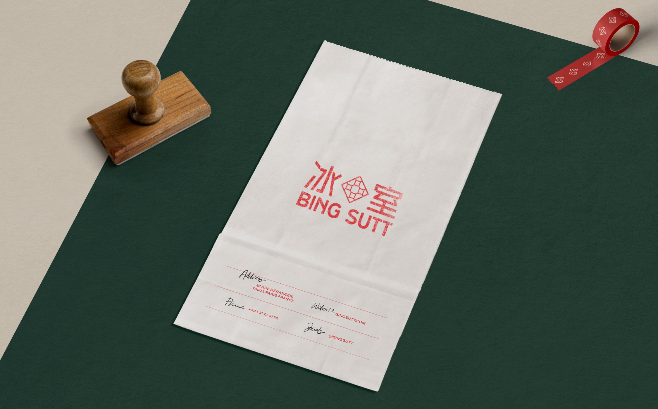
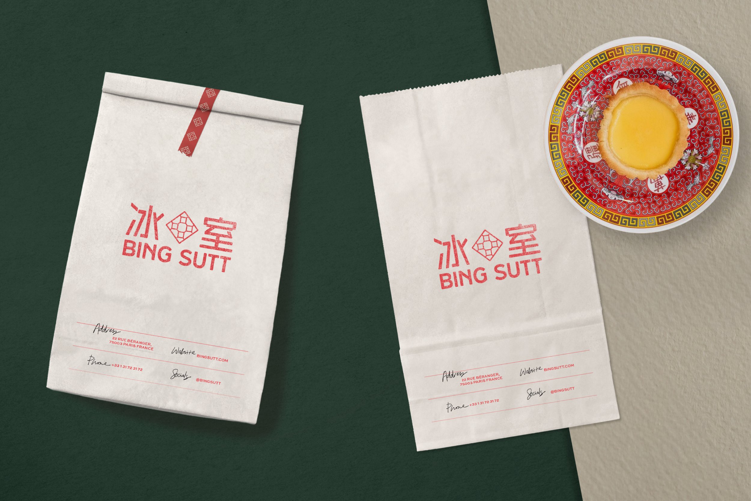
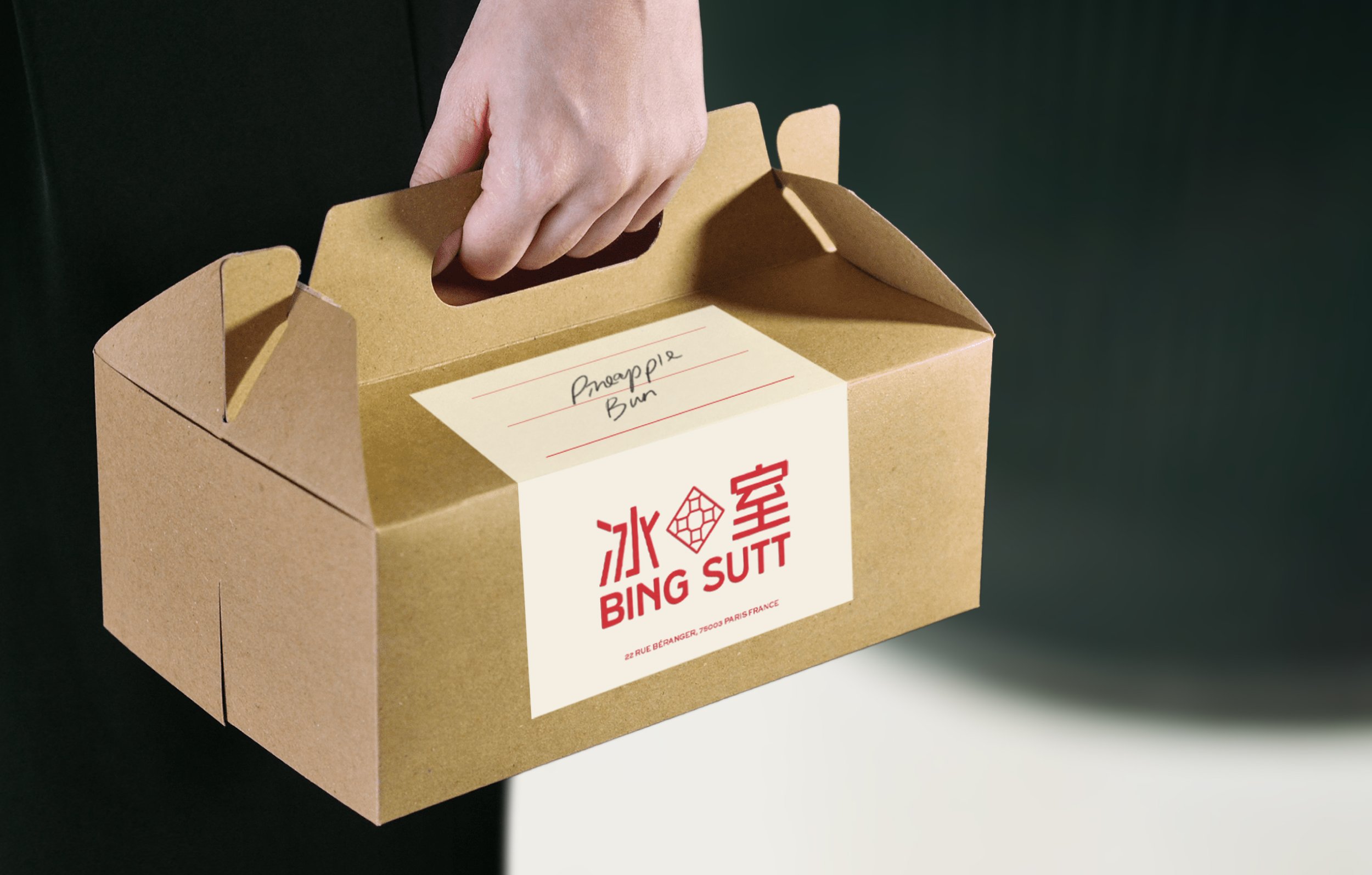
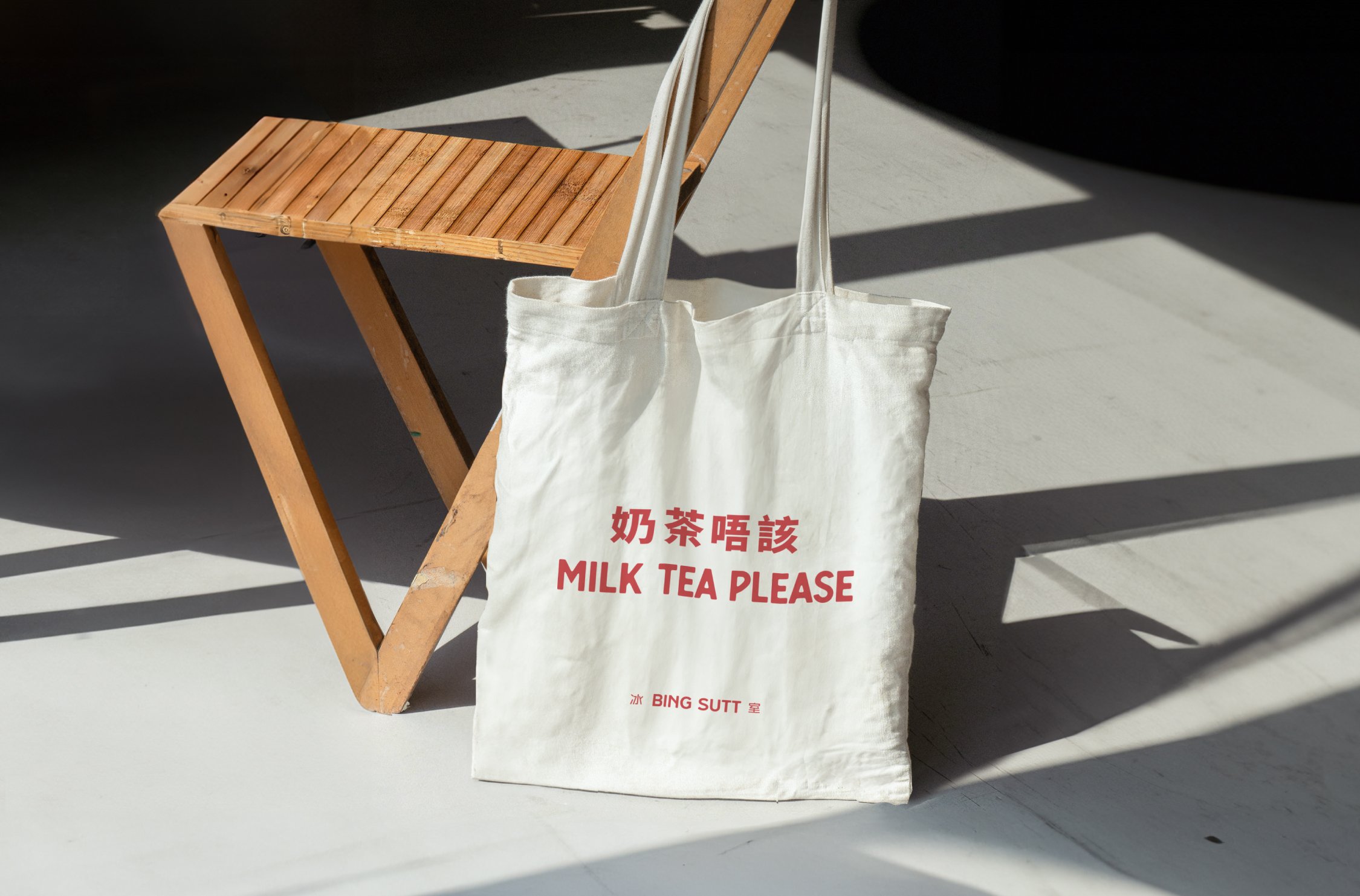
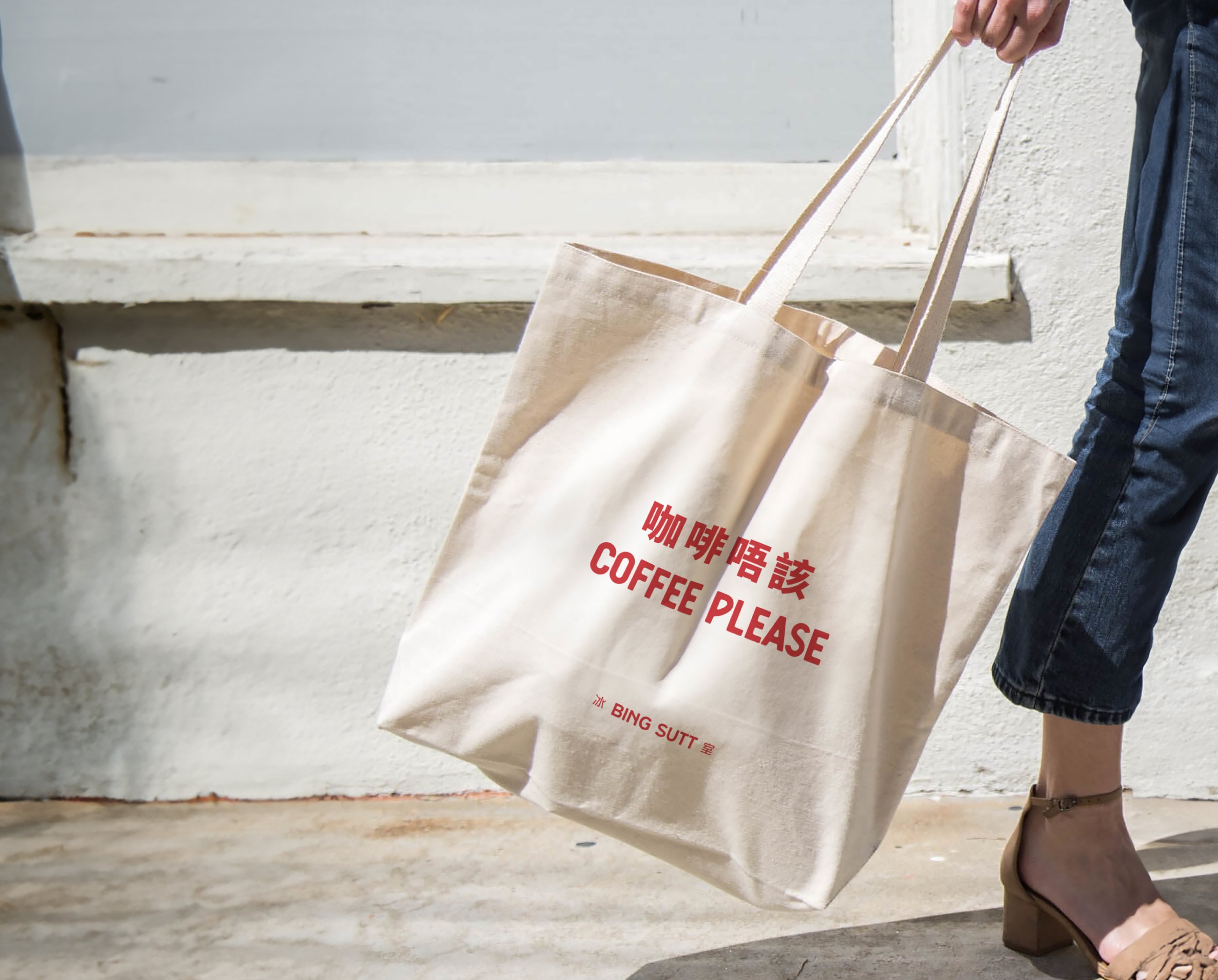
Elements of old bing sutts have also been modernised and integrated in other brand touch points such as egg tart boxes, takeaway boxes, tote bags and digital content, creating a hollistic experience for BING SUTT’s customers and allowing the essence of unique Hong Kong tradition to resonate in every interaction.


Moment
2022
Industry
F&B, Gastronomy
Services
Brand Management, Collateral Development,
Digital Design
Credits
Images - BING SUTT, HOP Architects
