Campfire

Together Further Faster.
Campfire is a global network of customised shared spaces, leading the evolution of how people work, live, learn and play — Bringing them together to go further, faster.
Founded in 2016 amidst the hustle of Hong Kong, they're building the next generation network of shared spaces that fosters all aspects of modern life.
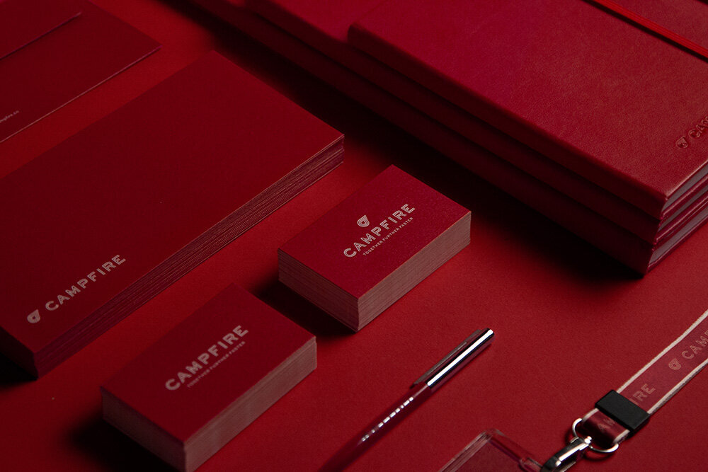
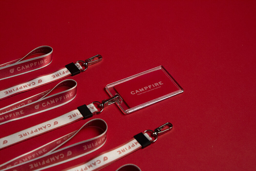
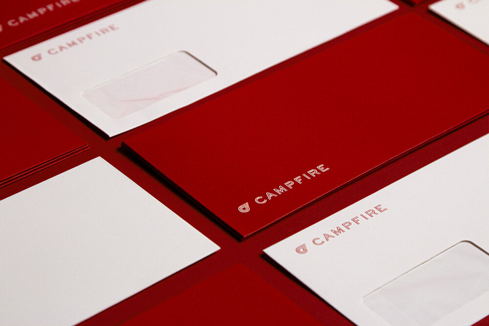
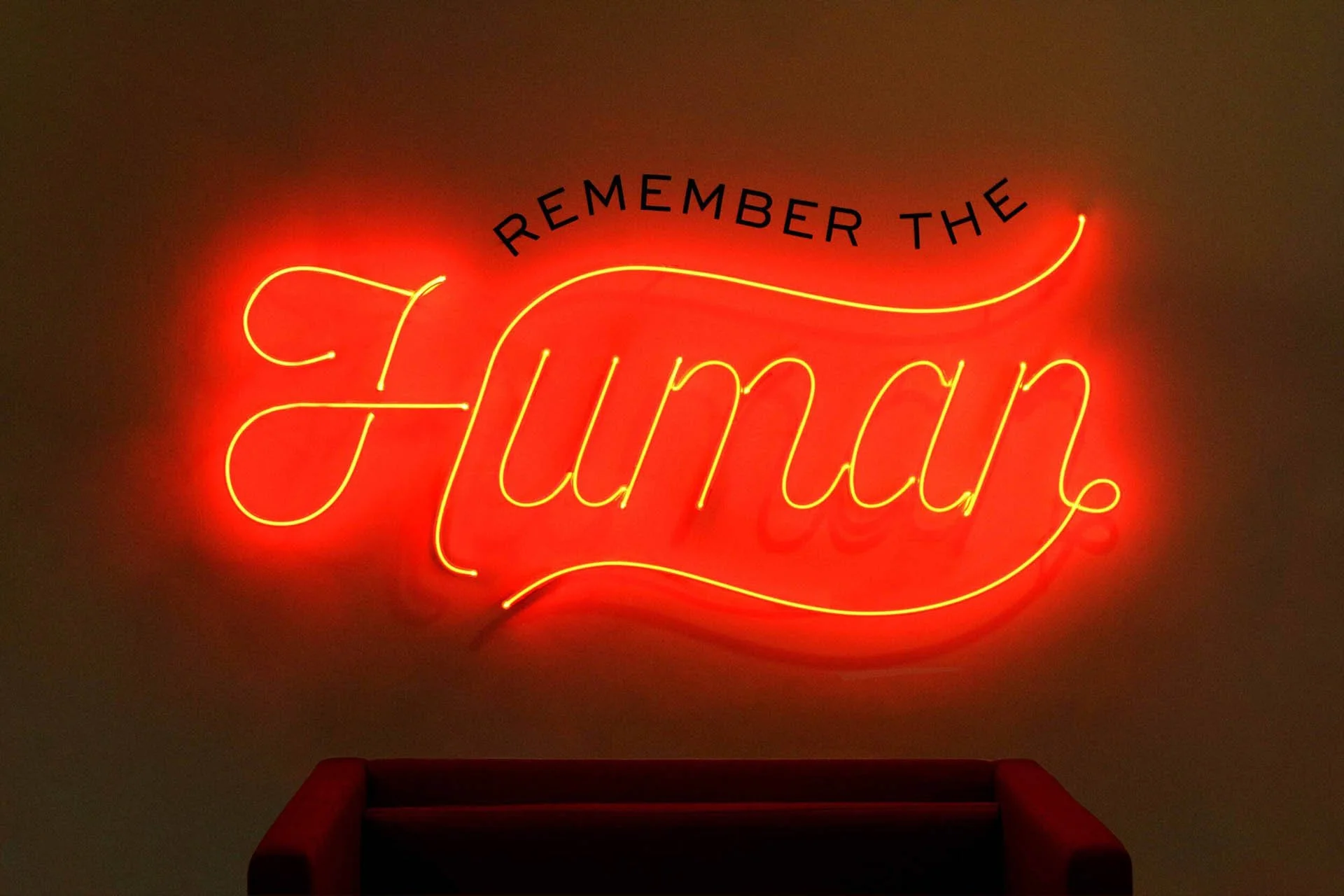
House of Forme worked with the client on their global rebranding strategy, stationary, digital media, marketing, interior space and photography.
See their website: www.campfire.co
The Brand Identity
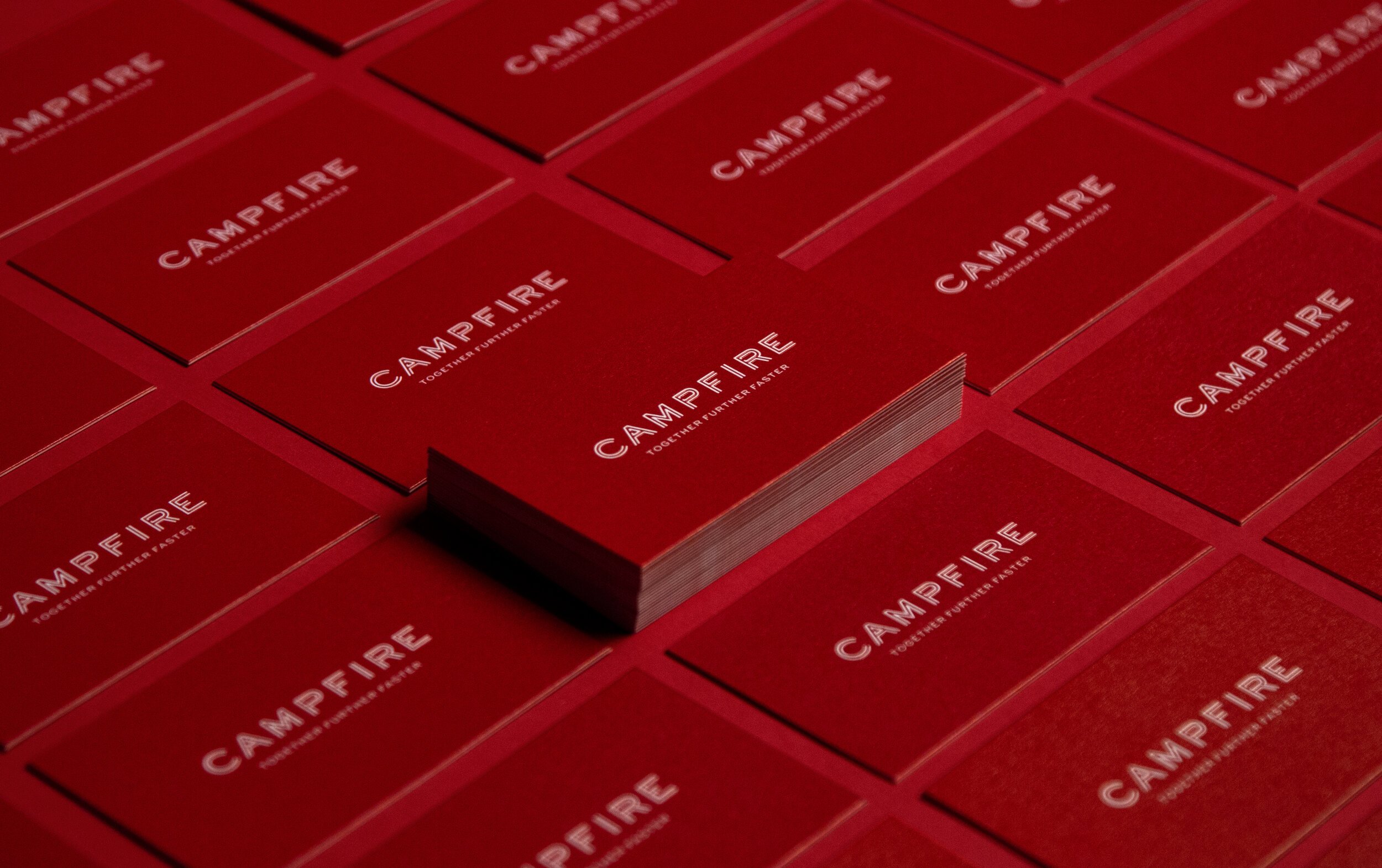
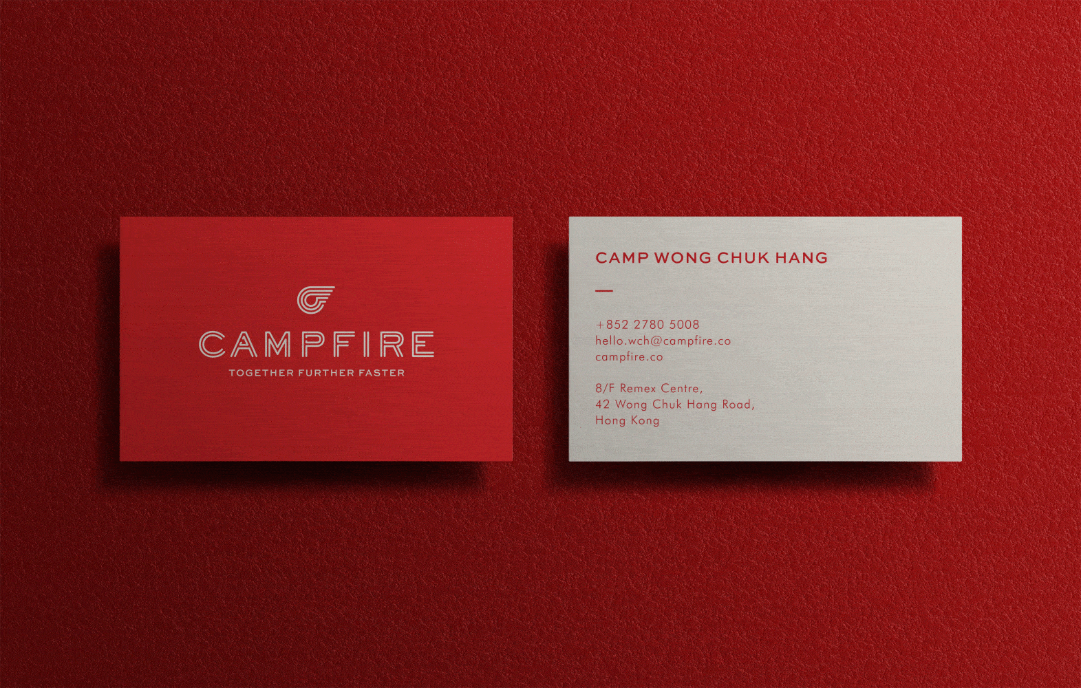
The rebranding takes inspiration from Hong Kong, the original home of hustle. Like Hong Kong, Campfire is building a honey pot for explorers and visionaries seeking to make Tomorrow better than Today. The double strokes in the new brand mark symbolises the togetherness in the new brand ethos, it also mimics the neon signs that roams the very streets of Hong Kong. Layered with a flaming red that represents the fire that burns brightly in every camper, the new brand brings a bold and energetic aura to the environment.


Neighbourhood Stories, Emotionally Told.
To further enforce the story of Hong Kong. A series of secondary icons were created for each Campfire location. Each uniquely designed to pay homage to what the area was known for. Such as the iconic noon day gun for Camp Causeway Bay, to the western terminus of Hong Kong Tramway for Camp Kennedy. Giving individuality to each space and design inspiration for the interiors.


Moment
2019
Industry
Shared Space, Hospitality
Services
Rebranding, Brand Strategy, UI & UX, Collaterals Development, Environmental Design, Signage Design, Print & Digital Production,
