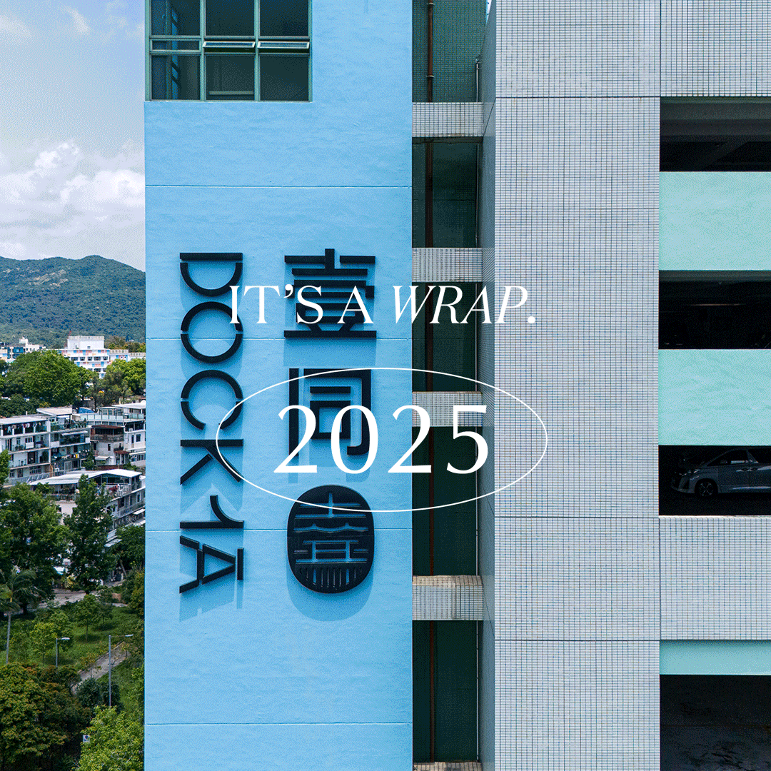
IT’S A WRAP - 2025
Effusive, is the word to describe the journey of House of Forme in 2025. We could not have been more grateful for the diverse projects undertaken, and the valuable clients we have crossed paths with throughout the year. Our team is growing quicker than ever, allowing us to tackle larger and more complex projects across a wider range of industries and cities. This success is an attestation to the shared vision and passion of our clients, and the never-running-dry creativity of our team.
With that said, we are proud to present a selection of our key projects from the past year. Join us as we showcase our fruitful journey of 2025.
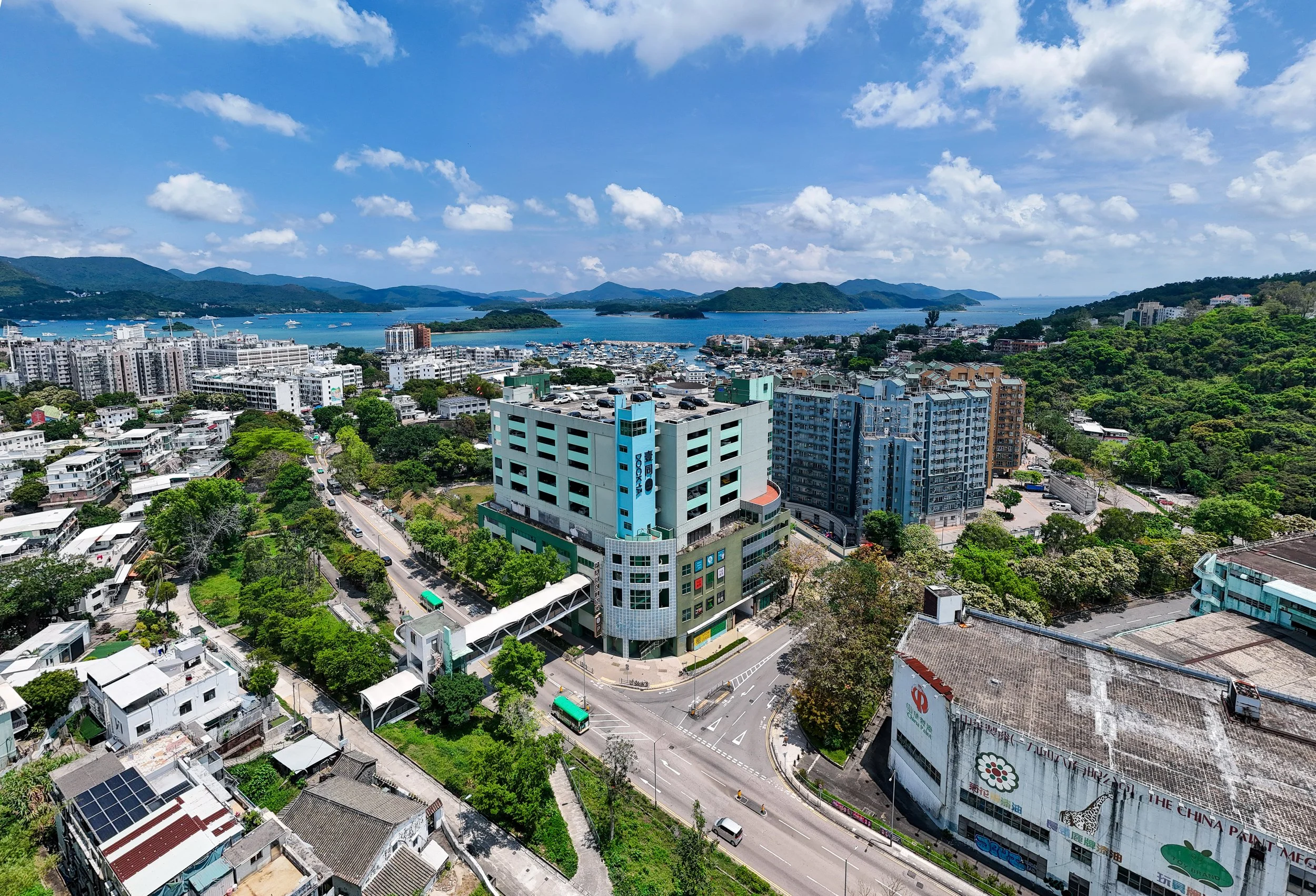

As foreshadowed in our 2024 Wrap , we’re excited to share that DOCK 1A and 再敘三點三 have officially opened their doors. Located in Sai Kung and Shenzhen, respectively, these projects are quickly becoming vibrant hotspots. It’s always rewarding to see our designs embraced by the community no matter the scale!
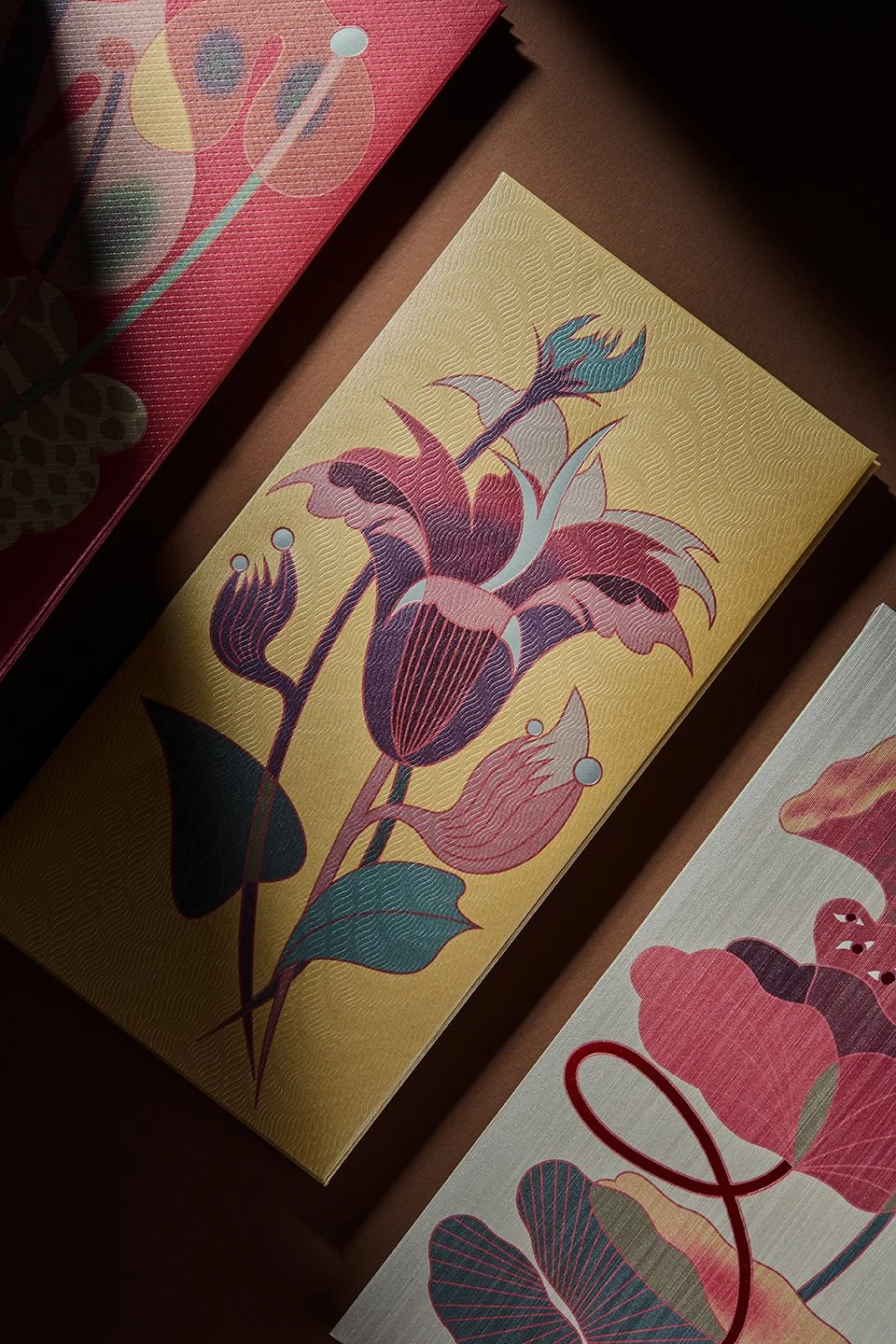
Following our tradition of self-initiated projects, we have designed a new series of red packets for the Year of Snake. Branching from the ouroborus symbol, these festive creations consist of powerful snake and floral imagery to celebrate renewal.
Modish.
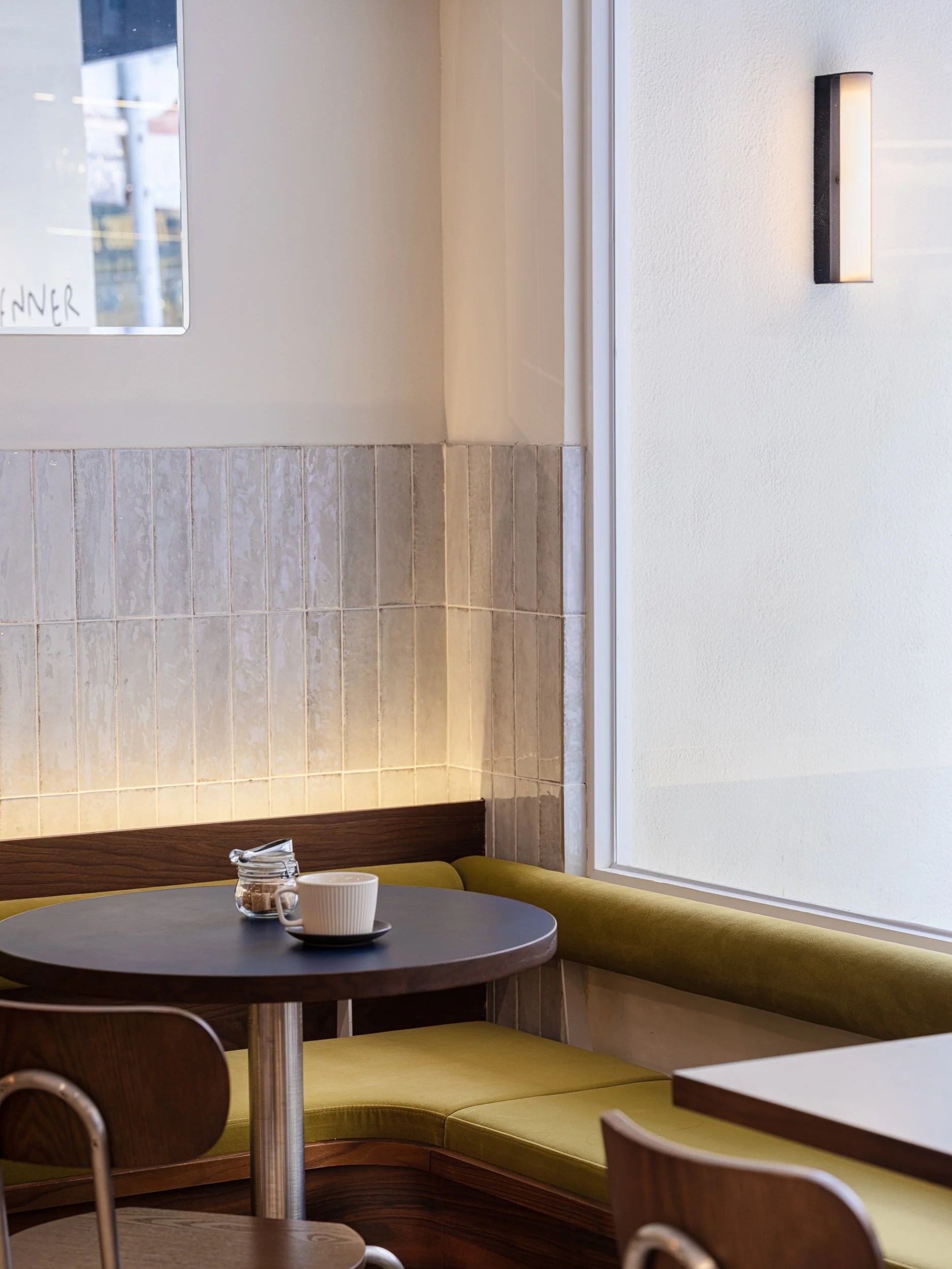
Our projects are always forward-thinking, designed to be trendsetting spaces of the community. Venner, a viral cafe that transitions from daytime pastries and coffee to evening natural wines, exemplifies our approach. We designed it with Nordic simplicity and timeless elegance, showcasing the versatility that can exist in a cafe.
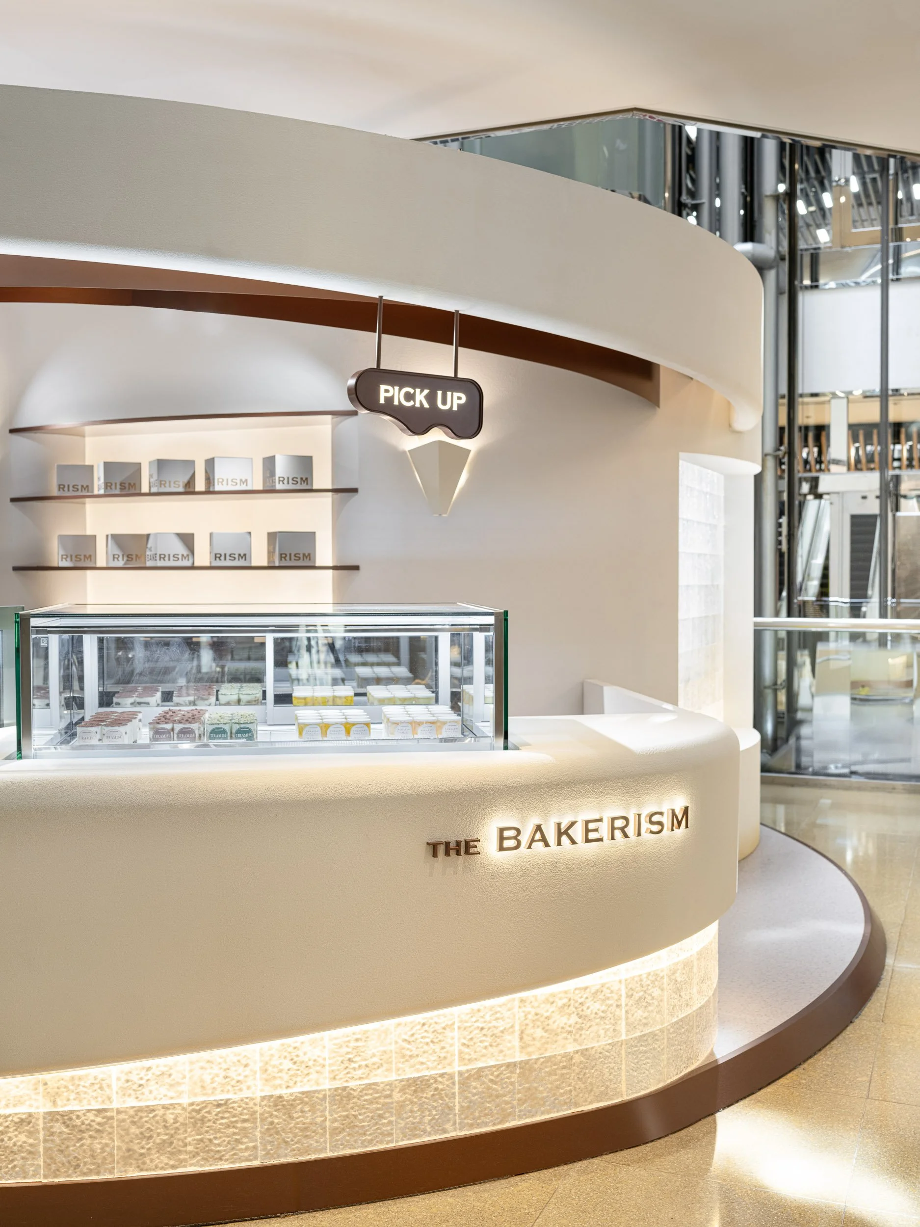
In another recent project, The Bakerism's pop-up at Cityplaza, we have moved beyond conventional pop-up shapes to create a spiraling pavilion, proving that pop-up design can be both functional and engaging. It embodies the brand’s commitment to quality cream cake. The pop-up is a physical manifestation of their brand values.
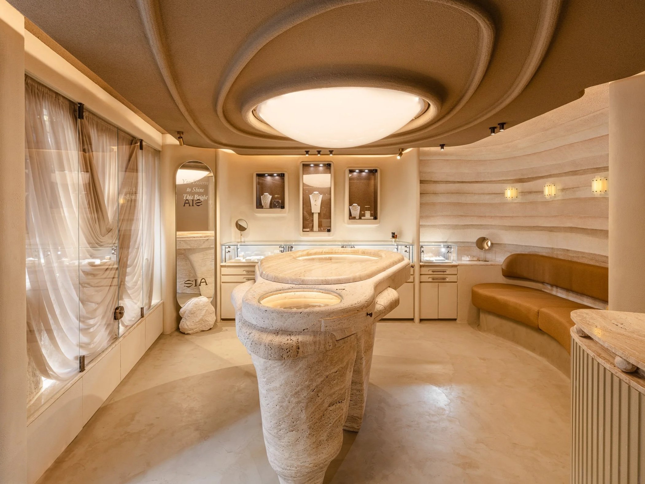
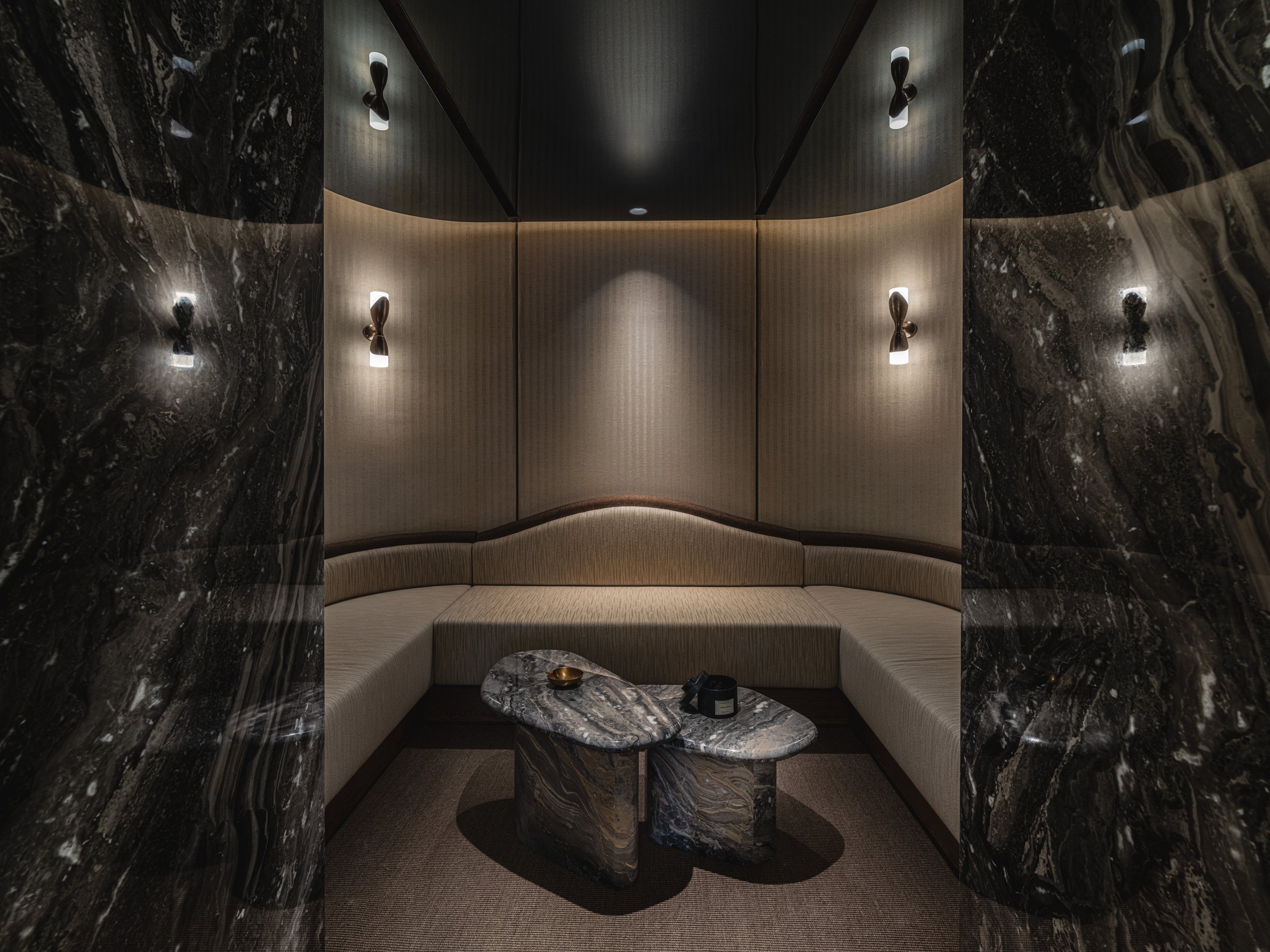
SIA Jewelry’s newest location offers a sophisticated portrayal of the brand’s dedication to presenting the Earth’s profound beauty in the form of jewellery. Designed to evoke a cave-like atmosphere, the space invites visitors to journey through the Earth’s core in search of precious jewels. The use of natural stone across the space and displays, along with soft, bespoke lighting, completes the immersive narrative of a nature’s vault.
Classy.
Classiness manifests in diverse nature, adapting to different environments. Our recently completed residence, SC Residence, embodies this philosophy, showcasing a mid-century modern design that reflects our clients’ mindfulness and creativity.
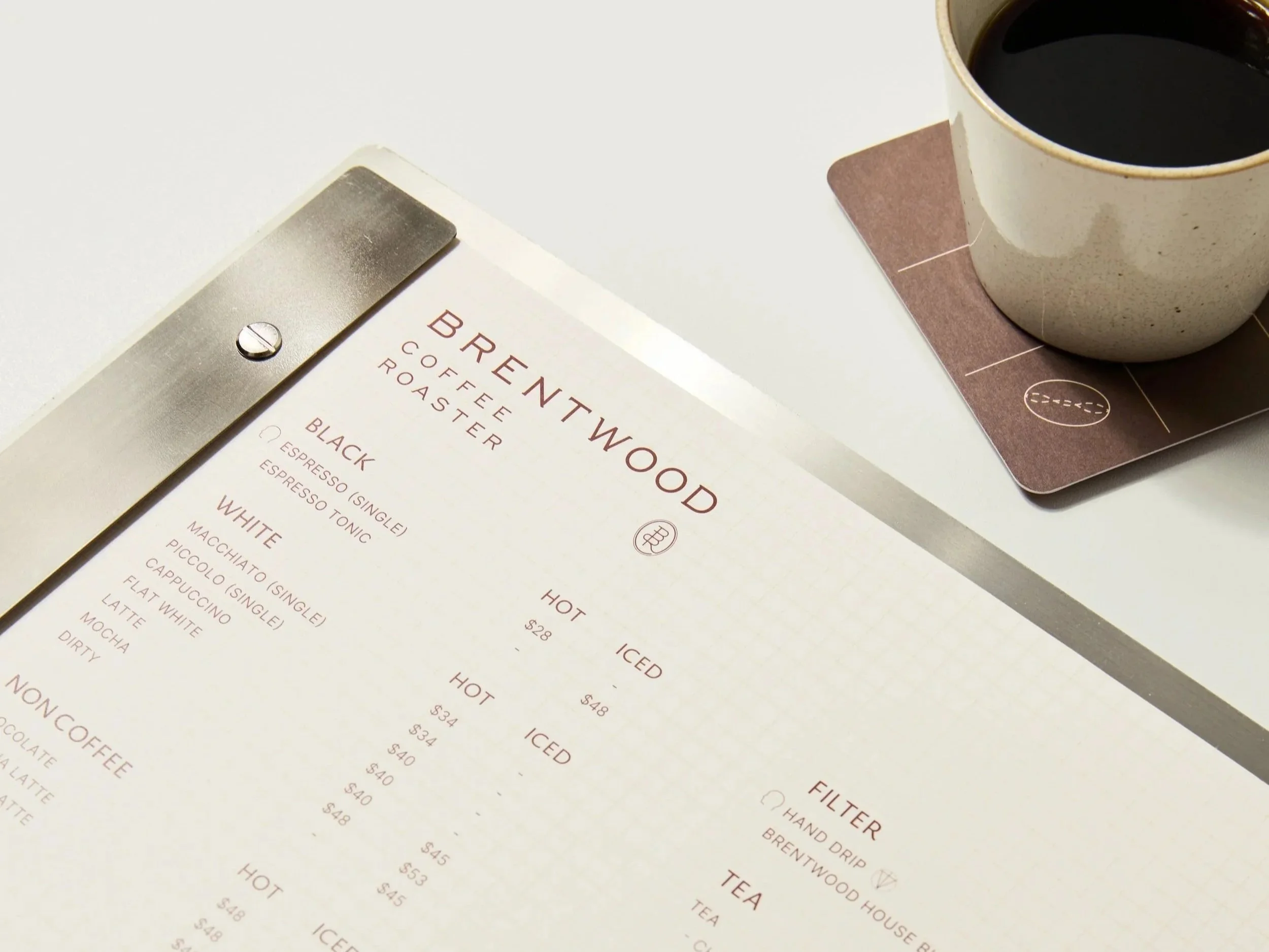
Our rebranding of Brentwood Coffee Roaster draws inspiration from 17th-century ‘Penny Universities’, sophisticatedly conveying the professionalism and artistry of coffee making. The brand identity evokes tradition, while scientific diagrams and hand-sketches enhance the narrative of exploration within the world of coffee.
Face Lab is a fresh interpretation of beauty centres, pivoting away from the cold, clinical environment. The design positions it as an urban retreat, inviting visitors to feel at ease within the warm and inviting aesthetics of its neutral materials. The space integrates grace and luxury, providing hotel-quality experience to all visitors.
The new brand identity of TINYAN, a confinement centre with a rich history, transcends its traditional image. Inspired by the phases of the moon, it echoes the nurturing cycle of a new life. Its elegant logo, integrating material and lunar motifs, along with a minimal and soft brand palette and graphics, visualises the refined, ritualistic services the brand provides to mother and child.
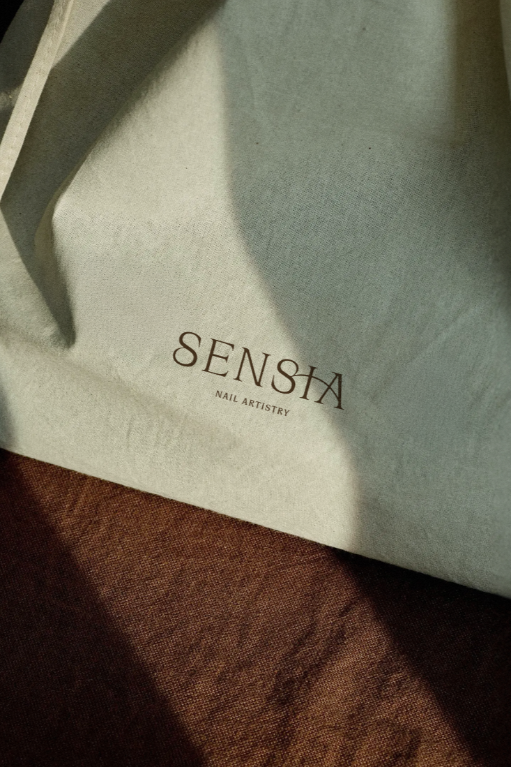
Our work has expanded to Milan with the newly opened nail studio, Sensia. Named after ”Senso”, the Italian word for “sense”, it stands as a shared space for visitors to experience beauty and artistry through manicure and hand care. The beauty of self-care is emphasised through a warm, elegant brand identity, setting the new standard for nail studios in the area.
Experimental.
As a full-service agency, we are always open to experimentation and pushing creative boundaries. We partnered with Innery, an innovative supplement brand, to launch their revolutionary “editable skincare” concept. The minimalistic logo and pale colour gradient palette visualise the idea of elixir running through one’s body, promoting inner radiance. The bespoke packaging, composed of pure colours, gradient foil, and frosted pill bottles, further reflects the brand’s focus on inner beauty.

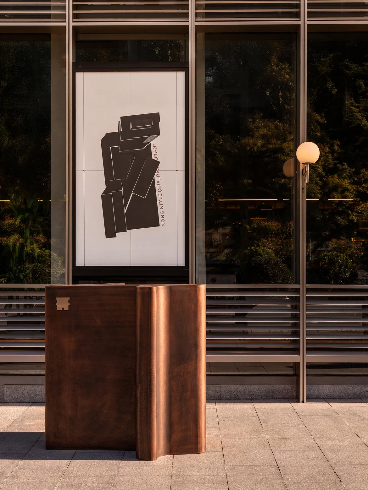
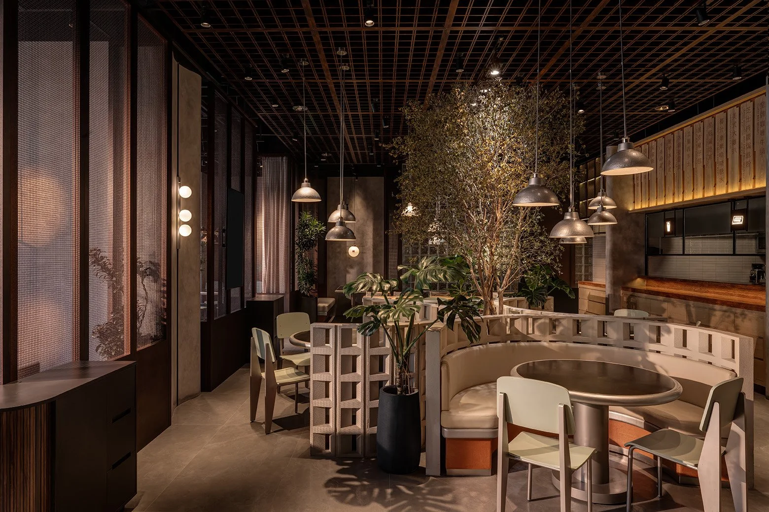
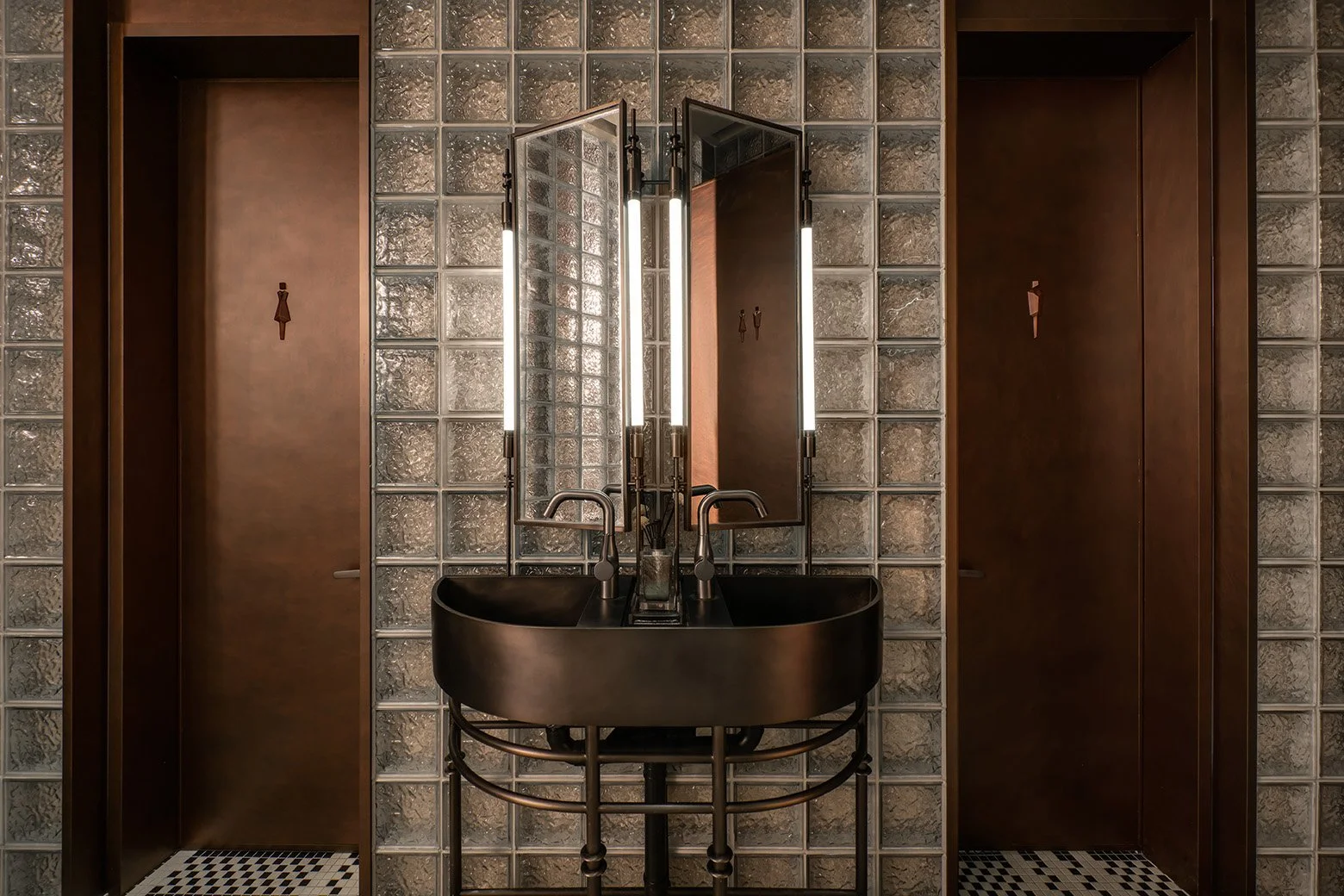
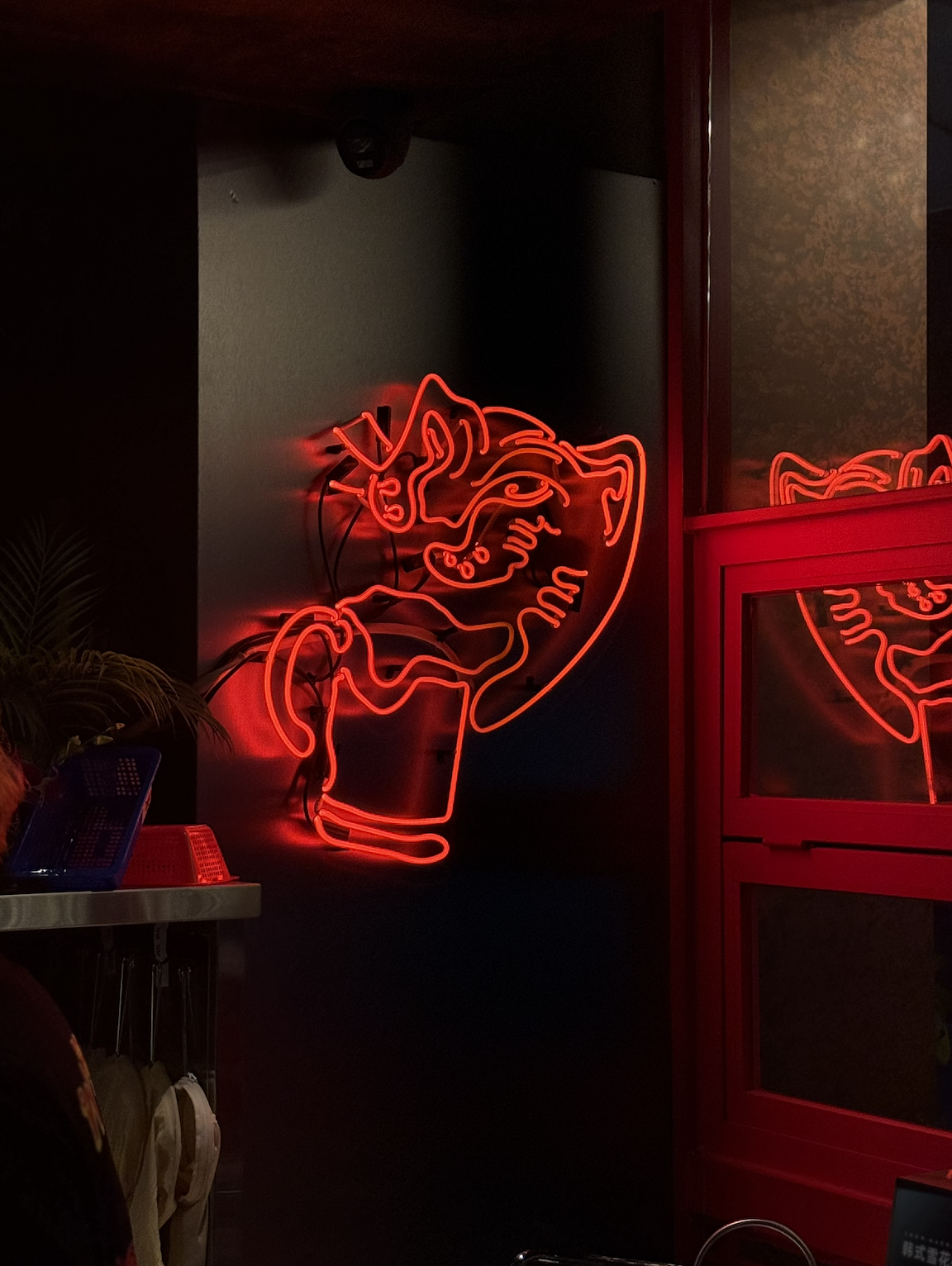
Thaiger is a rebellious reimagination of Thai barbeque. From branding to interior design, we merged raw, modern industrial style with the vibrant energy of Thailand’s streets. A playful mascot and bold colours complement the nostalgic, gritty space, bringing a full-sensory journey of aromatic grilled meats and bold flavours to China.
Beyond the culinary world, our strategic creativity extends to diverse sectors across China. We revitalized TOSHIBA's brand presence in the market through a comprehensive redesign of its Chinese branding and collaterals. Additionally, we partnered with a major Tianjin-based national enterprise to design the FMCG packaging for a new line of frozen products, now shelved in supermarkets nationwide.
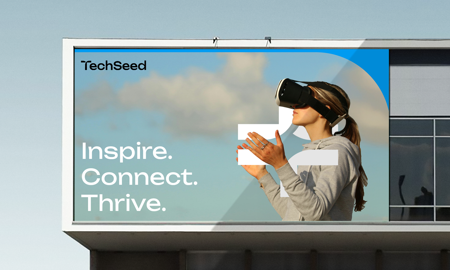
Challenging the stereotype that financial and technology are unrelated to design and branding, we experimented with the branding of TechSeed, a technology foundation, and Abacus, a venture capital firm. Their new branding symbolises the beginning of growth and continuous breakthrough respectively. With a thorough brand identity, the brands now better present their values and communicate more effectively with stakeholders across different touch points. Their distinctive character and new sense of authenticity also makes the brands stand out in their industry.

Refined.
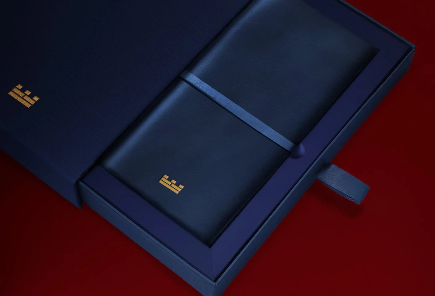
We truly believe the smallest detail makes a huge difference, and we care about every detail in every aspect of our work from interior design to digital experiences. Our collaboration with Citadel on their festive collateral epitomises this philosophy. The red packets, paper fans, illuminating packaging and more were carefully designed to capture the essence of the festival while reinforcing Citadel’s commitment to excellence and innovation.
RB Residence, a colonial house in Repulse Bay, is a motley of its original features and contemporary design. Our design livens the space by weaving together a new narrative of curation and articulation into its existing structure. The result is a blend of history and modernity, introducing a new approach of living within the original framework.
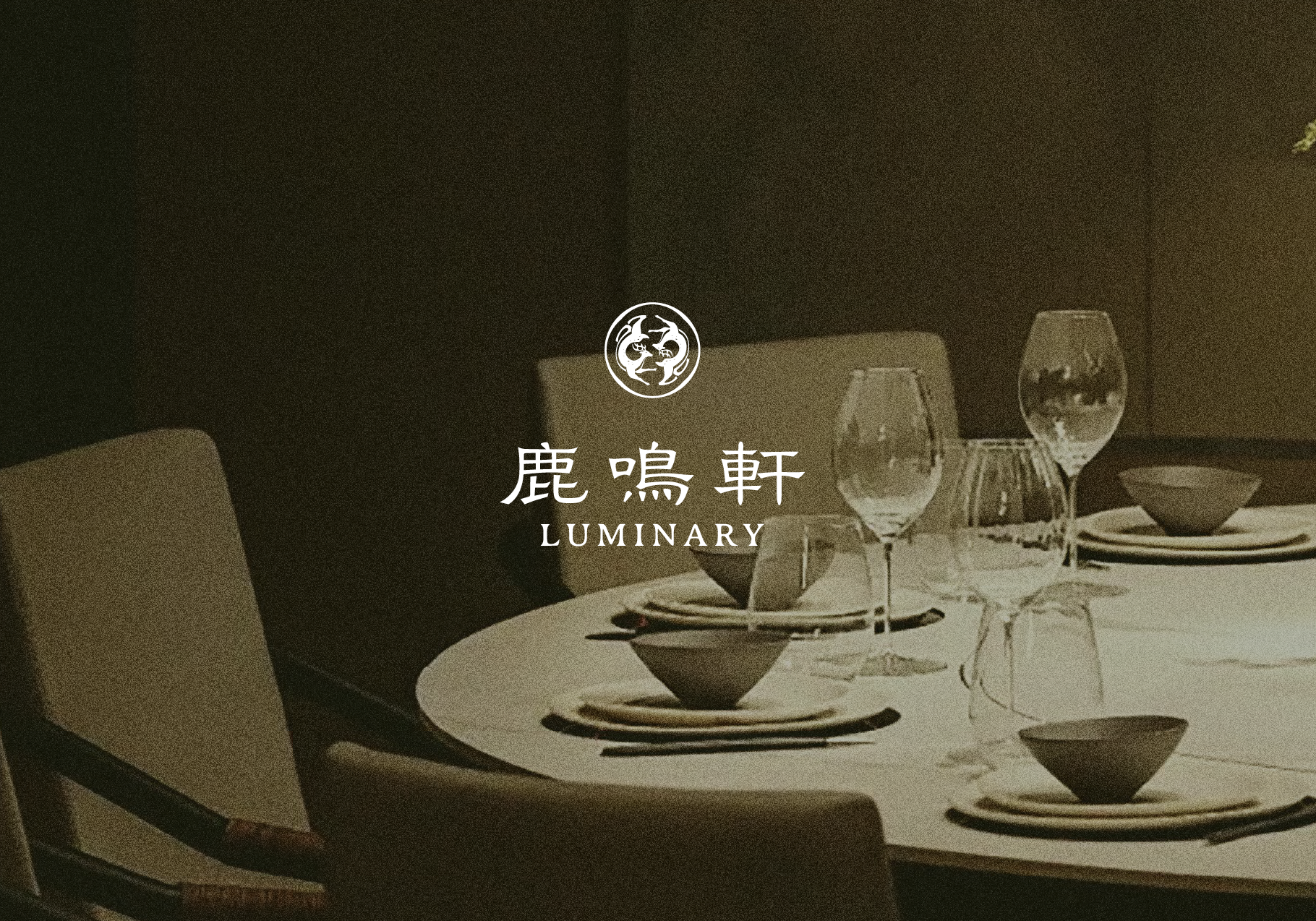
Luminary’s branding is inspired by “鹿鳴宴”, a Ming Dysnasty court feast honouring top talents with a deer-based banquet, symbolising the emperor’s appreciation for talent. This tradition implies Luminary’s commitment to serving high-end cuisines, bestowing blessings of prosperity and fulfillment upon every guest.
Crafty.
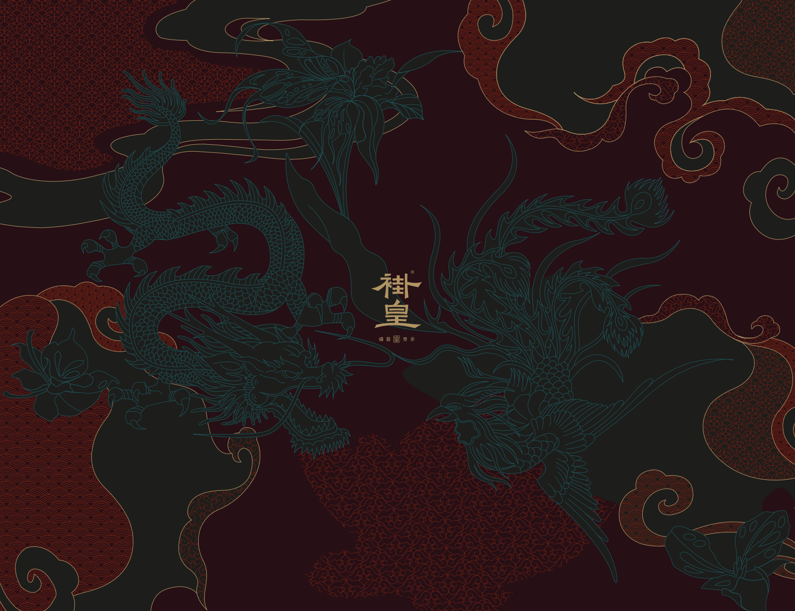
Our most stylish branding project to date, Guahuang, redefines traditional wedding gowns by celebrating their rich heritage and craftsmanship. Through a rebranding practice, we have also designed distinctive branding for its three collection: 典 (The Classic), 藝 (The Artistry), and 尊 (The Noble), implemented across all brand touchpoints, blending creativity, culture, and tradition.
The convergence of tradition and modernity often sparks unexpected chemistry. MIST, an unconventional hookah lounge in Shenzhen, fuses Chinese tea with shisha and cocktails. Inspired by cloud, wind and smoke, and incorporating traditional water marbling techniques, we crafted a modern, multisensory brand experience.
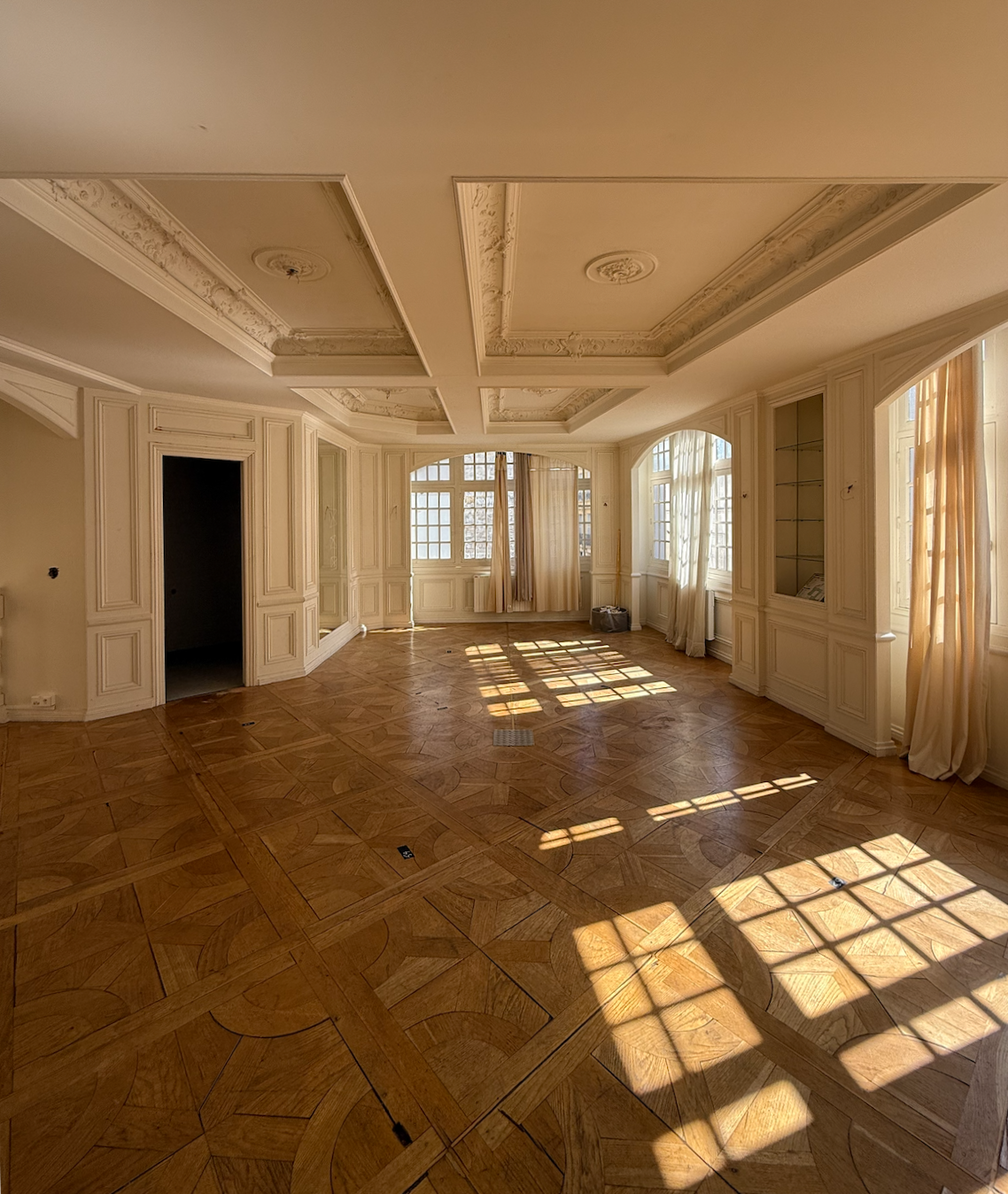
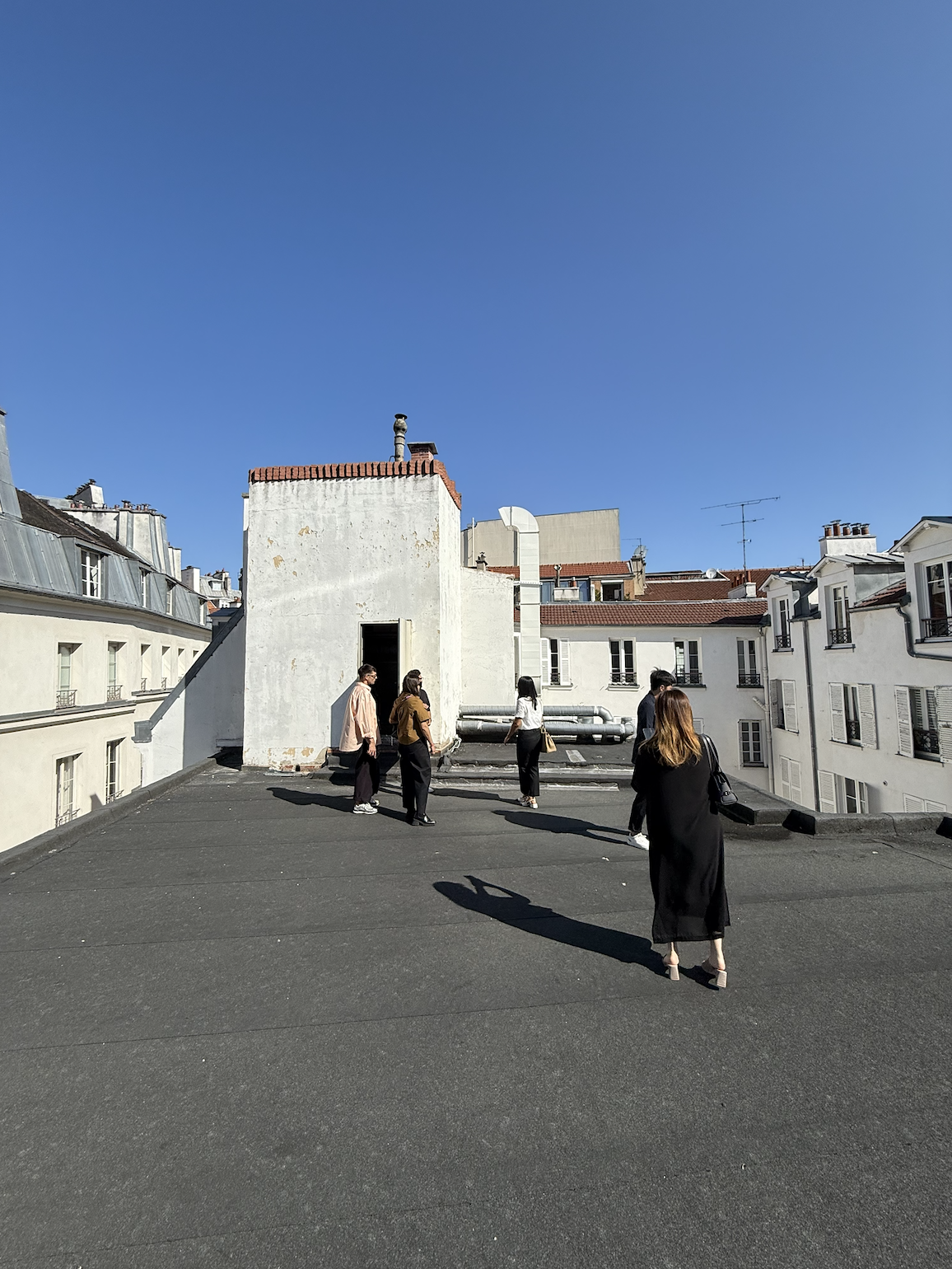
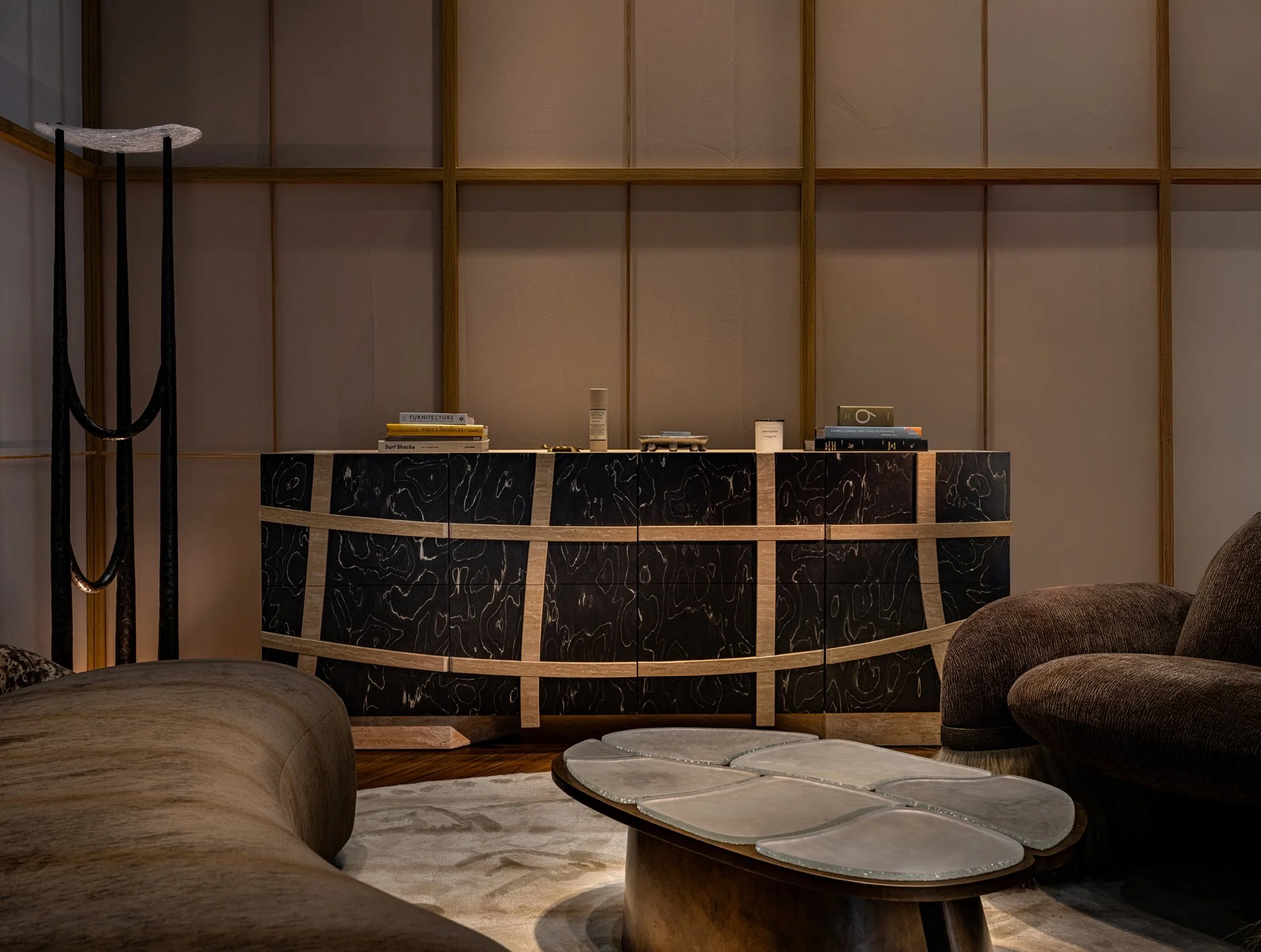
Beyond the projects above, our footprint extends internationally. Earlier this year, our team flew to Paris for a forthcoming cafe rooted in the manifestation of fullness. Our work has also reached other Asian cities, including Shanghai, Niseko, Osaka and more.
Other than our projects, a highlight of this year was our participation in Design Shenzhen 2025. After extensive planning and designing, not only did we showcase our extensive portfolio, but also breathe life into a new House of Forme project. The overwhelmingly positive feedback we have received sparks our excitement for what is to come.
Transformative.
Looking back, the past year has definitely been transformative. Our portfolio grows significantly, opening doors to opportunities across the globe, allowing us to collaborate with like-minded brands and individuals. Despite the downturn in the economy, we have also taken on projects larger, more luxurious than ever, pushing our creative boundaries and unlocking new potential within House of Forme.
And this is just the beginning. We are creating luxurious homes with immersive story-telling, developing fresh branding for prominent developers, and designing commercial spaces that speak to consumers through branding and interior design.
At House of Forme, we are always evolving, always striving to create something even more imaginative and creative than our last. With that said, we are ultimately thankful for all our clients, partners, and you who have been following along. We can’t wait to see what the next year brings and are thrilled to have you along for the joy ride!
Other Interesting Reads